Features
February 20, 2025 •
The Semi-Annual Stationery Affair: NY NOW delivers fresh currents in paper — now for literally a century, and counting

At NY NOW, stationery is serious business. Any venue with any sort of offering — from high end and handmade to topical and trendy — cannot miss walking this famed assortment. Like an exotic bloom, this market only comes to life twice a year. I walked it to unearth the treasures within. Among them were the stickers in ink.paper.craft’s booth — they helped prepare me for my close-up!

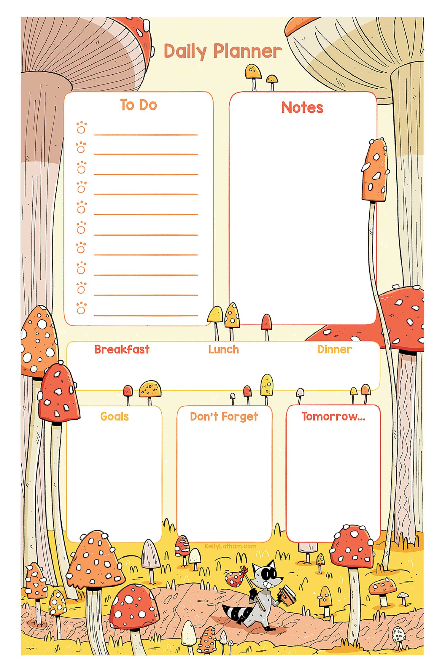
Amy Zhang. Gone are the days of humdrum notepads — this pun-a-rific design with a clever layout adds panache to even the most tedious of tasks.

Artik. I’m already a fool for a sewn notebook with a sharp bellyband — but when the product in question is so lovingly assembled to honor our planet as it organizes our thoughts, well, consider me sold!

Designworks Ink. This exquisitely fabric-bound tome looks like it came off the shelf of a distinguished library — but is instead poised to become one’s own dramatic autobiography.

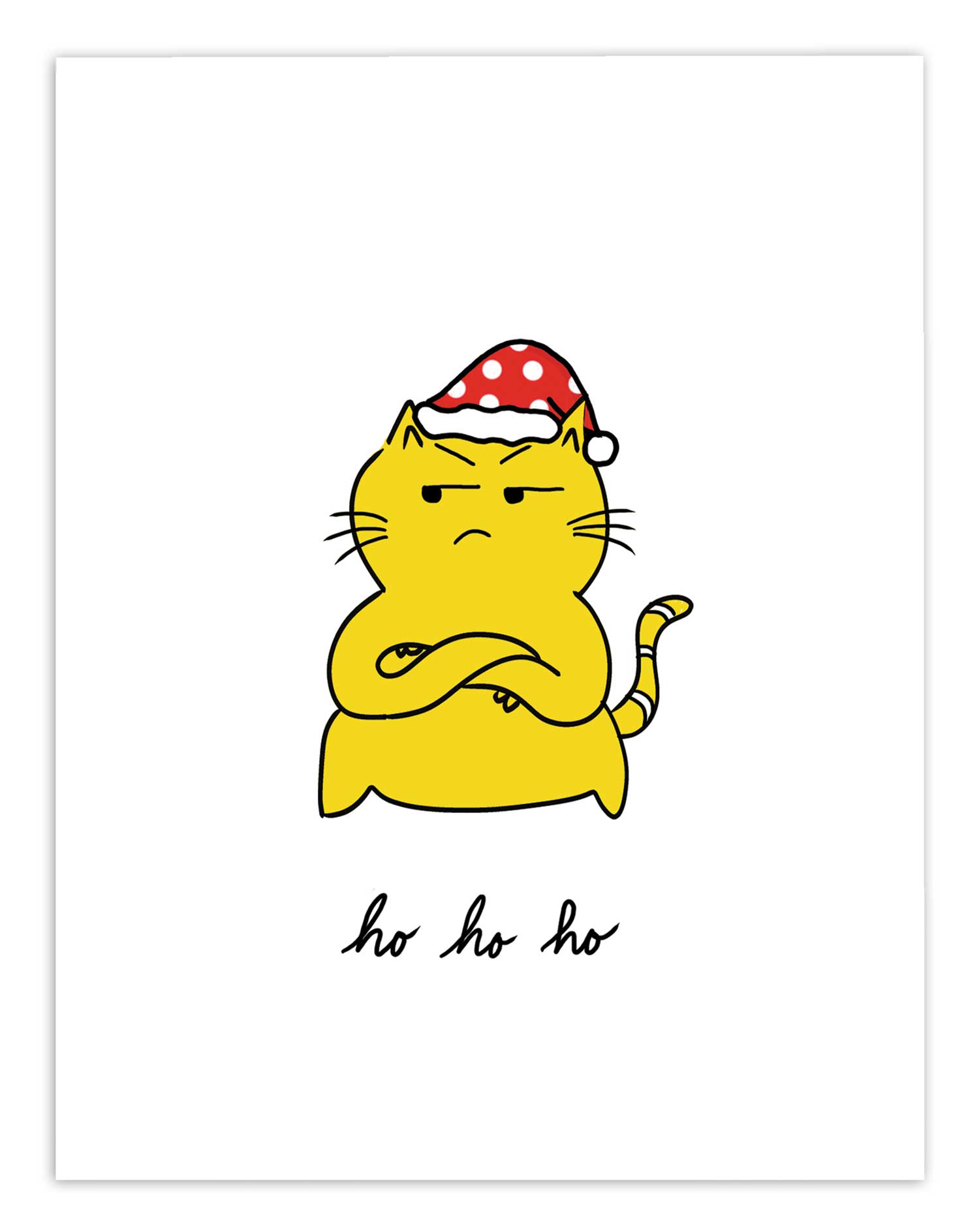
Indigo Maiden. Meet Heather, a new voice in stationery out of Columbus, Ohio, that is by turns opinionated, sweet and snarky — in other words, a voice that most likely speaks to your audience.

k.Patricia. This mom-and-daughter duo never fails to grab directly at the heartstrings. I especially enjoy how a strong new image — like this pup replete in floral sunnies and scarf — will appear in different categories over time — e.g., notepad, sticker, card — with the messaging accordingly adjusted each time.

Kala Style Soap Co. Here soap gets the stationery treatment, with elevating effects. The “die-cutting” (AKA flower molds) utilized here lends itself to endless merchandising possibilities, and those upscale boxes are far too pretty to toss and have plenty of potential as well.

Not Picasso. Every winter market I walked was full of decorative earrings presented on equally decorative cards. These utterly ducky acrylics, handmade in Kentucky, were among the more thoughtful and polished that I found. I always know I’ve discovered a compelling brand when I can’t decide which of my booth shots to share, as was the case here. I especially dig the mismatched designs.
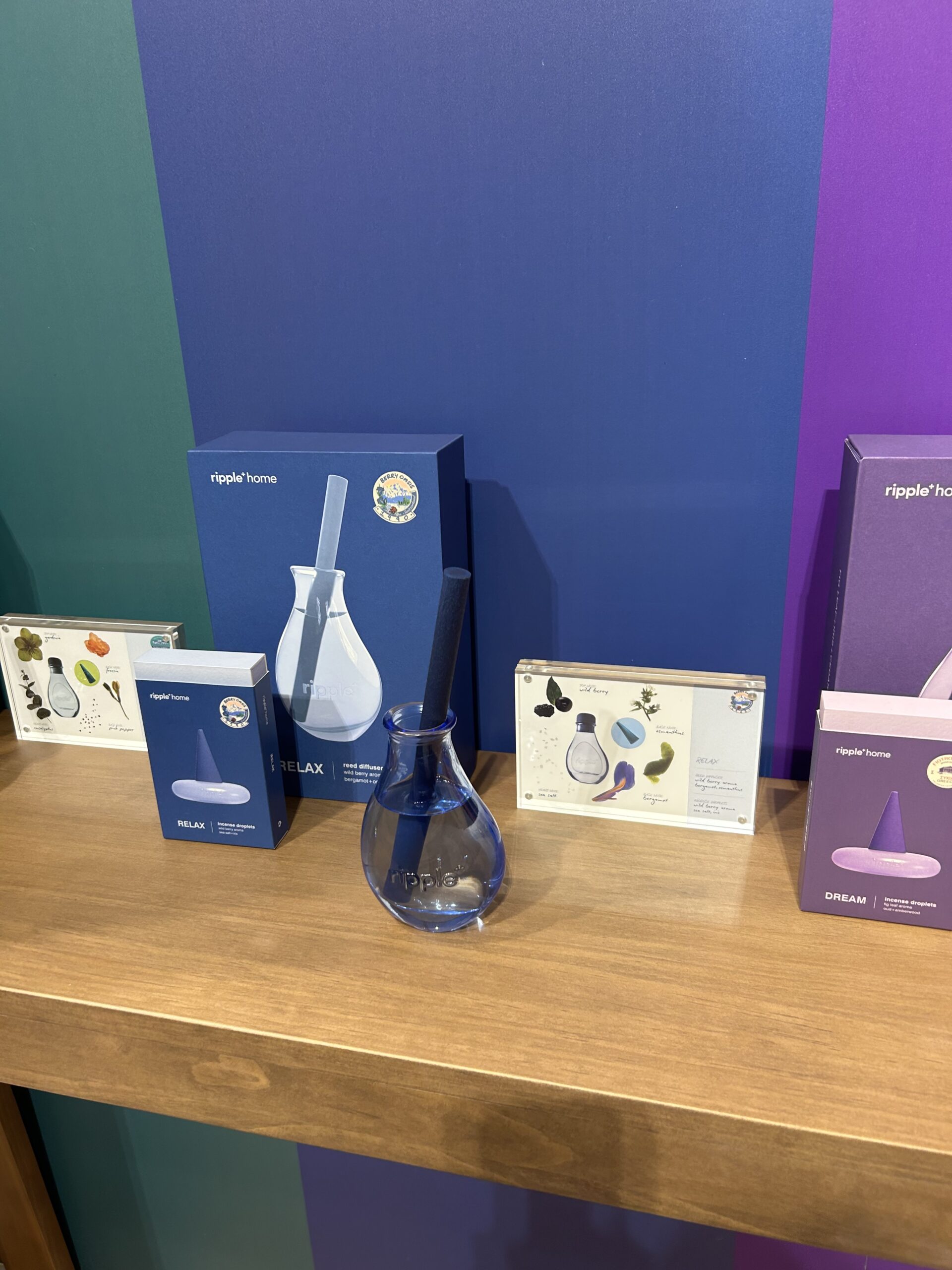
Ripple Home. I am an utter fool for reed diffusers — isn’t everyone?!? — and this London house of style infuses the entire concept with elevated, color-driven modernity.

Smudge Ink. April’s new book log was her market hit and joins an existing design for gifts and thanks. In a market filled with literary designs, this thoughtful approach (with a letterpress cover even) that truly thinks like a reader definitely endures.

The Silicone Straw Co. In all of the frenzy over British stationery brands, let’s not overlook the gift ones too. In addition to plastic and paper varieties, there also exist silicone straws — here colorfully and beautifully presented in award-winning form by Charlotte Walsh. The travel tins are beyond fun, and I love how the display incorporates straw cleaners.

Truelux. A clean candle that melts into a lotion? Um, yes! As an added bonus, those boxes beg to be stacked at display, and that foiled logo is really something else! Once the lotion is gone, the chic containers demand upcycling.

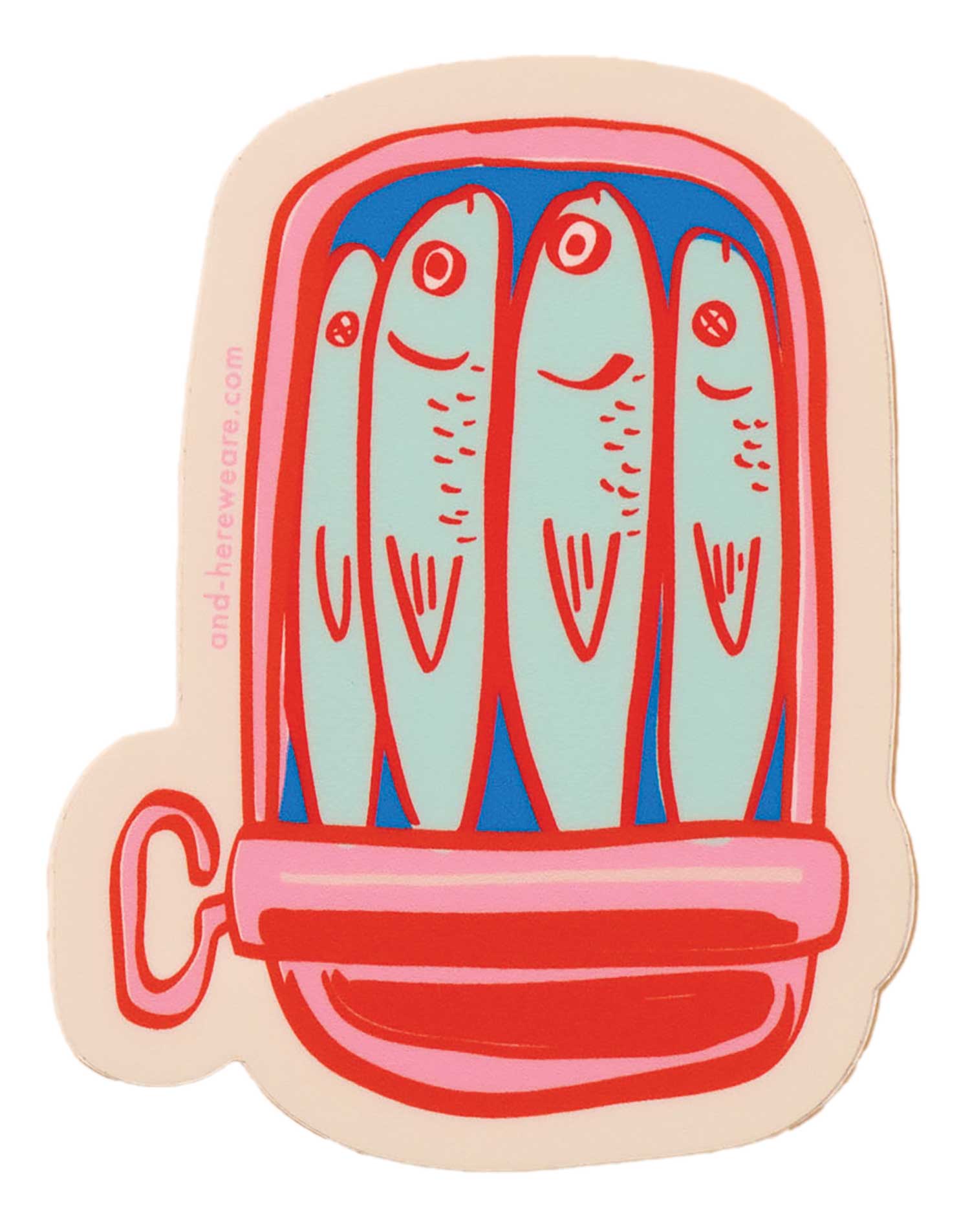
Turtle’s Soup. Every design I saw at this freewheeling house of Arizona stickers was a keeper — plus they have add-ons like sun catchers and air fresheners. Topically, the entire world of trends can be found here: from smutty romance to plant and fruit love, from tarot to mushrooms to aliens and back again, consider yourself covered!
The Card Counter

Ampersand M Studio. Although the cards here are certainly square, they’re also spicy — and smart! You may never see the everyday objects pictured quite the same again.

Ash + Chess. Run by queer and trans couple Ashley Molesso (she/her) and Chess Needham (he/him), the upstate NY brand (and store!) has accordingly resonated with the LGBTQ+ community since its introduction in 2019. However, its overarching positivity and infectiously cool signature style makes it irresistible to anyone who sees it.

Brittany Paige Designs. This racy, girly brand, named for its enchanting founder, turns the tabloid world upside down. It’s all in the name of serving America’s celebrity-laced messaging needs with consistent style and sass.

Brook Isle. The tagline for this new-to-me brand is ‘modern goods with a vintage soul,’ and it certainly has soul in spades! I am definitely looking forward to seeing more from this woman-owned Pennsylvania house of paper.

Cards by Allie. Interestingly, as Ozempic becomes commonplace, all those passed up sweets and snacks have miraculously metamorphosed into calorie-free, stationery form.

Embued Photophiles. No one creates cards quite like Beth. Front and back unite brilliantly. The addition of a meaningful message tucked inside completely transforms the card receiving (and hopefully re-reading) experience.

Everyday Yiddish. I have been wanting Yiddish stationery forever, and, like a gift from the universe, I discovered this kitschy range from Toronto maker Jody Kamen. It’s funny and fun, with potential in spades.

Evil Llama and Friends. Looking for a line that’s 100 hand-drawn? Check! How about 100% evil? That’s a check too — though I would argue there is some good here! — according to founder Neda Omidvar. It’s amazing how the addition of a question mark and a flustered pigeon can transport a traditional greeting somewhere new.

Honeyberry Studios. Like several makers lately, Yuko has decided to leave Instagram for the moment. I’m guessing that turning inward is going to create even more pastoral gems like this.

Ink.paper.crafts. In my opinion, ‘Meaning to Write’ is an emerging theme, with potential to transform card browsers into card senders. That intention to reach out but never getting a moment to do it — until now, that is! — is rather universal. Meanwhile, the range of what’ll be written inside this letterpress design will vary enormously.

JaneLi.co. This brand, hailing from the imagination of Jane Li, a Taiwanese American designer & illustrator, puts a salty yet somehow sweet (and thus completely welcome) spin on the world.

Jessica Frasz Studio. This maker’s marvelous oceans and landscapes continue to develop new illustrated and messaging elements, with great effect!

Little Feet’s Opus. I was really warmed to see so much encouragement and acknowledgement of female strength and power running through many indie card ranges. This is a particularly potent expression of this trend!

Lynn-oleum. Because she had a store of her own, Lynn knows that capturing the majesty of block printing and accessorizing it with gold foil and heartfelt, flexible messaging is a winning, eye-catching design blend.

Maison Chanamom. Part of the NY NOW magic is connecting with makers at their first-ever trade show, like the talented Chanamon Ratanalert. Her card game was strong as I think you will agree — also be sure to check out her earrings.

Mellowworks. I hadn’t seen Divya’s vibrant work in a while, and I’m happy to report she’s back with plenty of bows — a huge theme, period — as well as a heady color palette that’s somehow simultaneously sweet AND sophisticated.

Niquea.d. Whoever said handmades were dead never saw the exquisite, spellbinding artistry that is this brand, the brainchild of the incredibly talented Dominique Schurman. Every last design is fine art in greeting card form.

Quick Brown Fox Letterpress. Tone-on-tone letterpress flat cards? I’ll take one in every color of the rainbow, please, and two of those cherries!

Steel Petal Press. Letterpress from this Chicago house never fails to blend the freshest vernacular with compelling layouts that pop and beg to be read, sent, and read again.

You’ve Got Pen on Your Face. This brand was founded by British married couple Frankie and Tom. Also raising two children, they bring a fresh sensibility to the American stationery space.
Featured image: The editor-in-chief snapped a selfie in the ink.paper.crafts booth.



0 CommentsComment on Facebook