


Features
June 14, 2023 •
Noted lookbook: Stationery inspired by Pantone’s NYFW palette
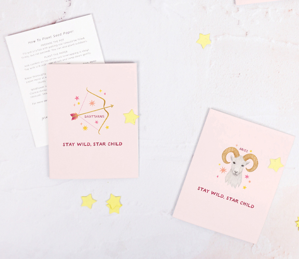
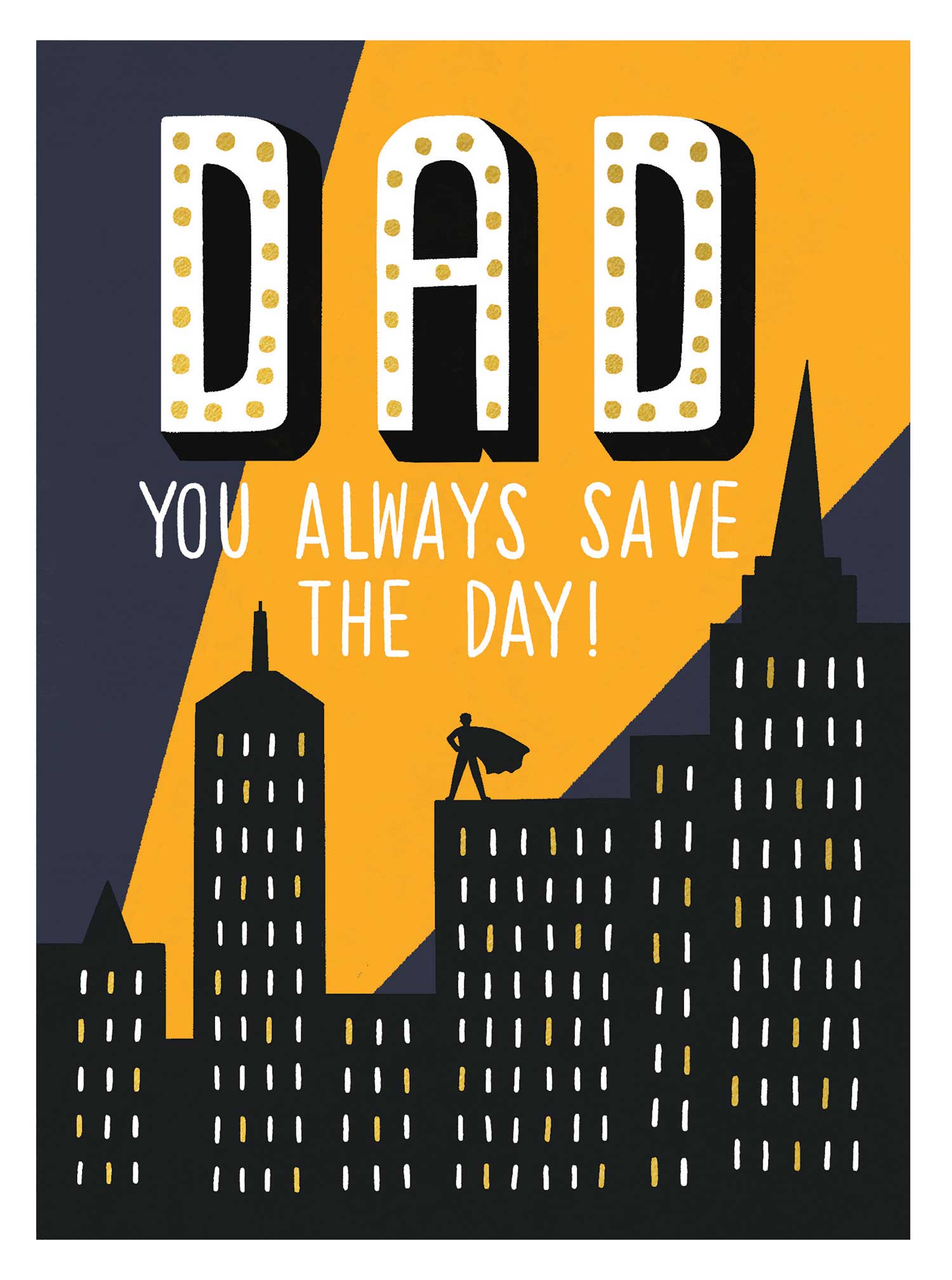
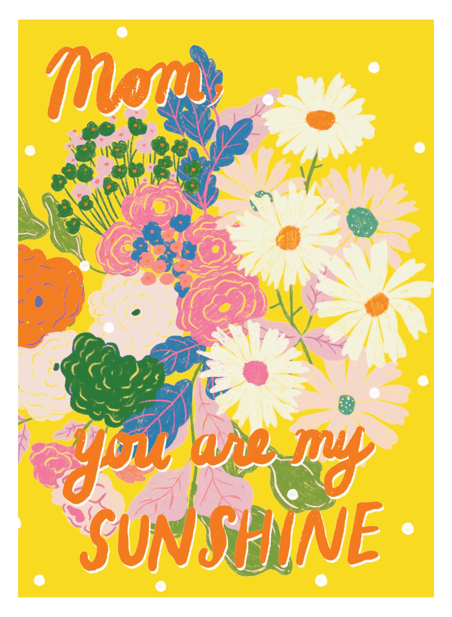
This community-driven expo turned 5 this year, and its third in-person edition came alive in San Francisco April 27-28, co-located with SF NOW in the vibrant Fort Mason Center for Arts & Culture. *Noted was completely sold out, so those who missed out, missed out on experiencing North America’s single largest gathering of greeting card publishers in real life and real time. Just witness, for example, these starry-eyed selections from Amy Zhang (above). Glimpse all the magic that was showcased with our jaunt through Pantone’s Spring/Summer 2023 New York Fashion Week Color Palette. We kick off with the very vivid Viva Magenta!
Click each subhead for an array of products.
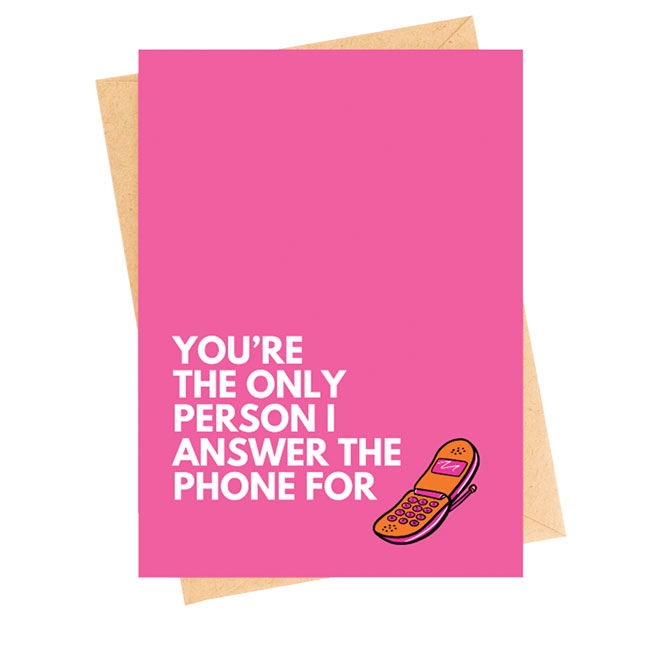
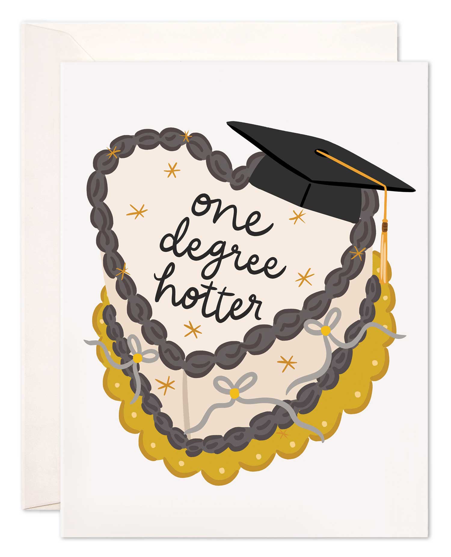
VIVA MAGENTA
Pantone describes this animated red as an unconventional shade for unconventional times. In the able hands of our maker community, Viva Magenta powerfully evokes various moods and messages.
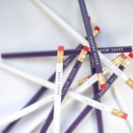
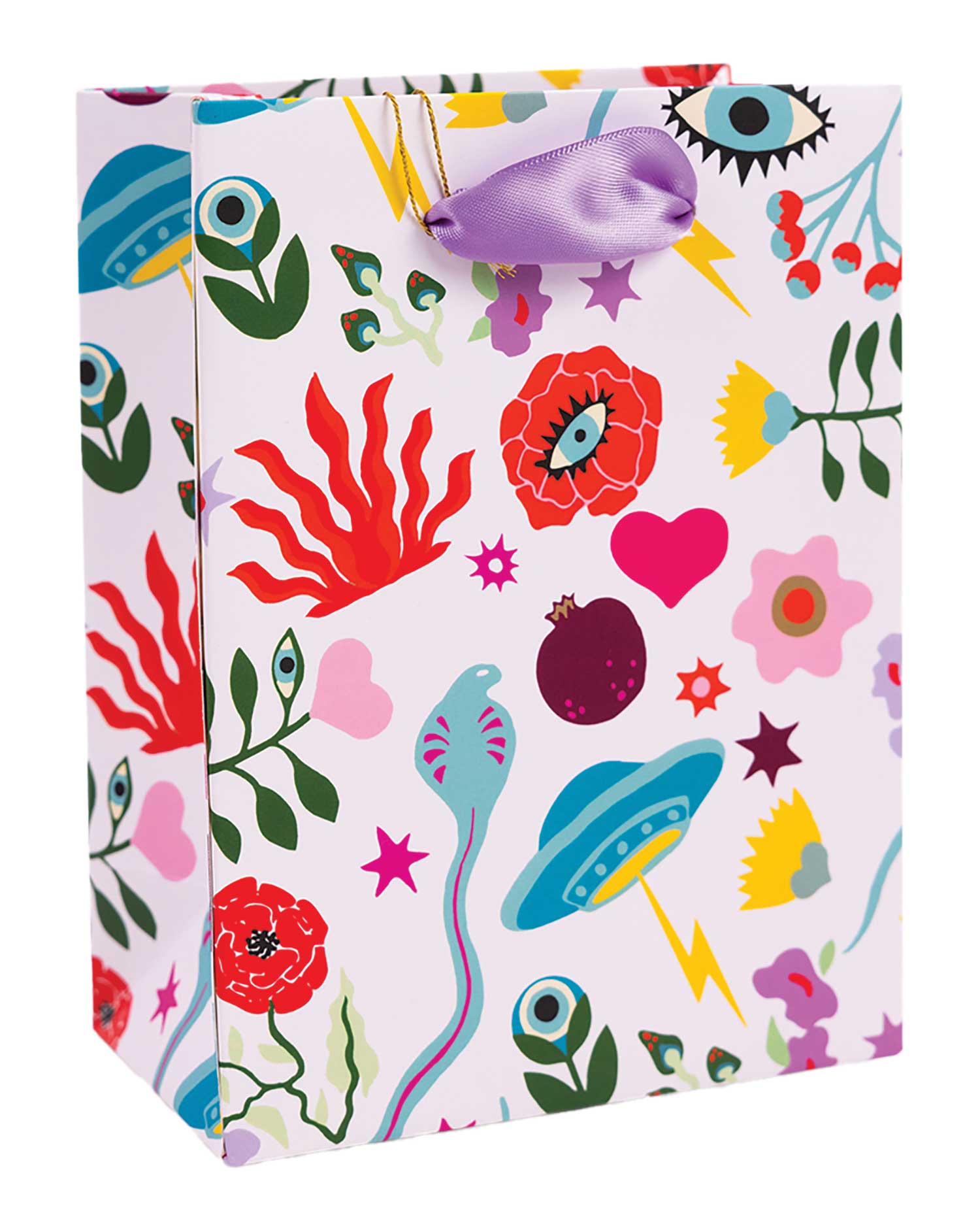
BEETROOT PURPLE
Whether this dramatic fuchsia is used as an accent or the main attraction, it’s very hard to not take a second glance!
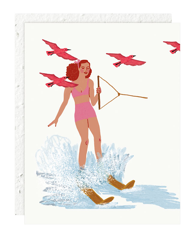
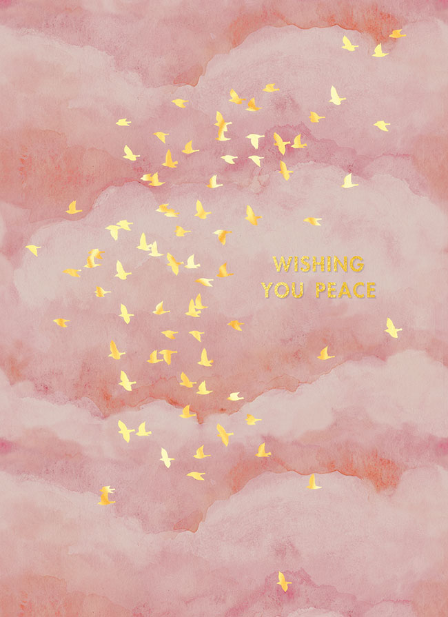
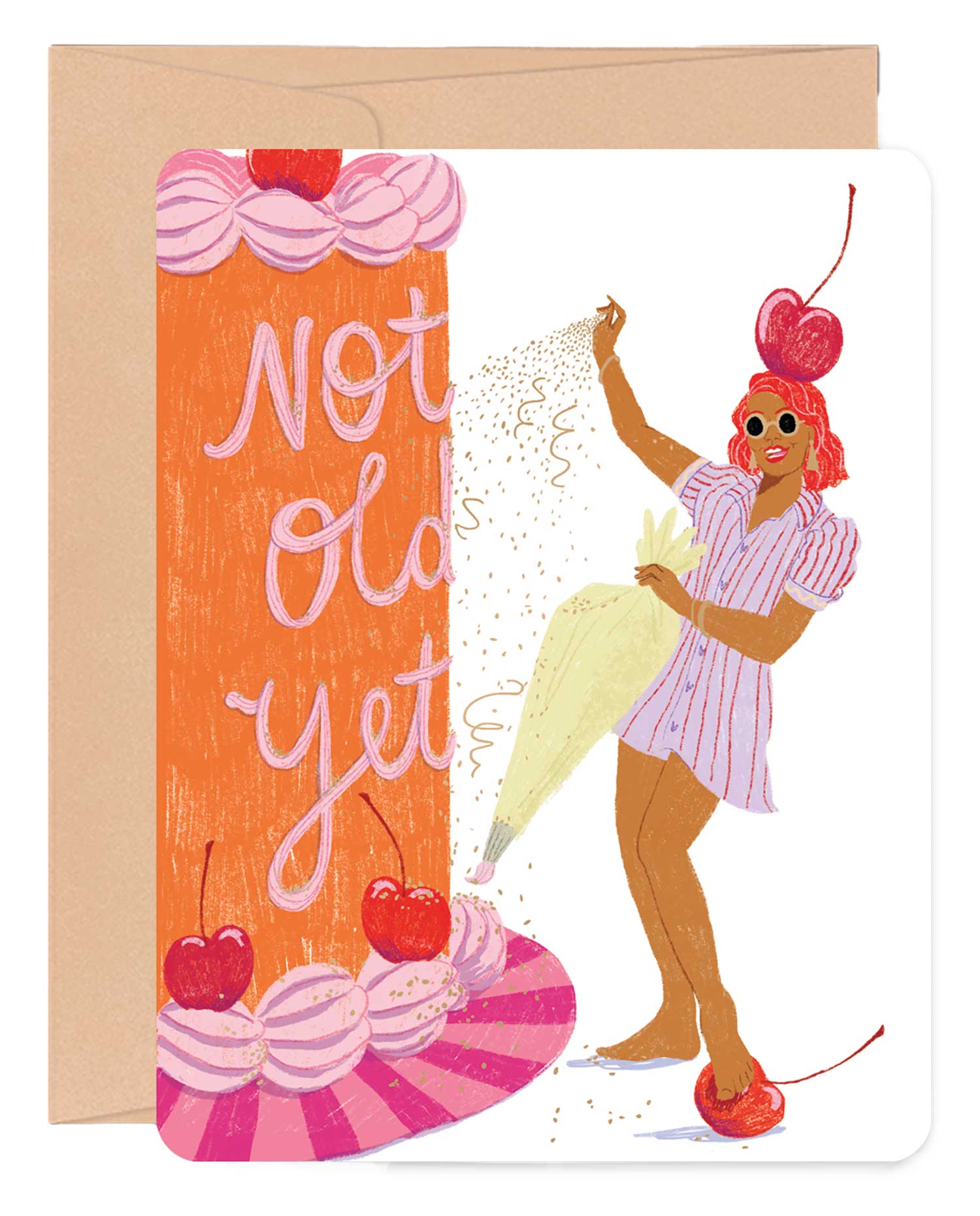
PEACH PINK
Just like the sweet taste of the popular fruit for which it is named, this tone adds a fresh and even slightly unexpected flavor to stationery.
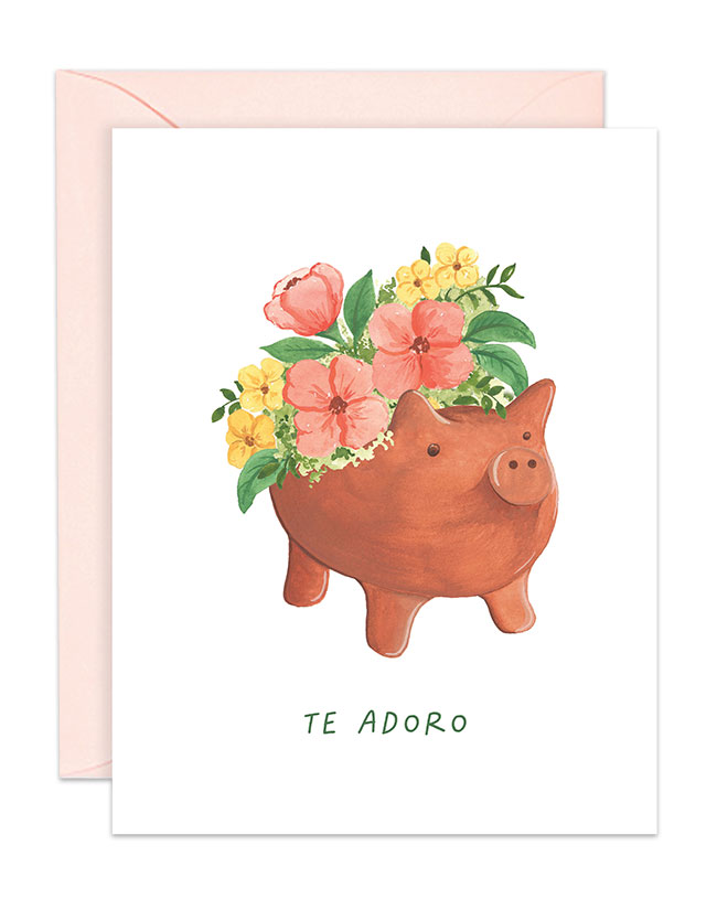
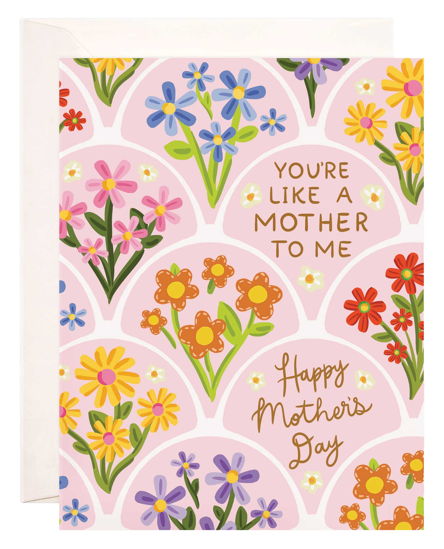
CRYSTAL ROSE
This clear, romantic shade picks up where Millennial Pink left off for an effect that feels completely of this decade.

0 CommentsComment on Facebook