Designer Profiles Features
April 14, 2010 •
Jonathan Adler
Who can’t use some ‘Happy Chic’ in their life?
There are good designers, and then there are clever designers whose output tends to reflect what people crave before they even realize they crave it. Jonathan Adler seems to fall in this category time and time again — and his career has accordingly thrived. Officially starting as a potter with an order from Barney’s in 1994, he expanded into furniture and interior design eight years later and hasn’t looked back.
Producing everything from rugs and pillows to wall decor and lighting, Adler operates seven stores nationwide, wholesales to more than 1,000 worldwide and maintains a personality-driven Web site featuring his Musings, plus a Manifesto. He also has established himself as a preeminent interior designer for both luxury residences and large-scale commercial projects — and viewers of Bravo reality show “Top Design” recognize him as a judge along with interior designer Kelly Wearstler and Elle Decor editor-in-chief Margaret Russell and host Todd Oldham.
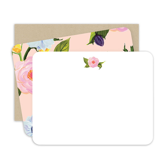
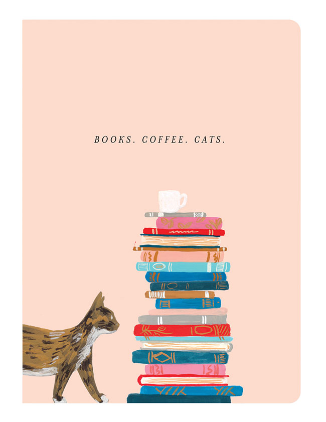
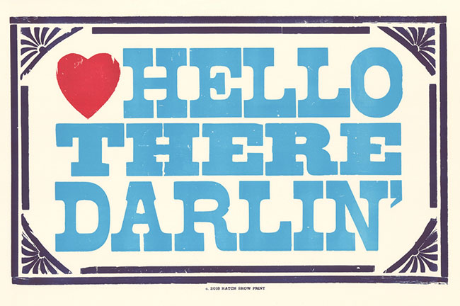
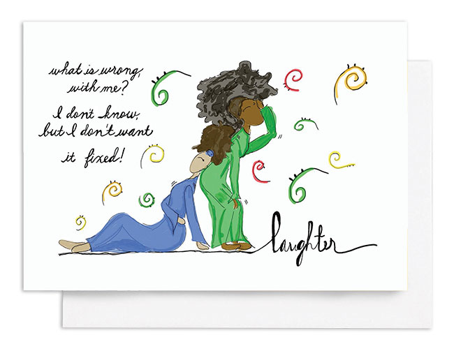
Adler also is unveiling an extensive stationery line with Lifeguard Press. Extending his signature Happy Chic philosophy, the line promises to be one of the more compelling releases of 2010. Stationery Trends interviewed Adler to learn more about his newest foray.
Putting it on Paper
ST: This is not your first stationery release, though we find it your most dazzling. Years ago you created a line for Mara-Mi, and you do private label for Barnes & Noble. What do you bring to this release that you’ve learned from earlier experiences?
JA: I think my stationery lines embody Happy Chic in that (they are) unimpeachably chic and yet (have) an element of levity and exuberance. I think it really comes together in this stationery line. I love how it has such bold bright colors that make you feel happy and look groovy.
ST: One of your commandments for a happy chic home is, “Thou shall mix fancy with frisky. Thou shalt not be overly formal, for if thou art, thou will be sad. Conversely, thou shalt not be overly whimsical, for if thou art thou will not feel chic. Therefore, embrace a mix, pairing the chic classical foundation — excellent proportions, classic furniture — with a layer of playful punctuation.” How did you express this philosophy in a different medium?
JA: I am in love with stationery as a medium because you can have so much fun with it, and the graphics can be so over the top. What’s really nice about (my Lifeguard collection) is that (it has) incredible, bold, bright, poppy graphics but this feeling of quality, and it’s that marriage that really works. To be playful with graphics you need to have the craft part of it at the highest level, and that’s what Lifeguard brings.
ST: Your unabashed love for color and pattern — what you call maximalism — comes through loud and clear in this release. In the wrong hands, such an approach can cross the gaudy line. How do you avoid it?
JA: The way to avoid it is by making sure that there is a level of craftsmanship that enables one to have fun. If the stuff was cheesily rendered I wouldn’t be able to be bold, but because it’s so well-crafted you can be over the top.
ST: When you are having fun with graphics, humor and color, how do you know when to stop yourself?
JA: That’s actually a great question. There is usually an element of restraint, whether it be a bold color in a restrained palate or a repeated graphic …. I just know when to stop. There’s usually a rigid geometry to what I do that provides a solid foundation.
ST:You’ve created Barbie-inspired accessories from needlepoint pillows to canisters for glitter, and even an actual-size Malibu Dream House. Can you describe the stationery you’d design for her?
JA: Working with Barbie has been a blast. It’s been a chance for me to get in touch with my inner Ken. I think the great thing about Barbie is that she allows all women and girls to get in touch with their inner kitten. If I did Barbie stationery I would crank up the glamour and the pink and the kittenishness.
ST: Do you see this line as more of an extension of your current home lines, or is it meant to stand on its own in a stationery retail environment?
JA: I see my whole work as being interconnected. There’s graphics and geometry that repeats itself. I just want to make stuff that all looks great together. I hope the bold colors and bright graphics speak for themselves, and they’ll catch people’s attention.
Design Details
ST: Part of what makes your output so distinctive is a palpable current of humor running through your creations, which was not really present in your early pottery. What made you decide to incorporate humor?
JA: That is such a great question. I did start out as a very organic modernist and funnily enough, that stream in my work still continues. I do lots of stuff that’s in that organic modernist vein, but I also have a part of me that’s kind of schizophrenic in a good way. I think my personality is more playful and verbally driven, and I wanted to not hold back in my work. I think there should be an element of levity in home design.
I started out as a production potter. I made every piece myself, and that really impeded my ability to design all the stuff I wanted to design because I was more of a factory worker. But when I got out from behind the wheel and had all that time, I channeled the same energy that I channeled into production into design. I’m lucky to be very, very prolific, and part of being prolific means having a broad range of product.
ST: How do you differentiate a good designer from one who is merely average?
JA: I like all your questions! I think when someone is a good designer you can just tell that there is something urgent that they need to say. The object communicates something very, very strong, and I think that that’s the key to good design: You can feel the passion. It’s an ineffable thing, but you know it when you see it.
ST: What advice would you give stationery designers looking to branch into home categories?
JA: Probably that they shouldn’t, only because the stakes in stationery are lower. Usually minimums are high but the cost of production is so low. Stationery’s a little less cumbersome (to produce), and it’s a little more consumable than typical home (product). There is a pace to stationery that you really don’t see in most of the home world so I think people would be ill-advised to branch out.
ST: When is the next season of “Top Design?”
JA: We are done. It’s so fine. Honestly for me it was so fun, and I think Gore Vidal said, “You should never turn down an opportunity to have sex or be on TV.” So in that sense it was a great experience. I had to do it, BUT it was wildly distracting. I had to move to Los Angeles for six weeks at a time and leave my husband and my dog, so I am glad I did it and we had a good run.
ST: Looking at your Web site, you are all about orange now, although you do profess a predilection for your “first love” baby blue. Can you give us a sneak peek at what your next favorite color will be?
JA: I think an unexpected color that wound its way back into my world in a big way is gray. (It’s) the new chocolate brown.
The Big Picture
ST: How do you manage to transmit your brand and personality in so many formats and retain continuity?
JA: The Happy Chic design philosophy can apply to any medium. The same basic tenets apply throughout media. I wanted never to be stuck in the typical ghetto that most potters start in, making the same thing over and over again forever, so in that sense I always knew I wanted to work in all different mediums. I think the same principles apply throughout.
ST: Are there any other upcoming product or projects you have in the works?
JA: There are so many I don’t know where to begin. For me it’s just always more, more, more.
ST: You are passionately involved in Aid to Artisans, through which craftspeople around the world work with designers and retail venues. You’ve worked with Peruvian weavers and a pottery workshop for the last decade. Have their traditions influenced your own designs?
JA: Absolutely, just 100 percent. Working with Peruvian weavers especially is eye opening because they have proprietary skills that are so inspiring. (They’ve) informed my design sense tremendously.
ST: Would you enter more such partnerships?
JA: When the right thing comes along, sure. It really depends on the medium.
ST: How do you foresee your Lifeguard line evolving — into new categories, or just reinterpreting current products?
JA: I think this is just the beginning. There’s lots more to come. It’s the first season taste. I think next season we will add tons and tons of stuff.
ST: What tend to be your biggest inspirations?
JA: I draw inspiration from travel, design, life … everything. I am sort of Catholic in my tastes and inspired by really random things, from a frock I might see a woman wearing on the street to skateboard graphics to the color of the sea in Capri.


