Trends
January 22, 2017 •
The Color Wheel: Mustard
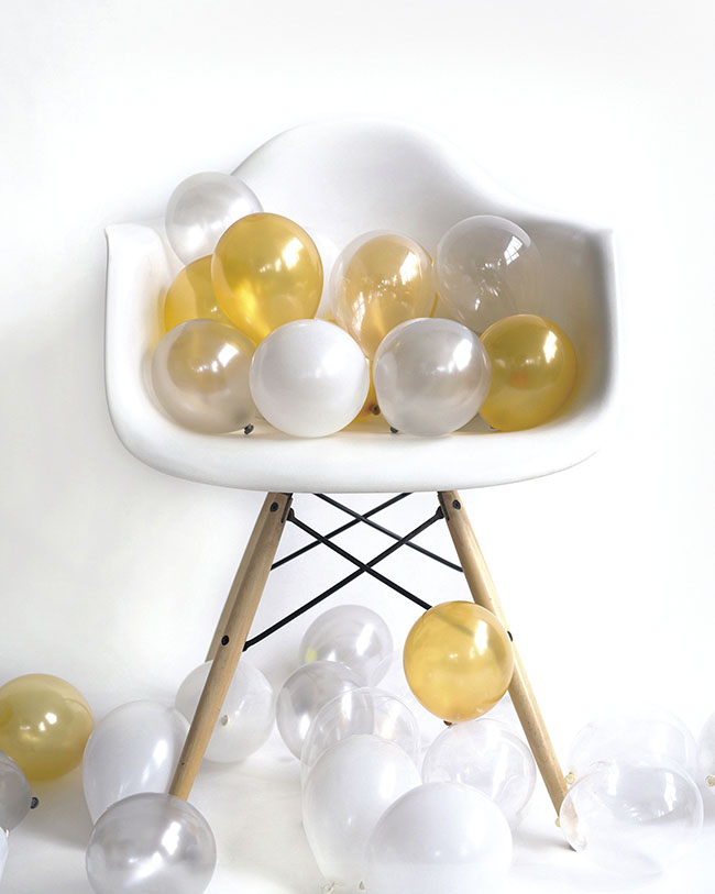
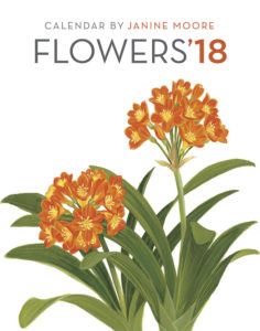
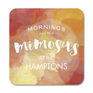
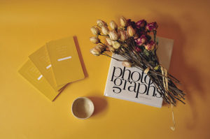
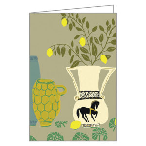
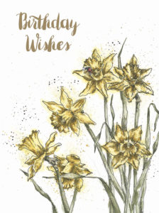
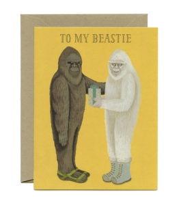
The rise of mustard in late 2016 and throughout 2017 makes a lot of sense, explained Mark Woodman of mark woodman design & color and past president of the Color Marketing Group. “It connotes maize, saffron, and, certainly, gold, so it can be luxurious, healthy and precious. This color was seen as a ‘staff of life’ in Latin America, with its relationship to maize, used in so much cuisine. It is valid around the world and represents so much to different cultures.”
Describing it as a “truly international color,” mustard, which Woodman has dubbed maize in homage to its worldly roots, becomes “more ‘local’” through effects like metallics, sheen levels and textures. “It becomes lush in matte or textured finishes — think flocking! — extravagant in a metallic finish, though in that finish, it should be a mix of matte and polished. As a matter of fact, the color, in and of itself, when shown in two finishes, gives it a modern edge.”
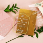
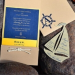
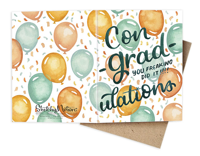
He recommends bringing mustard to life in a timely monochromatic treatment, for example with the outside of an envelope matte and the inside gloss. Or mustard can be on an invitation backer in a pretty matte pattern, and embossed in metallic type on front.
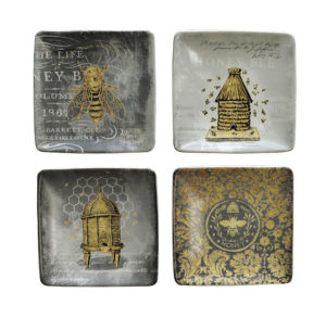
Woodman noted that in stationery treatments, mustard feels especially of the moment when paired with black — following an establishing trend in home fashion — as well as navy, plum and charcoal gray with white. “When coordinated with pink and petrol (think of an oily teal), it has a ‘mid-century for the new century’ vibe,” he observed.
As to how long this color will endure, expect to see it throughout 2017, he finished. “It’s actually a cool summer color as well, though it may get a little more toned, not as vibrant.” — SS
