

Features
December 20, 2023 •
10 Makers to Watch in 2024
Stationery Trends presents its 10 Makers to Watch in 2024.
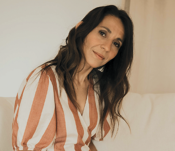
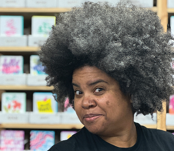
CHRISTY ASPER
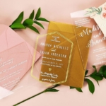
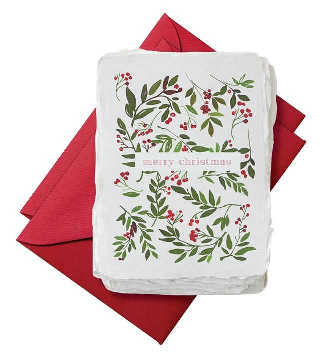
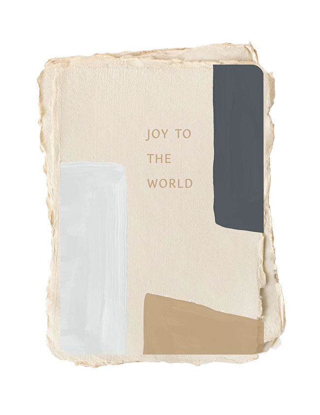
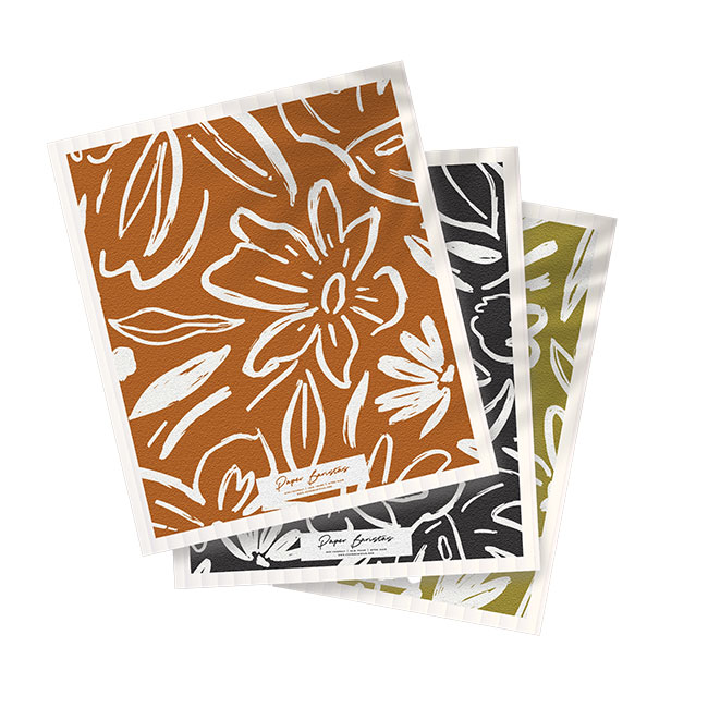
Paper Baristas @paperbaristas
This Fair Trade range does more than put handmade, upcycled creations into the world — it creates sustainable livelihoods for victims of sex trafficking.
Aesthetic of the Line? Eco-friendly. Fair trade. Gives back. Paper goods brewed to do good.
Current Bestseller? Christmas box sets. They fly off the shelves every year because people want our cards to be received as gifts to distant relatives and friends.
Personal Favorite? Our holiday collection of greeting cards. It comes from a place of spending time with my littles and sharing that love with our broader audience.
Surprise Hit? Out of the gate, our Swedish dishcloths flew off shelves when they first hit the sales channel. Because we are a stationery company, I was shocked how much paper and home goods speak to our target audience. It should not be a surprise that the same people that love upcycled paper love the idea of Swedish dishcloths that help eliminate the use of paper towels.
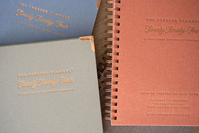
Iconic Selection? Aside from our greeting card paper that stands out, our Fair Trade Planners have created unbreakable loyalty in our customers. Everything about our planners are unique, from the FSC cloth binding to the copper and coffee details infused in them. They sell out every year, and our customers start pre-ordering them in May for January of the next year. Creating a fair trade planner is challenging because the margins are not there, so we are thankful for customers that not only appreciate their beauty, but also the importance of fair trade.
![]() Favorite Color? It’s hard to pick one! I love greens, browns, blues, oranges. Basically anything earthy.
Favorite Color? It’s hard to pick one! I love greens, browns, blues, oranges. Basically anything earthy.
Current Design Obsession? My team and I are increasingly paying attention to environmental issues and causes. As our concern about the Earth grows, our appreciation for natural patterns and textures grows as well. I have become obsessed with showing our commitment to the environment through creative and original content in our designs. Ultimately, nature-inspired visuals and Earth-friendly materials with texture resonate with my desire to connect back to the Earth.
Favorite Flower? Antirrhinums. I know, odd answer. It’s a genus of plants commonly known as dog flowers or snapdragons because of their resemblance to the face of a dragon that opens and closes its mouth when squeezed. I used to pretend that they were miniature puppies in my grandmother’s garden. Every time I see one, I can’t help but remember a child with a wild imagination.
Favorite Indulgence? Coffee. I mean if our company name did not say it, I hope our products do. I love me some coffee.
LEEANN BRISSETT
Add Pink and Stir @addpinkandstir
This Florida house of letterpress is a definite outlier, but one perfectly poised to harness the big emotions of today’s card senders courtesy of its eye-grabbing looks.
Aesthetic of the Line? Large and loud. Design and lettering that is large enough to push past card boundaries. Rich and saturated colors and combinations that pack a punch. Overall, the goal is playful and kind messaging meant to help folks get loud, magnify the moment and leave an impression.
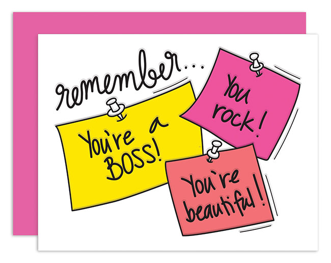
Current Bestseller? Sticky Affirmations. The message is relatable. Folks want to remind themselves and others of their “awesomeness.”
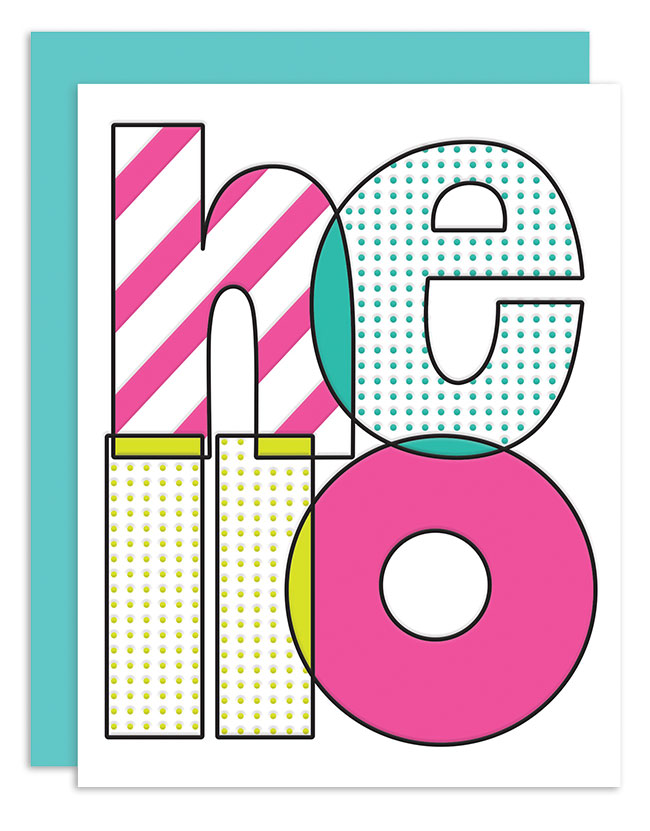
Personal Favorite? Hello Dots: It’s simple, it’s easy and it’s widely applicable. I love sending cards just because, and sending a simple hello is as “just because” as it gets for me.
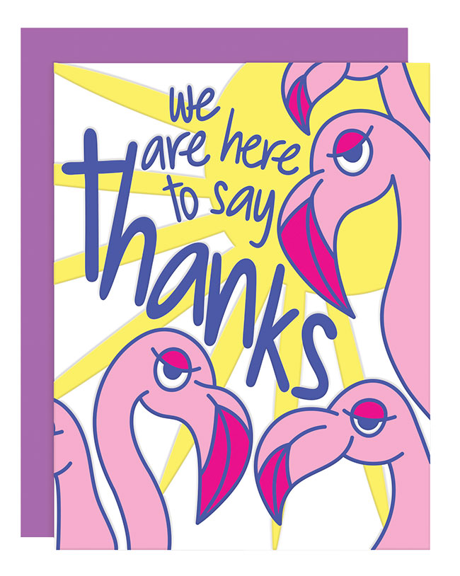
Surprise Hit? Thank You Flamingos. I love this card, but for a while, I thought I was the only one because no one was buying it. Recently, and now surprisingly, folks have been loving it.
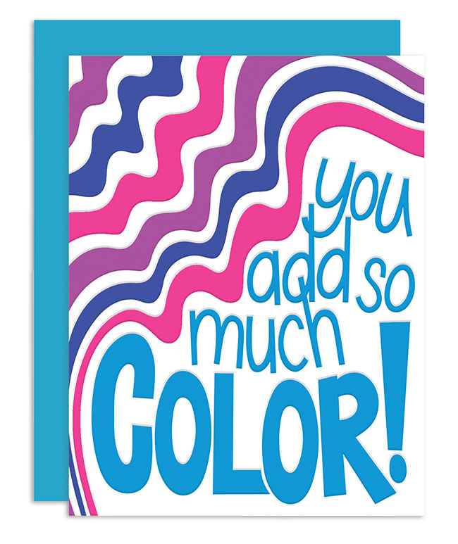
 Iconic Selection? You Add Color. This looks, says and does everything I want Add Pink and Stir to say and do. This reflects the impact I want to make in the way I want to make it.
Favorite Color? It should be pink, right? It’s actually purple for the next six months.
Current Design Obsession? Wildflower Watercolors. They look so delicate, soft, the total opposite of the things in my brain. Sometimes I need them to slow me down and quiet the noise.
Favorite Flower? Tulips. I’ve always loved the way tulips look, from buds to petals falling. If you’re thinking of sending me flowers, I’ll always be happy with tulips.
Favorite Indulgence? Sneakers. I have too many yet not enough. I wear a lot of black so a colorful pair is how I accessorize.
MICHELE BYRNE
paper&stuff @paperandstuff_co
This clean, colorful range pares down the past to create purely 21st-century communications — and Michele has also singlehandedly redefined Louie branding for a new generation of card lovers.

Aesthetic of the Line? Modern, minimalist and slightly retro. It is inspired by typography and takes cues from the bold posters found in our graphic design history books. Our designs showcase vibrant and striking colors, evoking a sense of happiness. The subtle contrast of the off-white envelope adds a gentle touch.
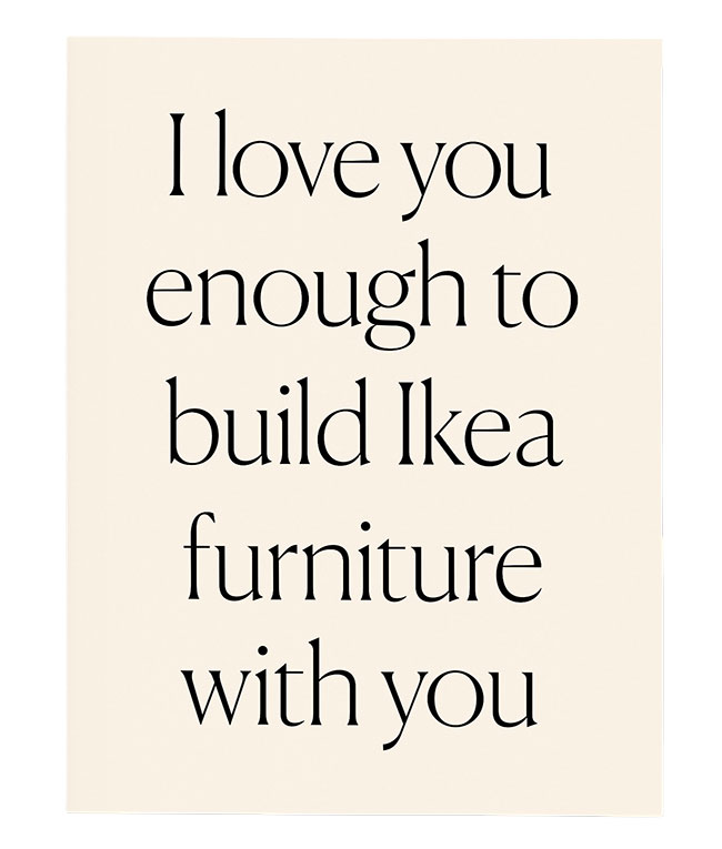
Current Bestseller? The Build Ikea Furniture card hilariously captures the shared struggle and triumph of assembling Ikea furniture. It’s a humorous testament to your ability to conquer any challenge together, one Allen wrench at a time!
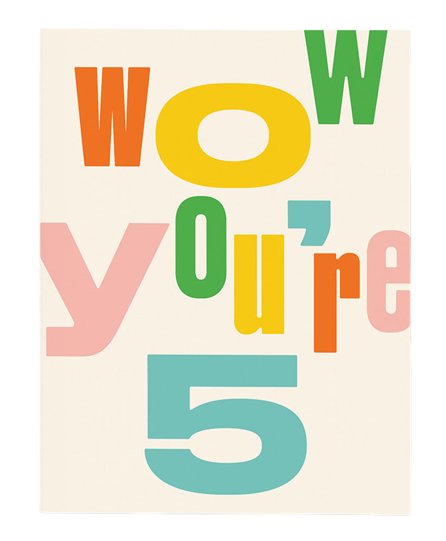
Personal Favorite? The Wow You’re 5 greeting card for its playful colors and typography, but also because it reminds me of a funny memory with my husband. He initially misunderstood the card and thought it was sarcastically teasing someone for acting like a 5-year-old. We both laughed when we realized the mix-up, and now this card brings back that playful moment with my husband.
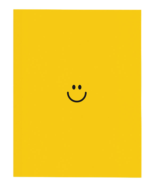
Surprise Hit? The Happy Face card was a delightful surprise! Initially, I had doubts about whether its simplicity and minimal design would resonate. However, this card turned out to be a huge hit, probably because it works for so many occasions.
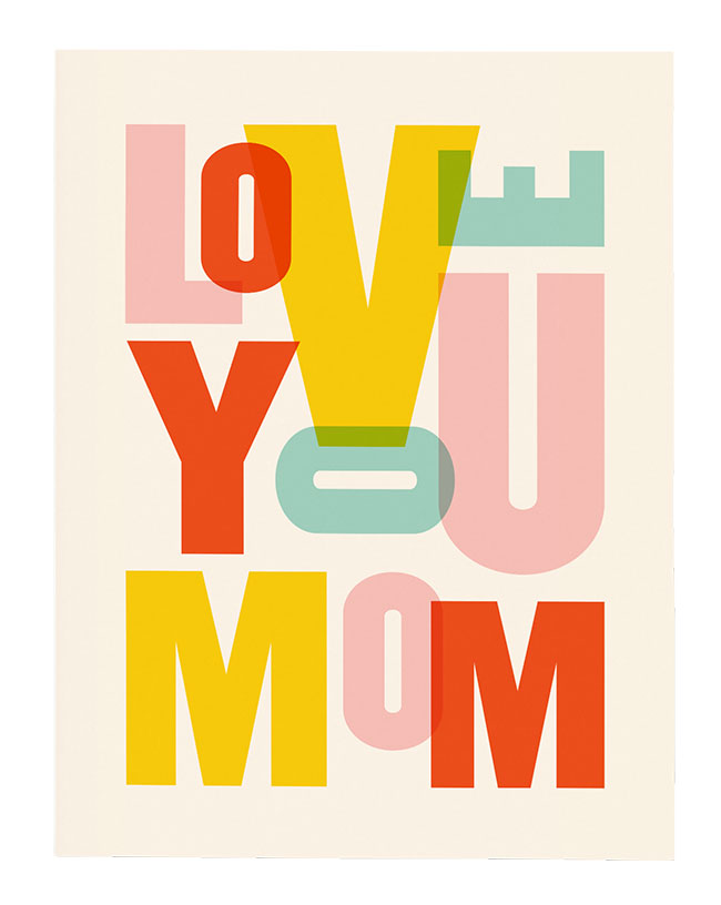
![]() Iconic Selection? The Love You Mom and Love You Dad cards represent significant milestones for me. Although I sometimes feel uncertain when introducing new designs (as it can be quite intimidating!), these instill a sense of self-confidence in my work. Both were nominated for Louies, but the Love You Dad version ultimately won me my first Louie award, which was an incredible experience.
Iconic Selection? The Love You Mom and Love You Dad cards represent significant milestones for me. Although I sometimes feel uncertain when introducing new designs (as it can be quite intimidating!), these instill a sense of self-confidence in my work. Both were nominated for Louies, but the Love You Dad version ultimately won me my first Louie award, which was an incredible experience.
Favorite Color? Can I say six colors? One of the ways I like to keep my designs cohesive is by using the same colors throughout. Although this approach may seem a bit restrictive at times, it actually helps me stay true to my minimalist style. Plus, it adds a fun element of challenge and often leads to unexpected and exciting results when I play around with unconventional colors.
Current Design Obsession? Creating designs that adhere to a strong grid system, emphasizing symmetry and clean lines. Neatness and tidiness have always been fundamental elements; I also have a passion for experimenting with different styles of bold typography. Whether it’s straightforward or more organic, when typography takes the spotlight, it’s a victory for me.
Favorite Flower? Magnolia, for the lovely contrast between the creamy white petals and dark green leaves.
Favorite Indulgence? Brownies, iced lattes and boutique hotels.
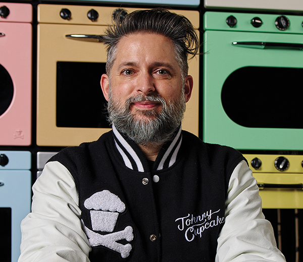
JOHNNY EARLE
Johnny Cupcakes @johnnycupcakes
This headline-grabbing Boston “baker” redefined and reinvigorated T-shirts; more recently he has cooked up a tasty range of cutting-edge cards.
Aesthetic of the Line? Food-themed brand with nods to pop culture. Based in Boston on 332 Newbury Street with a T-shirt and stationery store that looks and
smells like a bakery! Limited edition T-shirts displayed in fridges and stationery packaged in lunchboxes and pulled out of a secret smoking oven! Celebrating 22 years of business!
Current Bestseller? Sprinkles Joint.
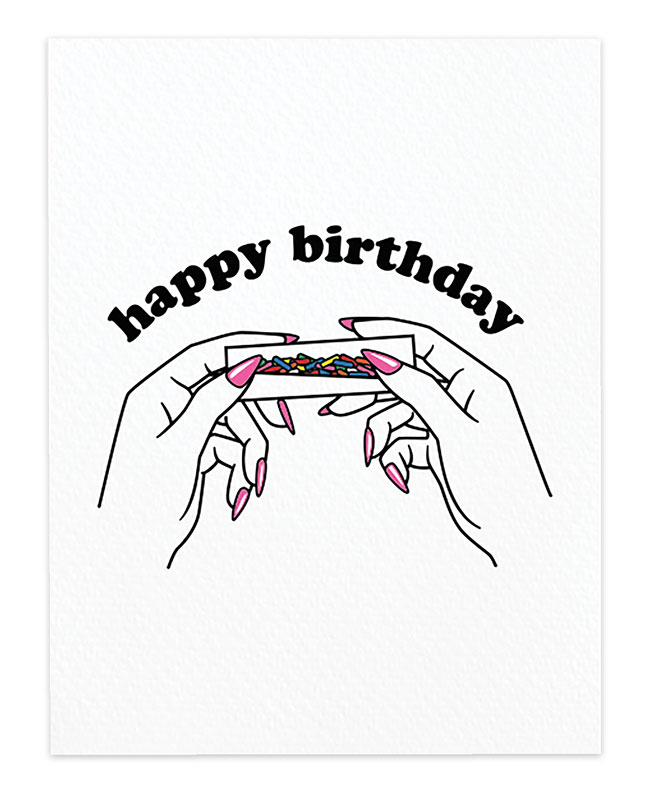
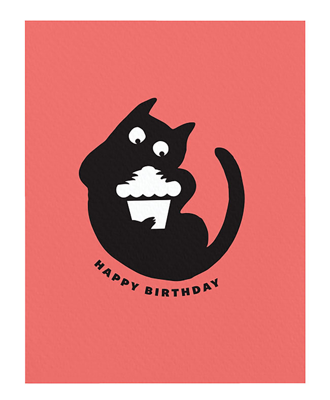
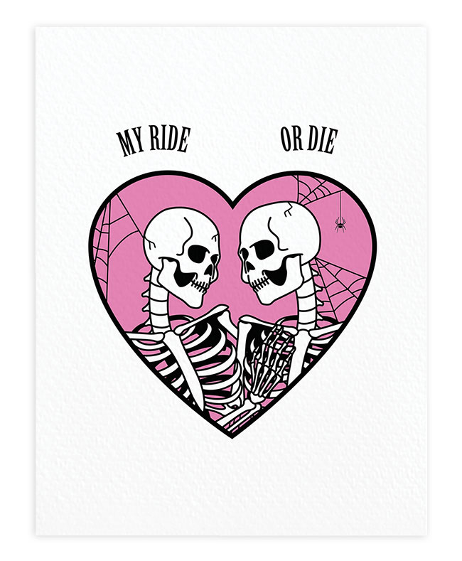
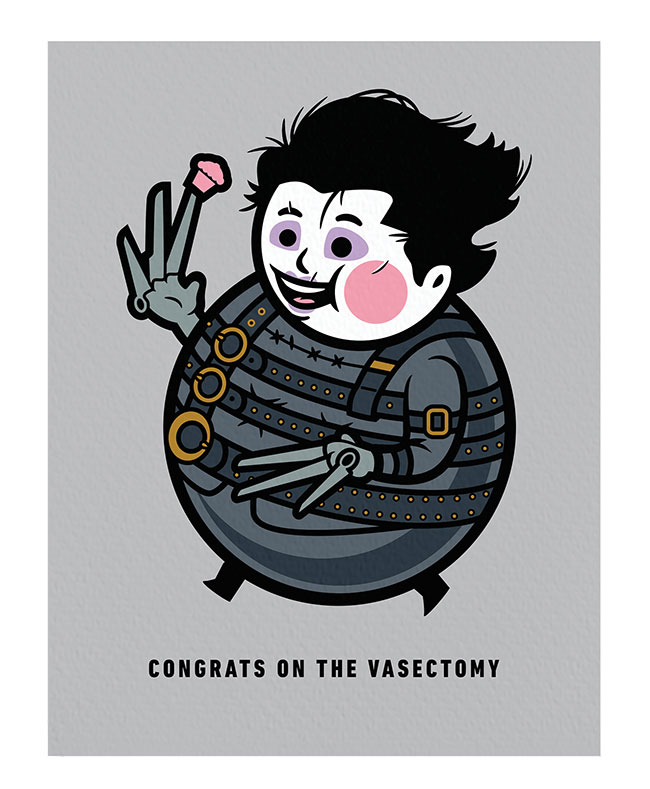
Personal Favorite? Meowcakes. Surprise Hit? My Ride or Die. Iconic Selection? Congrats on the Vasectomy.
![]() Favorite Color? Bright Mint Green PMS 333 C.
Favorite Color? Bright Mint Green PMS 333 C.
Current Design Obsession? Matchbooks; vintage postage stamps, especially Santa ones; olive oil bottles; foreign “Back To The Future” paraphernalia; micro vans; jazz 45s; mid-century breakfast cereal mascots.
Favorite Flower? Baking flour 😉
Favorite Indulgence? Jeni’s Brambleberry Ice Cream, popcorn with nutritional yeast and olive oil, double-stuffed Oreos, cacio e pepe, English muffin with butter and raspberry jam with the seeds, and my partner’s sourdough bread!
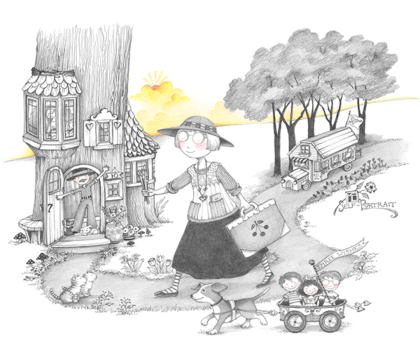
MARY ENGELBREIT
Mary Engelbreit @maryengelbreit
The talent and vision of this licensing powerhouse snowballs again and again — a true gift to not just the stationery space, but the entire human race!
 Aesthetic of the Line? The new collection with Designer Greetings is rendered primarily in black and white and showcases my irreverent sense of humor. We also print our own postcards and greeting cards that show the more classic look I’ve been doing since forever, and we’re working on a brand-new line of die-cut cards.
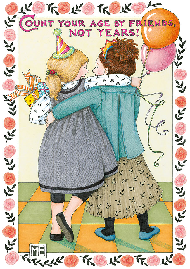
Current Bestseller? Count Your Age in individual cards, while the Christmas Cottage postcard collection is the bestseller over the past 12 months.
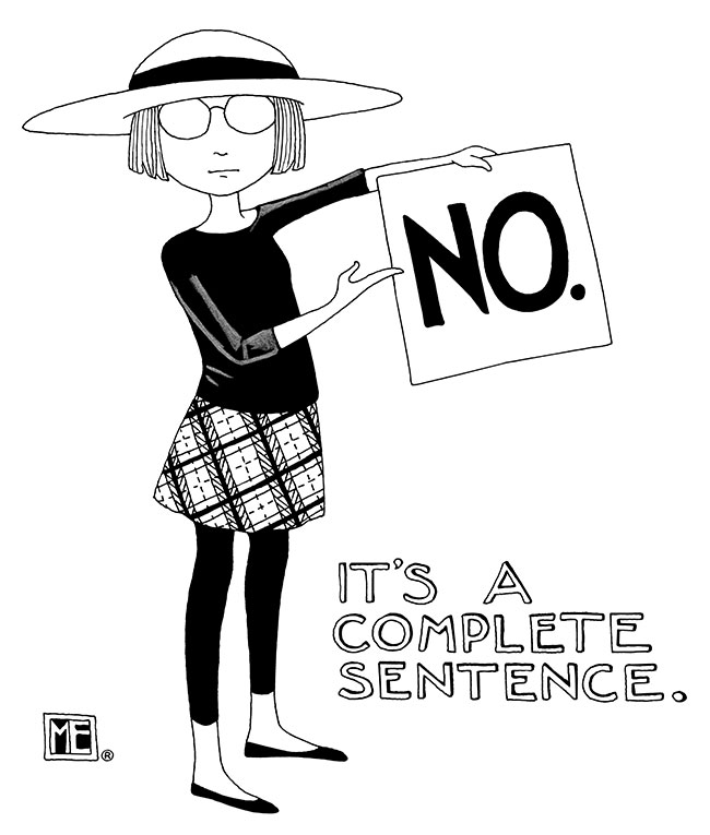
Personal Favorite? No. It’s A Complete Sentence. Such a handy line for so many situations …
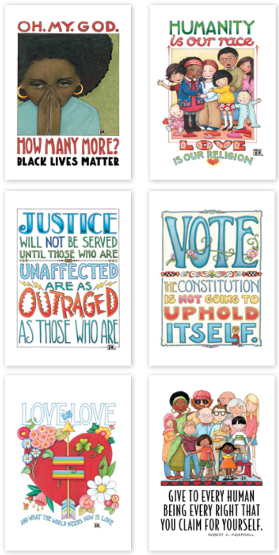
Surprise Hit? My Social Justice postcard collection, much to our surprise. We weren’t sure how they’d go over, but thankfully, people are really involved in current events and not only like to send them, but also keep them.
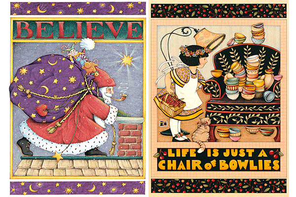
![]() Iconic Selection? Probably Life Is Just A Chair Of Bowlies and Believe. They remain big sellers after all these years.
Iconic Selection? Probably Life Is Just A Chair Of Bowlies and Believe. They remain big sellers after all these years.
Favorite Color? Red, with black a close second.
Current Design Obsession? I love the art produced in the 1920s — never get tired of it. Lately, I’m also loving graphic art from the ‘60s and ‘70s, like Peter Max and Milton Glaser.
Favorite Flower? The California Poppy.
Favorite Indulgence? A box of six glazed Krispy Kreme donuts, a big glass of milk and nobody else at home.
YOOJIN KIM
Up With Paper Luxe @uwpluxe
The ingenious card creations that spring from this art director’s deft imagination effortlessly embody beauty and wonder, each a testament to the infinite possibilities of paper engineering.
Aesthetic of the Line? Beautiful paper magic! Interactive, tactile, surprising, humor; all of the above good things in an envelope. We collaborate with makers from around the world to create a curated paper goods collection.
Current Bestseller? Flutter pop-up card illustrated by Riley Samels. We pulled inspiration from vintage curio cabinets and displays.
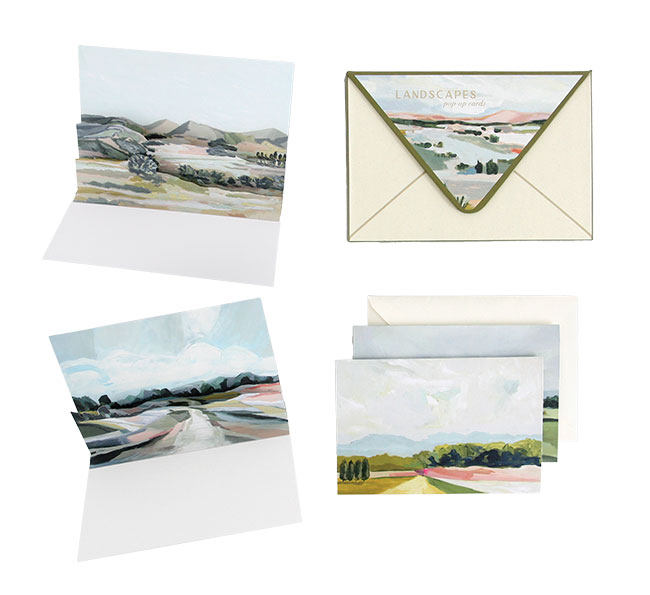
Personal Favorite? Landscapes Boxed Notes. Through the popped- up layers within this set, we captured the depth of the scenes found within the serene oil paintings of Laci Fowler. I love the way they came out.
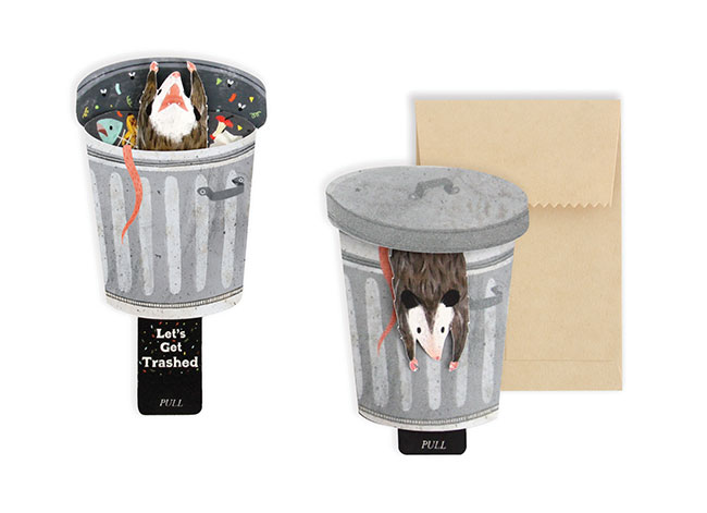
Surprise Hit? Trash, illustrated by Riley Samels! This is the most chaotic card we’ve made, and I love that our possum resonates so much for so many!
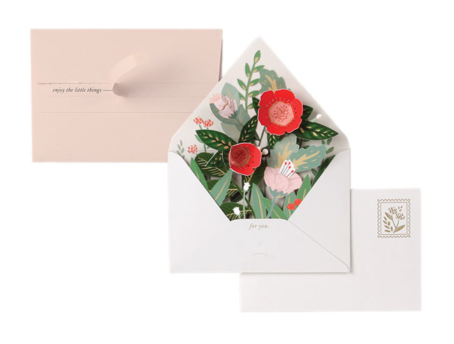
![]() Iconic Selection? Our Floral Envelope won the Card of the Year Louie Award in 2019, and is still going strong. Due to its success, we’ve translated its format into multiple card lines and occasions.
Iconic Selection? Our Floral Envelope won the Card of the Year Louie Award in 2019, and is still going strong. Due to its success, we’ve translated its format into multiple card lines and occasions.
Favorite Color? I go through phases, but right now I’m into deep navy blue and chartreuse as well as pink and green pairings.
Current Design Obsession? Maximalism, that is, integrating layers of texture and patterns in a tasteful, digestible way.
Favorite Flower? I’m personally more of a plant person. My favorite plant is monstera (bonus points if variegated). It’s bold and stunning!
Favorite Indulgence? True crime podcasts and collecting vintage brass trinkets and cool scissors!
EMMA LEWIS
The Twentieth @rareformchicago
This ultra-distinctive wholesale stationery brand is also a Chicago retail space, Rare Form Chicago, both the brainchild of this trained art historian with both a Ph.D. and mad card- writing skills!
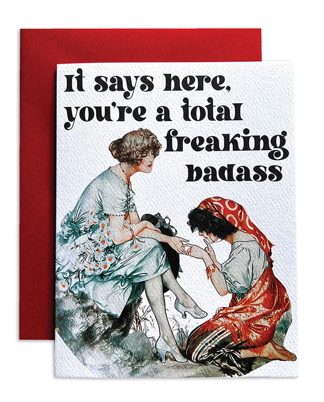
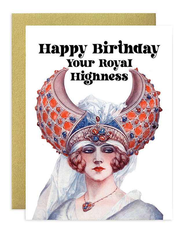
Aesthetic of the Line? I call it historical maximalism or Art Deco designed with love and a grain of salt. I take the dynamic designs of the Art Deco and Art
Nouveau periods and enhance them with bright colors, patterns and more than a little 21st- century sarcasm.
Current Bestseller? Fortune Teller. At trade shows I do a life-size version and people take selfies with it, or ask to take a picture to send it to their friends, to which I say, “That’s why it is my best- selling greeting card!”
Personal Favorite? My first love was my “snack” card, now probably my newer birthday card fast becoming a bestseller, Royal Highness.
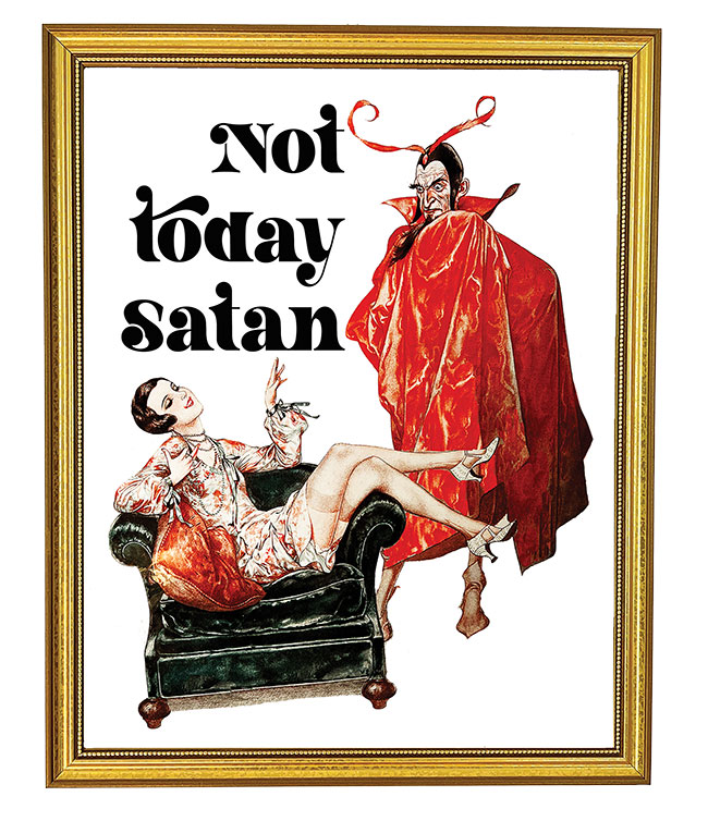
Surprise Hit? Not Today Satan art print. I didn’t think anything could top the 420 Somewhere or Find Out art prints, but it stops people in their tracks. Art prints are my bread and butter in my retail business.
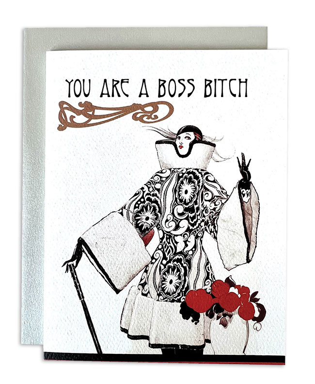
 Iconic Selection? The Boss Bitch card was one of the first cards I designed and continues to be a bestseller. She’s so popular I put her on a sticker, a candle, and used her for the Find Out art print as well. The stickers are my trade show giveaway, so I’ve had hundreds of people tell me they have them on their laptops and water bottles.
Favorite Color? It has always been turquoise, but for my brand it evolved into a peacock teal that matches the Art Deco and Art Nouveau designs.
Current Design Obsession? The transgressive illustration styles of turn-of-the-century queer artists working in “low brow” art forms, often in the shadow of the respected avant-garde. As a former academic, I love when my lesser- known artists make fun of what is now the canon.
Favorite Flower? The imaginary, insect-like vines of Art Nouveau architecture by Hector Guimard.
Favorite Indulgence? An entire day of uninterrupted antiquing.
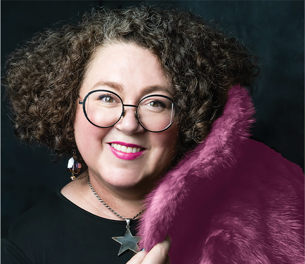
HILARY MEEHAN
Mirthos @mirthos_paper
Who would have guessed that this range filled with unexpected truths, presented in gorgeously imperfect lettering no less, could be so powerful … and captivating?
Aesthetic of the Line? Mirthos is jazz late at night too loud with wild abandon and the potential for skinny dipping. We are wild and weird and a little punk and really sincere that we love mail! Mirthos encourages dancing, not taking things too serious and really honing in on what it is that lights you up! Find your delicious golden core and share it with all of us. There’s no rule book; we’re all out here winging it — so let’s make this messy life as kind and lovely and fun and inspiring as we can! Mirthos Paper was created to free your heart into the universal ether where your soul breathes poetry back into your cells. Our current delivery system is lavish, eccentric and earnest stationery. Mirthos is like pathos, but on the happy side! Please use excessively!
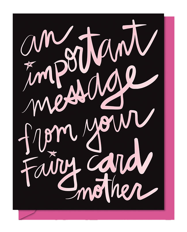
Current Bestseller? An Important Message From Your Fairy Card Mother. It always gets laughs and knowing nods. I love the juxtaposition of the serious start and fun finish.
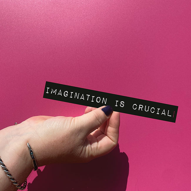
Personal Favorite? My mini-bumper sticker, Imagination is Crucial! I adore the size of these at 1-inch tall and 8-inches long, with a black with white font evoking the old label makers. This graces the back of my zippy hatchback but also works for laptops, bikes, binders and more. Share the message to keep art and creativity and imagination and thinking for yourself alive and well. It is crucial!
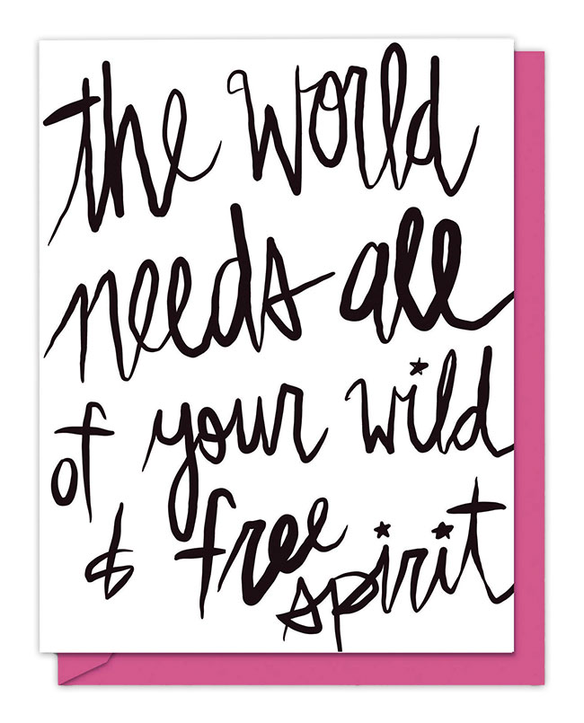
![]() Surprise Hit? The World Needs All of Your Wild & Free Spirit was a finalist for a Noted@*Noted award shortly after its 2022 release. It’s been a consistent runner-up in sales ever since. Its thermography gives it an elevated and tactile feel — along with its empowering and uplifting message, of course.
Surprise Hit? The World Needs All of Your Wild & Free Spirit was a finalist for a Noted@*Noted award shortly after its 2022 release. It’s been a consistent runner-up in sales ever since. Its thermography gives it an elevated and tactile feel — along with its empowering and uplifting message, of course.
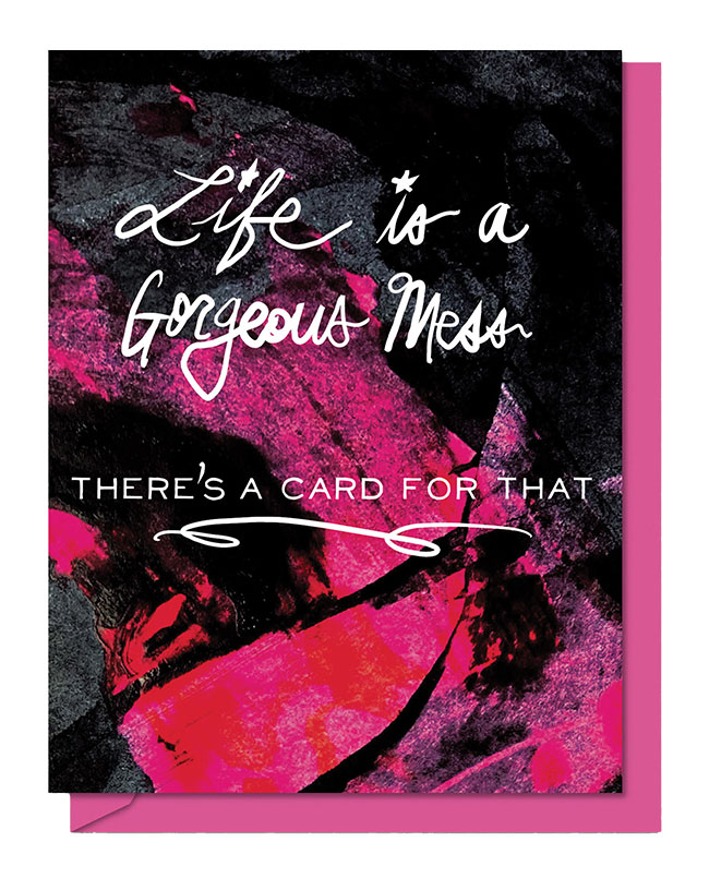
Iconic Selection? Life is a Gorgeous Mess/There’s a Card for That, hands down! I penned it for my NY NOW booth graphics last January because it really summed up my voice. A few months later I used it for *Noted marketing mailer … then it finally dawned on me that this needs to be a card! Sales have been robust since its release.
Favorite Color? Ham pink glitter.
Current Design Obsession? Libertine, Schiaparelli, wallpaper, patterned carpet, luxe absurd trinket trays, maximal edgy camp glam 4 EVER!
Favorite Flower? Peony! But mainly any flowers that I buy for myself (there’s a song for that, ha!). I tend to choose extravagant and obscure blossoms, including the amazing peony! Someone once tried to tell me, “Paris is so done, everyone goes there,” and I scoffed because it is Paris! It will always be a good idea! This same applies to anyone who apologizes for loving peonies. Embrace what you love! Celebrate it!
Favorite Indulgence? Wandering into a lavish hotel lobby in a world-class city to get my morning coffee in my PJs. Gin martini — stirred, not shaken — with vermouth, please. Pizza forever, preferably on the good china!
LAUREN MIELE
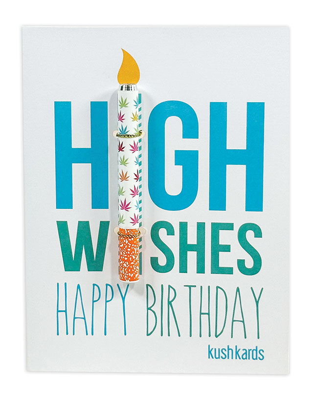
KushKards @kushkards
Burning a path not just through stationery but the cannabis industry as well, this design dynamo now tackles the sexual wellness arena with her offerings that provide “a gift with a lift.”

Aesthetic of the Line? Surprising, full of humor and packed with puns. My passion lies in creating designs that resonate with everyone.
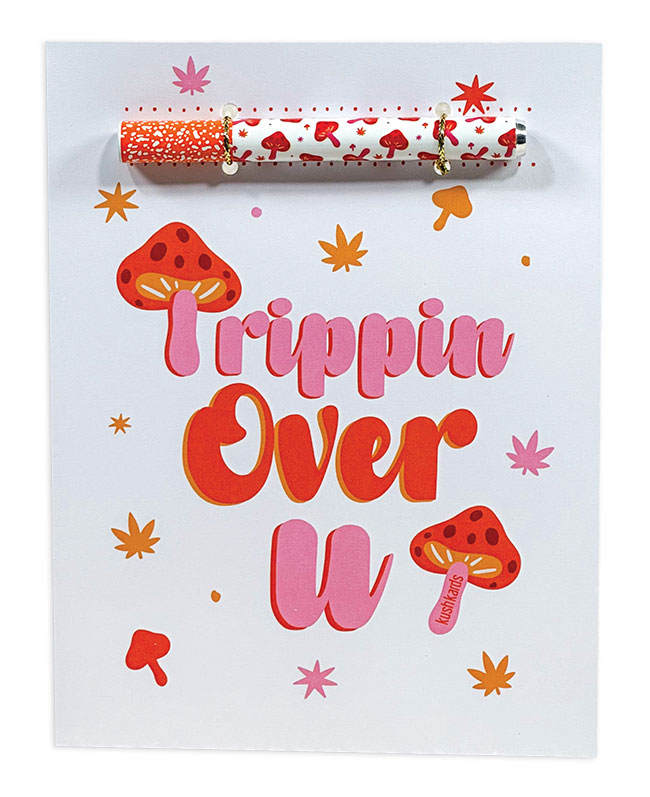
Current Bestseller? Trippin Over You one-hitter greeting card. The delightful pink, orange and white color combination, coupled with my love for mushrooms, forms the core of this design. Adding an extra layer of detail, the “T” in “Trippin” is a mushroom of a similar shape. These subtle design touches are always at the forefront of my mind during the creative process.
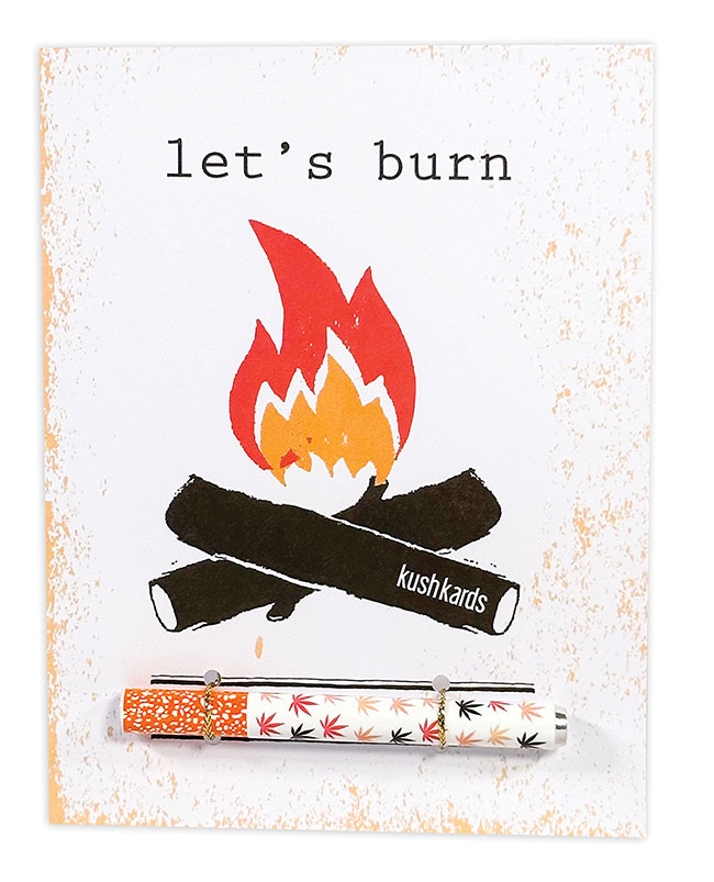
Personal Favorite? My Let’s Burn One one-hitter greeting card has a special place in my heart since it was among the initial five KushKards release. Living in the concrete jungle of New York City, I often pondered what life is like in Colorado. This was inspired by the idea that there’s nothing quite like getting high by the fire.
Surprise Hit? Polka Pot gift boxes. I decided to take a risk and design medium-sized gift boxes, drawing inspiration from my current assortment of Polka Pot gift tags. At first I made them using my Cricut machine to craft gift boxes, primarily for showcasing process videos on social media. Then a Netflix producer found me on Etsy and ended up featuring my gift boxes in the film “Senior Year.” This exciting opportunity motivated me to mass produce the boxes in larger quantities.
![]() Iconic Selection? High Wishes One Hitter Kard. This was the initial design that launched KushKards back in 2015. I came across a button labeled Big Wishes, and it dawned on me that, for our customers, we don’t just dream bigger: We aim higher! Its straightforward design and intentional placement perfectly align with the one hitter. It remains our best-selling item and makes me smile everytime I see it purchased!
Iconic Selection? High Wishes One Hitter Kard. This was the initial design that launched KushKards back in 2015. I came across a button labeled Big Wishes, and it dawned on me that, for our customers, we don’t just dream bigger: We aim higher! Its straightforward design and intentional placement perfectly align with the one hitter. It remains our best-selling item and makes me smile everytime I see it purchased!
Favorite Color? Shades of purple! Lavender has recently become a favorite, as it adds a gentle touch to any design and, in my eyes, exudes a positive, soothing vibe.
Current Design Obsession? Functionality and dual purpose. From the inception of my journey in innovating a unique type of greeting card, my company’s foundation has always been centered around the concept of attaching a gift to a greeting card, giving rise to our tagline: A Gift with a Lift. While I’ve honed the cannabis aspect, I’ve expanded this concept within my product line. My launch of NaughtyVibes Powered by Rock Candy Sex Toys introduced a greeting card that incorporates a Bullet Vibrator. In a time when sexual wellness is becoming increasingly mainstream, this card epitomizes the act of sending nothing but good vibes!
Favorite Flower? Anything green is my favorite.
Favorite Indulgence? Popcorn and a movie! If I’m not making cards and watching movies, I’m eating popcorn and indulging in the latest and greatest.
CHRIS STANLEY
Redback Cards @redbackcards
Humor is universal, especially when it comes from this award-winning British range that is colorful in every last sense of the word.
Aesthetic of the Line? We are Redback, champions of laughing in the face of adversity and purveyors of funny and stylish greetings cards. Our brilliant small team works hard to create high-quality, straight- talking, beautiful cards. Our philosophy is all about connecting with our fellow humans, embracing the absurdity of life and finding a reason to smile. We reckon sending funny cards to loved ones ticks all three of these boxes.
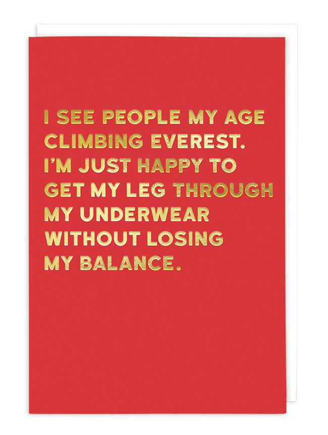
Current Bestseller? Everest from the Cloud Nine humor collection is the biggest seller by far with its relatable humor. We love to hear our retailers tell us that they know customers are reading this card when they hear them LOL!
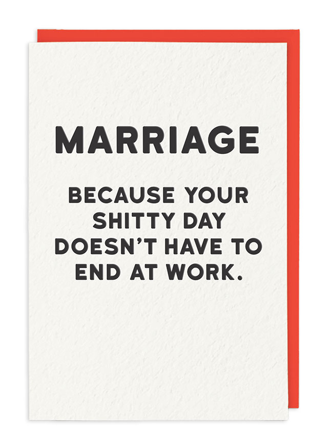
Personal Favorite? Marriage from the award-winning humor line Holy Flaps (winners of the Best Humorous Range for the Henries 2023!) The card says it all to be honest!
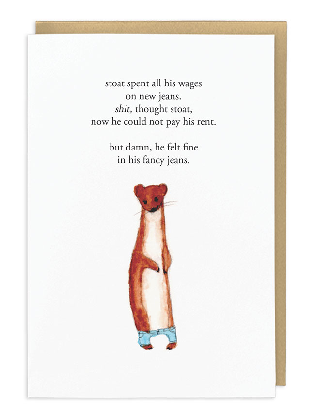
 Surprise Hit? New Jeans from the badass humor Zeppelinmoon collection. Wow, this collection has blown us away this year with our retailers ordering this card time and time again.
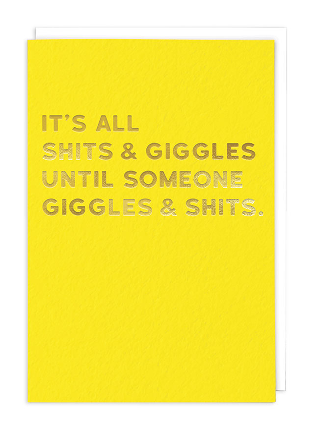
Iconic Selection? Shits and Giggles, an all-time favorite of stores worldwide with its bold standout color and finished with foiled lettering.
Favorite Color? Cloud Nine Yellow (Pantone Process Yellow U). Bright, bold and so colorful standing out from the crowd on shelves.
Current Design Obsession? A new painterly collection called Hebe. Watch this space!
Favorite Flower? Orchid. Just love their wonderful smell!
Favorite Indulgence? Kobe beef — yum!