Trends
January 14, 2013 •
10 Designers to Watch in 2013
Who said there’s nothing new under the sun? Our annual who’s who of stationery highlights 10 designers who shape trends as they present some of the most mesmerizing offerings out there. Some are established, some are new to the business, but all are especially compelling.
Compiling this tensome is never easy. I tried to avoid work that felt too trendy, since it can stray into “one-hit wonder” territory. Rather, I sought creatives whose distinctive output felt of our time yet also timeless. That’s not an easy path to traverse, but this group does it with panache. — Sarah Schwartz, editor
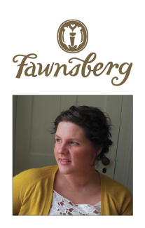
Patricia Murmau | Fawnsberg, www.fawnsberg.com
Aesthetic of the Line: A mix of folk and fine. Northern European countryside living is a consistent source of inspiration.
Current Bestseller: Our Return Address Simple Stamp.
Personal Favorite: Boxed Writing Sheet Sets, particularly the Berry Picking design.
Surprise Hit: Strawberry Blue Notecards.
![]()
Iconic selection
Iconic Selection: The Bridgette Wildflower Notecards depict a lot of what I love about the line. The color is playful, the imagery frank and the non-occasion makes (it) everyday.
Favorite Color: French Gray; Gentle, unobtrusive and it makes everything around it look better.
Current Design Obsession: German carved walnut furniture. The naturalistic decorations are purposefully choreographed, simplified and meaty. And there is always the hidden surprise of a bird or squirrel.
Favorite Flower: I’m always drawn to Cabbage Roses, a satisfying mix of dense and delicate.
Favorite Indulgence: Reading.
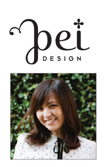
Pei Pinney | Pei Design, www.pei-design.com
Aesthetic of Line: Inspired by the graphic, whimsical designs of Scandinavia, the line is bathed in vivid colors drawn from a pool of whimsy and balanced with sophistication.
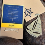
Current Bestseller: The Spectrum Nautical Collection, a labor of love down to every detail.
Personal Favorite: Nautical Letterpress Cards. I wanted to create a line that captured the imagination of the sea with a modern twist.
Surprise Hit: Foil Thank You Cards. The response has been a very pleasant surprise. Gold has been a very big hit!
![]()
Iconic selection
Iconic Selection: Stockholm Collection. Playful illustrations and clean graphics accentuated by the contrast between light and dark really captured the fun and simplicity I was aiming to find.
Favorite Color: Right now, I love creating vibrant relationships between black and white through the use of an intermediary color, giving it a modern edge.
Current Design Obsession: One of the coolest things about being a designer is being able to constantly evolve and find inspiration. My mood changes all the time and I love to surprise myself with what I can come up at the moment.
Favorite Flower: White Anemones. The white petals and black center of this flower are so graphic and the form of the flower itself is pure and simple yet striking.
Favorite Indulgence: Ice caramel macchiato in the morning. It wakes me up in a really sweet way.
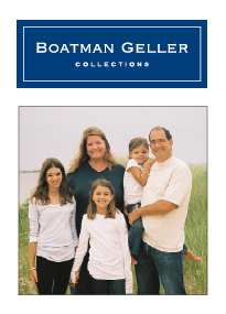
Jane Geller | Boatman Geller, http://Boatmangeller.com
Aesthetic of the Line: Classic patterns with unexpected color combinations create a fresh twist on traditional. The patterns, colors and icons in the Boatman Geller collections embody the good life (and provide) a fun way to “Live Your Style.”
Current Bestseller: The Bristol Tile Navy pattern with tangerine accent on any product.
Personal Favorite: Bright Floral foldover.
Surprise Hit: The little gator has been through a lot and we call it “the little gator that could.”
![]()
Iconic selection
Iconic Selection: Toile Pink with Lime Check pattern.
Favorite Color: Yellow (PMS114).
Current Design Obsession: Great and amazing illustrations — think Nila Aye, Edward Fortheringham and Lorelay Bove.
Favorite Flower: Hydrangeas make me think of Nantucket.
Favorite Indulgence: A hardback book at FULL price — I love reading and turning the pages of a new book.
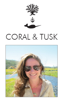
Stephanie Housely | Coral & Tusk, www.coralandtusk.com
Aesthetic of the Line: Steeped in the traditions of storytelling, inspired by a love of animals, travel and adventure, Coral & Tusk takes you on a journey through the ocean depths, to the treetops and out to the prairies and mountains. Witty sensibilities abound with consideration given to every detail of each laser cut or embroidered character. Smart design mixed with magic and mischief creates enjoyable compositions.
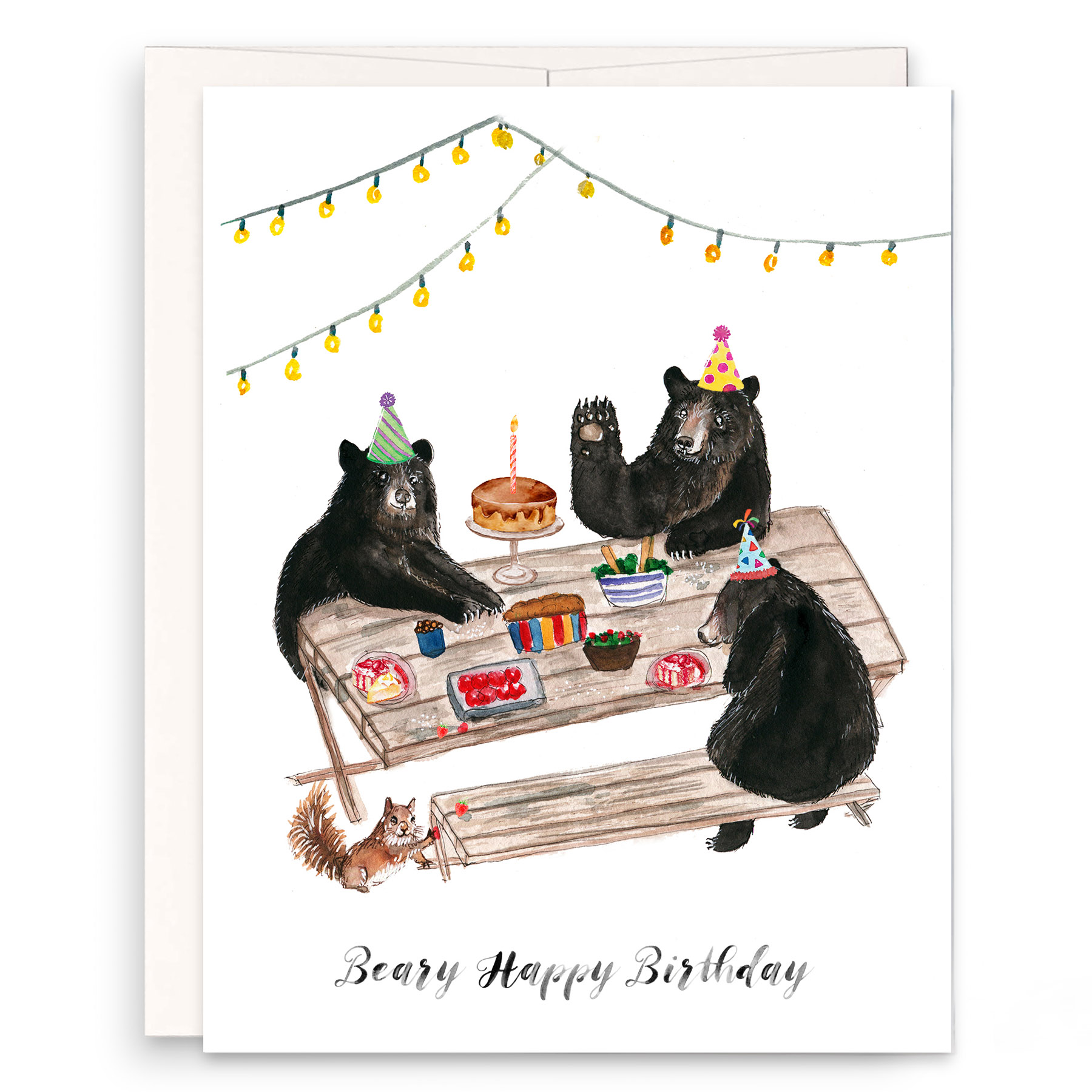
Current Bestseller: Birthday Bear card.
Personal Favorite: Ski Bunny embroidered card.
Surprise Hit: Canoe laser-cut card.
![]()
Iconic selection
Iconic Selection: Sparklers embroidered card.
Favorite Color: I’m on the hunt for a perfect color somewhere between saffron and ochre. I haven’t been able to find it yet, but I can see it perfectly in my mind. But generally my favorite color is a deep teal.
Current Design Obsession: We’re getting ready to move into our new loft workspace, so I am obsessed with space and furniture and how to tie in the overall feeling of what we make with the environment in which we make it.
Favorite Flower: How to choose one? Peony? Magnolia? Hollyhocks? LILAC!
Favorite Indulgence: Making time to do fun things: Be outdoors, have fun times with friends or just to sit and think for a while.
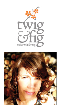
Suzie McKig | Twig & Fig, http://Twigandfig.com
Aesthetic of the Line: Twig & Fig has evolved from solely letterpress invitations in 2003 to a full-scale multi-media studio. This arose naturally as my partner (and hubby) Serge Vigeant and I have such a strong passion for the tactile. Our eclectic mashup is what we’re known for — fusing together unexpected print methods, colors, substrates and design.
Current Bestseller: Copperfields, a rusted metal invite, screen printed and mounted onto distressed wood backing. It’s accompanied by an etched solid cherrywood fanned program.
Personal Favorite: We had a blast doing this NASCAR suite. The invite is 1/8-inch-thick screen-printed, water jetted steel (!) with an eggplant calligraphed, sewn leather band in a wool pouch with grape leather band and brass buckle, plus a silver leather save-the-date.
Surprise Hit: The license plate save-the-date. They fly out the door.
![]()
Iconic selection
Iconic Selection: Drifwood Tides. Reclaimed wood slats are assembled one by one. Then we screen-print them and laser etch the text. Favorite Color: Over the past few years, classic bright gold warmed into my favor. I can’t get enough of it in the right dosage.
Current Design Obsession: I’m drooling over three new lines we’re designing. 1) Cozy little notebooks and journals with a weird mix of industrial and vintage. 2) Thick German wool felt coin, pencil and everything pouches, accented tone on tone with handbag leather and vintage Italian hardware. 3) Lulu Limberlost, our vintage-equipped picnic basket line will debut in spring. Victorian and Art Nouveau chinaware, flatware and vintage French and European linens will be the line’s core.
Favorite Flower: Big, luscious double-petaled peonies in that raspberry slushy color.
Favorite Indulgence: World travel, of course. That doesn’t happen nearly often enough, so more accessibly: leisurely riding our bikes to downtown Oakland on Sunday afternoons to the local Belgian watering hole, Trappist.
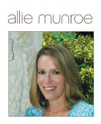
Alison O’Keefe | Allie Munroe, www.alliemunroe.com
Aesthetic of the Line: Modern, architectural and typographic.
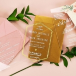
Current Bestseller: Our oversized, tall acrylic invitations. The designs and colors vary from client to client. They mail in a heavy cover weight envelope that protects them in the mail and creates that WOW factor.
Personal Favorite: This simple Holly & Jolly design features a gorgeous, vintage ampersand and two-color printing on clear plastic. “Holly & Jolly” are knocked out of white ink to reveal the clear plastic, making the best use of a transparent material.
Surprise Hit: We printed on 100 percent recycled content book board for a corporate client who wanted to demonstrate that they were environmentally friendly. Now we get orders each week for holiday cards, announcements and Bar Mitzvah and wedding invitations printed on this material.
![]()
Iconic selection
Iconic Selection: This Winter Soirée holiday invitation encompasses our love of typography, printing on unusual materials and die-cutting into an unexpected shape. It’s crossed over into events other than holiday. Favorite Color: Green. I live in Miami and we are outdoors surrounded by green foliage all year round. It is hard to narrow down to one favorite, but PMS 367, a bright happy green and PMS 399, a deeper avocado color, are two favorites.
Current Design Obsession: I am in love with chalkboard art, particularly when it incorporates contrasting typographic styles with a vintage feel. Favorite Flower: Hydrangeas. They remind me of one of my very favorite places in the world: Nantucket. I am a New Englander at heart.
Favorite Indulgence: Watching “Sex and the City” reruns after my children go to bed.
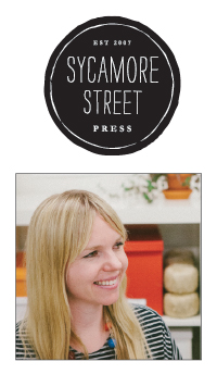
Eva Jorgensen | Sycamore Street Press, www.sycamorestreetpress.com
Aesthetic of the Line: I create hand-drawn illustrations for Folk, one of (our) three lines. I’m inspired by the earthy, yet classic appeal of folk art from all over the world. And as with all the SSP lines, I strive for a fresh, colorful approach.
Current Bestseller: Merci Beaucoup letterpress card.
Personal Favorite: Je Ne Sais Quoi letterpress art print.
Surprise Hit: Friends Forever letterpress card.
![]()
Iconic selection
Iconic Selection: La Vie en Rose letterpress art print.
Favorite Color: Cobalt blue.
Current Design Obsession: Valencian Lusterware. My husband, Kirk, and I finally made it to the Cloisters Museum while we were in NYC for the National Stationery Show last spring. I love everything about (it), especially this heavily patterned, colorful medieval pottery.
Favorite Flower: Old-fashioned roses. The smell!
Favorite Indulgence: Eating really good food while traveling. (Well, eating really good food any time, really. But especially while traveling.)
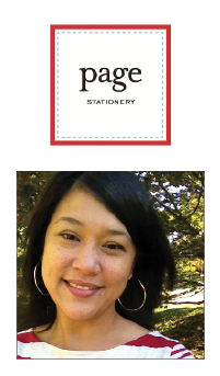
Sue Corral | Page Stationery, www.pagestationery.com
Aesthetic of the Line: Less is more, so most of my designs are simple and classic but with a slightly modern twist.
Current Bestseller: DUET is a collection of nearly 200 duplex, digitally printed custom designs. It offers almost endless customization options — and that’s what our stores and their customers love about it.
Personal Favorite: Catherine + Blake Wedding Suite. (Its) gold foil printing gave me an Art Deco inspiration. I tried to create a modern interpretation of the style that represented a fresh take on old New York elegance and glamour. Surprise Hit: Our Stationery for Men. Men are buying it for themselves and customizing it to suit their personality.
![]()
Iconic Selection: Our stores and customers come to us for classic, traditional designs. Letterpressed on a soft white deckled edge Italian stock, the Katherine + Jeremy suite has proven to be timeless in every way.
Favorite Color: Right now, the combination of blackboard green/black and salmon. It has a vintage vibe but still feels very fresh.
Current Design Obsession: A constant source of inspiration is Louise Fili. Most of her designs are modern interpretations of vintage Italian work so there’s always this incredible mix of old and new. One recent design is the 2012 Love Ribbons Stamp for the USPS, perfect for our brides.
Favorite Flower: Peonies. All those layers of petals are just crazy beautiful.
Favorite Indulgence: Coconut Chip Ice Cream and streaming old TV shows on Netflix (all five seasons of “Alias”), though never at the same time. Let’s not get too crazy.
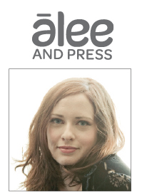
Amanda Thomas | Alee & Press, www.aleeandpress.com
Aesthetic of the Line: Modern, whimsical, and timeless with an emphasis on typography and color. We try to focus on the best graphical solution for the project.
Current Bestseller: Juliet.
Personal Favorite: Britt. I love the straightforward approach. It’s unexpected, simple and beautiful. The look and feel can be changed by color, (paper) stock and custom type layout.
Surprise Hit: “Awesome You” card — it seems to have a cult-like following.
![]()
Iconic selection
Iconic Selection: Headline greeting cards. These are the cards I always looked for while card shopping but could never find.
Favorite Color: (It’s) always changing but usually by season. Gray is a staple. I’m (also) loving deep navy blue, neon pink.
Current Design Obsession: Simple, effortless typography. It’s definitely my design passion and inspires a lot of our work.
Favorite Flower: Anemones and Magnolias. Favorite for fragrance would be Gardenias.
Favorite Indulgence: Ski holidays in the Alps, steam rooms and champagne just about anywhere.
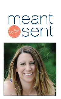
Robyn Wehab | meant to be sent, www.meanttobesent.com
Aesthetic of the Line: Casual luxury. Shiny details, luxe paper and colorful designs create a product that’s high-end, full of style and personality, yet never stuffy.
Current Bestseller: Gramercy Park. The quatrefoil pattern is classic, but paired with modern typography it looks so very now.
Personal Favorite: My new line of paper goodies and accessories is full of colorful designs, shiny foil accents and crisp patterns.
Surprise Hit: My Country Chic suite, designed for Deanna Pappas from “The Bachelorette.” It’s been flying off the shelves! Who knew there were so many rustic/farm/barn/ranch themed weddings?
![]()
Iconic selection
Iconic Selection: The perfectly preppy collection encompasses (everything) mtbs is known for — fun colors, mixed typography, crisp patterns and a decidedly preppy look.
Favorite Color: Coral has been a fave for a while now. It’s just (so) fun (and) versatile — it can be more orangey, sometimes more pink and others more red.
Current Design Obsession: Watercolor, handwritten and hand drawn details. Oh, and foil. How I love a touch of glam!
Favorite Flower: Tulips, Gerbera daisies, and more recently, dahlias and ranunculus. They’re all such happy flowers and I love all the layers. I especially love what tulips represent — SPRING, which means summer is around the corner.
Favorite Indulgence: Shopping (especially if j.crew or kate spade purchases are involved!) Dessert. And a beach vacation. Oh, day at the spa. Ahhhh!


