

Features
January 23, 2023 •
10 Designers to Watch in 2023
Stationery Trends presents its 10 Designers to Watch in 2023
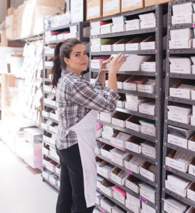
MICHELLE ANGENENT, 417 Press

Aesthetic of the line? Typography- heavy letterpress designs with a focus on humorous observations of everyday life. I love exploring modern font pairings to express the emotions behind the words, then add a hit of color with a fun envelope.
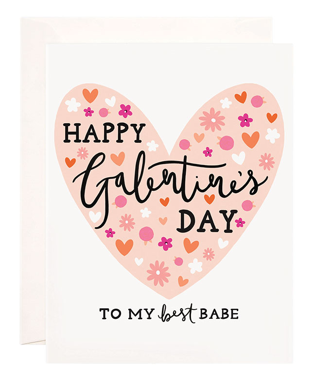
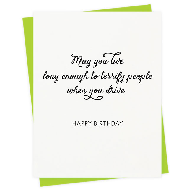
Current Bestseller? Terrify — as in, “May you live long enough to terrify people when you drive.”
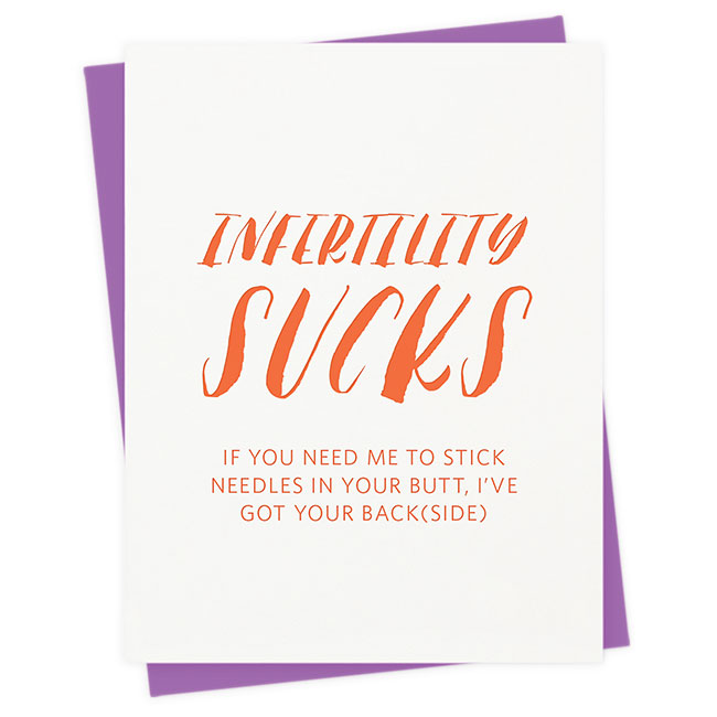
Personal Favorite? Infertility Sucks, because it’s written from my own experience and was the first greeting card to touch on infertility. These days, I’m tackling subjects like mental health.
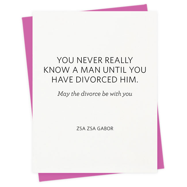
Surprise Hit? My Quote Unquote line was a hit out of the gate — but the Gabor divorce card was a surprise.
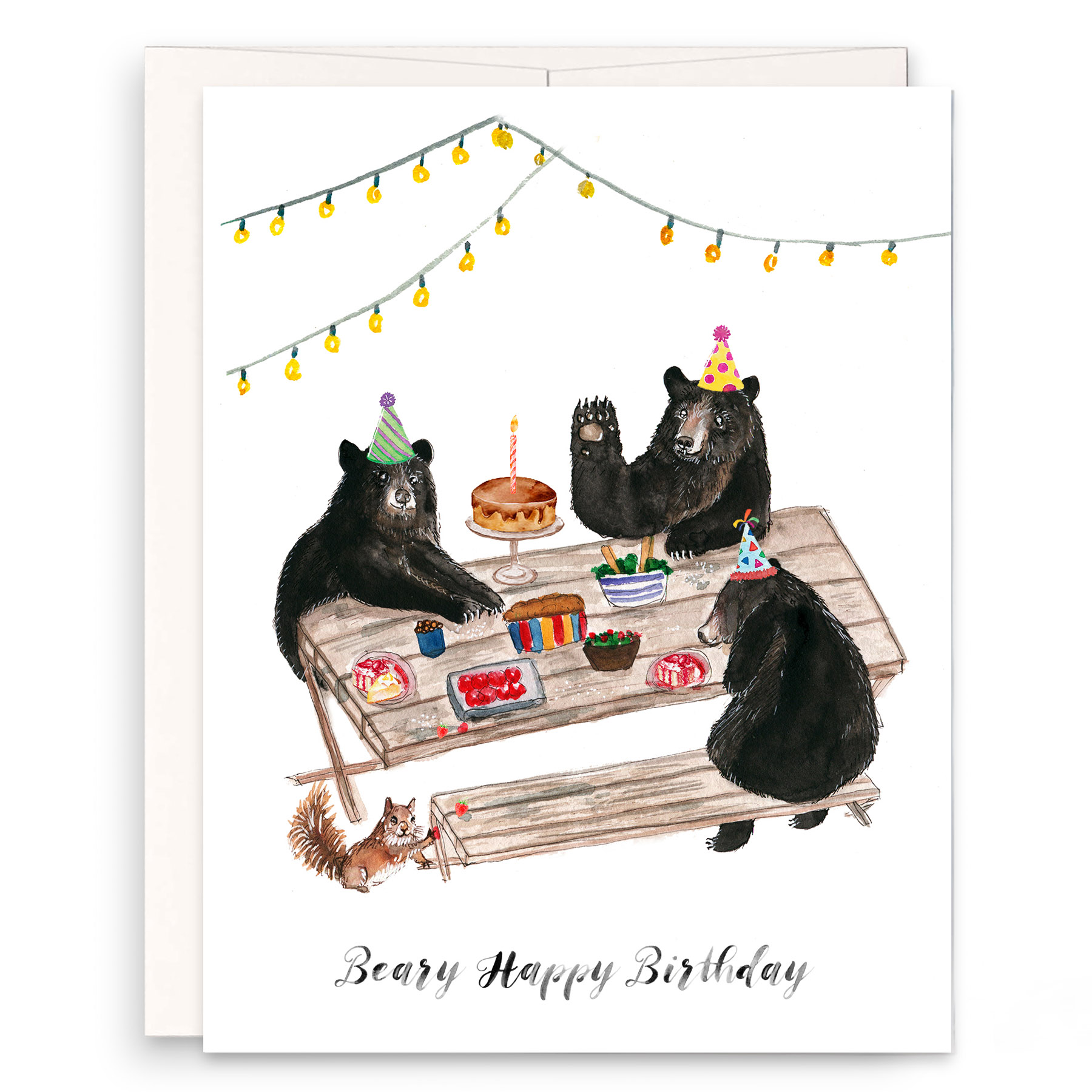
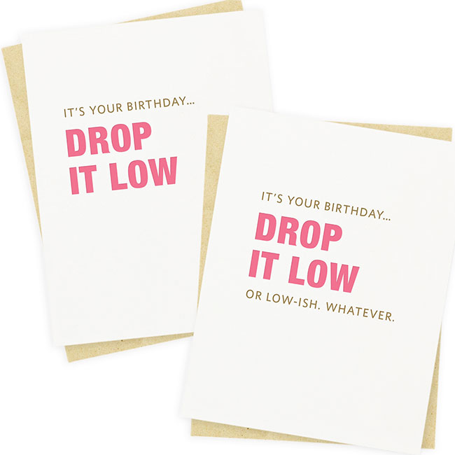
![]() Iconic Selection? A series of birthday cards revolving around classic songs. The most recent is actually a pair of cards with slightly different messages because I couldn’t decide!
Iconic Selection? A series of birthday cards revolving around classic songs. The most recent is actually a pair of cards with slightly different messages because I couldn’t decide!
Favorite Color? Fluorescent pink. Or maybe fluorescent yellow. Both? You cannot help but feel happy with either, and I use them like neutrals.
Current Design Obsession? OBSESSED with collage, I even used it on the cover of my 2022 catalog. Would love to collab with NYC artist @karocrafts if only I could figure out how to [incorporate] letterpress printing.
Favorite Flower? Flowers are pretty, but I lean hard into plants, especially anything with graphic shapes like a Monstera or a Schefflera.
Favorite Indulgence? Years ago, I was gifted a mid-century Rosenthal vase and recently began collecting them in earnest, especially anything by Martin Freyer. The lines, the shapes … I’m sensing a trend here.
MARIE CASTIGLIONE, Spaghetti & Meatballs
Aesthetic of the Line? Like a Sour Patch commercial. We love our sassy, witty copy paired with sweet, minimal illustrations.
Current Bestseller? Happy Birth-Yayyy design. We had an idea to do a “funfetti card” back in January 2022 (because who doesn’t like cake?) and launched it at NYNOW. Since then, it’s been in almost every wholesale order.
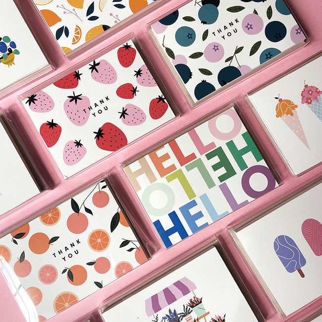
Personal Favorite? Mini Boxed Set Collection. I just love anything “mini,” and these fruit designs are just so fun and adorable.
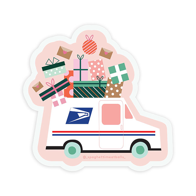
Surprise Hit? USPS Sticker. I designed it for a free giveaway, but so many stores messaged me to wholesale it, we launched it in our sticker collection.
Iconic Selection? Our Valentine’s Day and Love collection. These are so fun for us to write and come up with considering I am President of Single Ladies Anonymous! Every year, I get my sister and girlfriends in one room with unlimited wine and booze to brainstorm. We talk about bad dates, good dates and everything in between. I’d like to think of myself as the Taylor Swift of greeting cards — no one is off limits!
![]() Favorite Color? Normally, I’m an “everything pink girl.” But lately, I have really been into purples and lavenders.
Favorite Color? Normally, I’m an “everything pink girl.” But lately, I have really been into purples and lavenders.
Current Design Obsession? I’ve really been into checks and plaids lately. Very ‘70s inspired. Bright colors, smiley faces, peace signs and groovy typefaces.
Favorite Flower? I’m not really a flower girl — I’m more of a plant mom! My favorite plants in my apartment right now are my 7-foot fiddle fig tree and my Monstera. I almost killed everything a few months ago, so I made an Excel document of all my plant names, sun exposure and watering schedules. Now I live in a tropical rainforest!
Favorite Indulgence? Margaritas, bubble baths and scrolling. (Simultaneously for a triple threat!)

NAOMI DABLE, Naomi Paper Co.

Aesthetic of the Line? Featuring hand- lettered designs, bold colors and an overall handmade look, our products help others share the beauty of God’s Word, providing hope and encouragement for all.
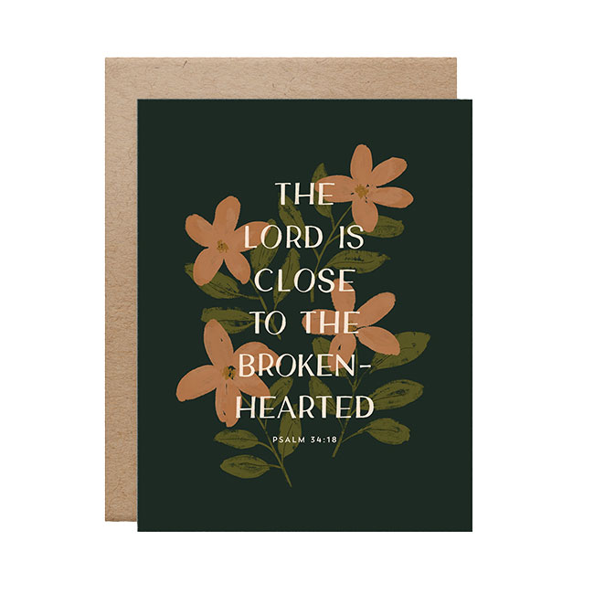
Current Bestseller? Close to the Brokenhearted. Our sympathy cards have always been top sellers, I think because it is rare to find a Christian- based sympathy card that doesn’t try to cheer you up. I learned this after unexpectedly losing my mom to cancer and receiving numerous well-meaning, yet shallow or cheesy, Christian cards. Our sympathy cards aim to sit with the brokenhearted in the midst of their grief, just as scripture says God does.
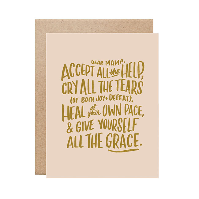
Personal Favorite? Dear Mama. I wrote this card after experiencing a challenging postpartum season with my first son. It’s the words I wish someone had said to me, and makes me emotional each time I read it. I want every new mom to receive this card!
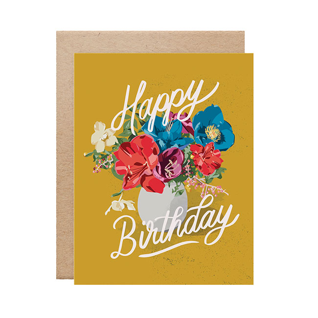
![]() Surprise Hit? Birthday Flowers. Generic statements like “Happy Birthday” always feel hard for me to design since there are thousands out there. I doubted anyone would choose mine (without a) unique sentiment, but this design has been one of our best-sellers for both retail and wholesale! It’s beautiful yet general enough to keep on hand for anyone’s birthday.
Surprise Hit? Birthday Flowers. Generic statements like “Happy Birthday” always feel hard for me to design since there are thousands out there. I doubted anyone would choose mine (without a) unique sentiment, but this design has been one of our best-sellers for both retail and wholesale! It’s beautiful yet general enough to keep on hand for anyone’s birthday.
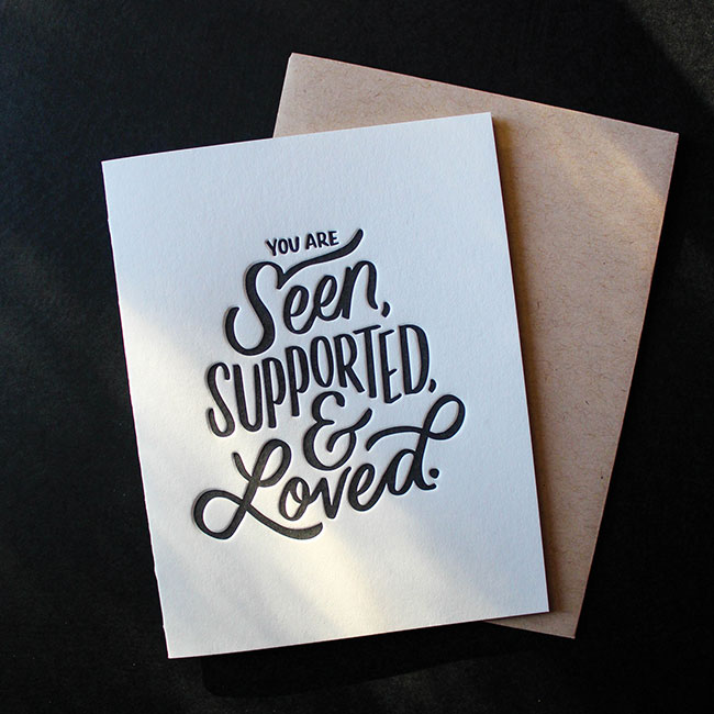
Iconic Selection? Seen, Supported, & Loved. The simple yet powerful message, the hand lettering and the deep letterpress printing work together to create a truly impactful card that sums up the way I want everyone to feel when they receive a Naomi Paper Co. card.
Favorite Color? Mustard yellow has my heart — I hope it never goes out of style!
Current Design Obsession? Landscape and abstract paintings! Last year, I took my first rec department watercolor painting class and had a blast diving into another side of art.
Favorite Flower? Lilacs. Their fragrance can fill the whole house, and they remind me of my mom!
Favorite Indulgence? Alone time at a coffee shop with an oat milk chai latte!
JAN GOLDEN, Age-Friendly Vibes
Aesthetic of the Line? Clean, minimalist designs that don’t ignore the elephant in the room that is getting older; instead, they address age in clever, inspiring and thought-provoking ways.
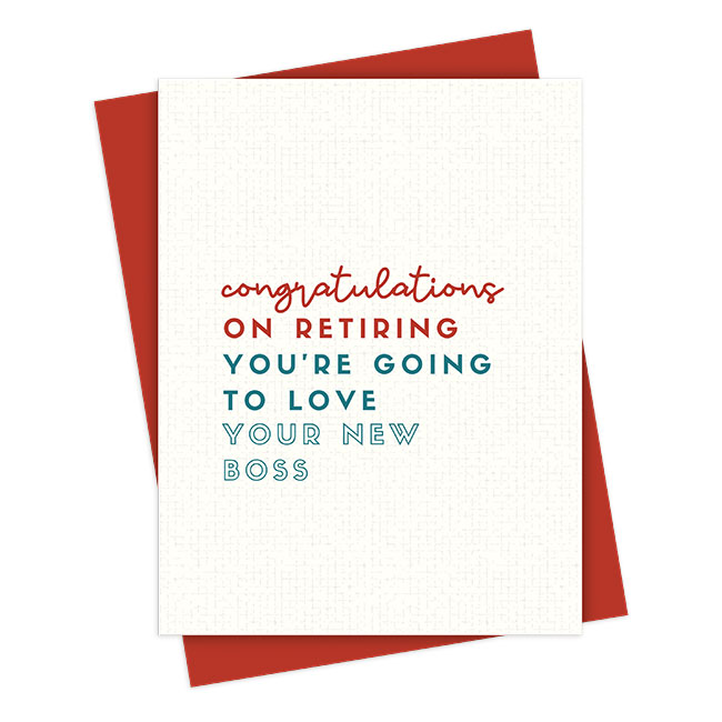
Current Bestseller? You’re going to love your new boss. Add your version of ‘new boss,’ and you’ll understand why this card works for so many retirement celebrations.
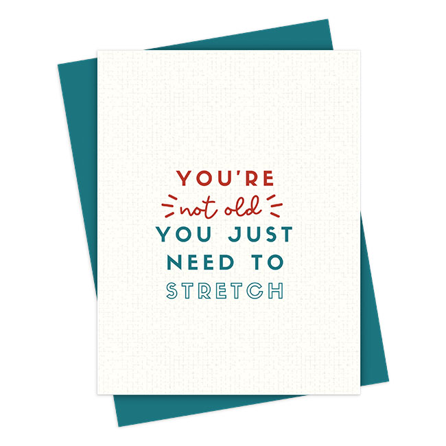
Personal Favorite? You’re not old; you just need to stretch. Stiff and sore? Stop blaming age, and take the time to stretch!
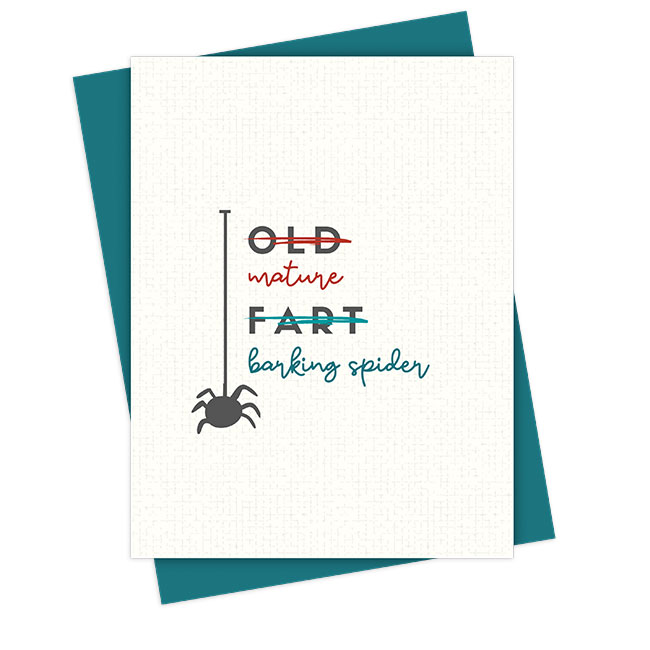
Surprise Hit? Who knew flipping the script on Old Fart could be so hilarious?
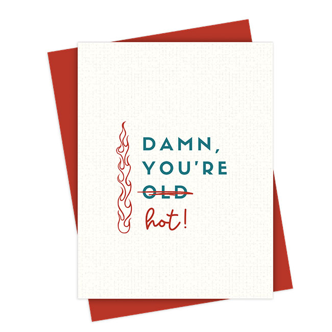
Iconic Selection? I’m most proud of my birthday cards that celebrate age in clever, sweet and inspiring ways. This top-seller stands tall next to the tired “damn, you’re old” selections, don’t you think?
![]() Favorite Colors? Rich holiday red and deep teal — the perfect backdrop for powerful words so many people are waiting to hear.
Favorite Colors? Rich holiday red and deep teal — the perfect backdrop for powerful words so many people are waiting to hear.
Current Design Obsession? Creating age-positive mini-billboards, AKA stickers! Especially those you can proudly display on your laptop as your boss schemes to replace you with someone younger.
Favorite Flower? In early summer, I venture out with my iPhone camera and delight in the delicate, complex blooms of the Columbine that thrive in the Colorado mountains.
Favorite Indulgence? A juicy IPA on the sunny patio at my favorite brewpub is the perfect way to kick off the weekend with my favorite human and canine after a busy work week.
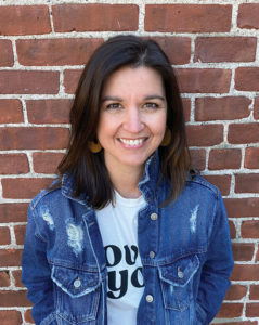
EMILY KING, 2021 Co.
Aesthetic of the Line? Building people up by harnessing the power of words is the true aesthetic of 2021 Co. I love to hand letter, illustrate and paint to create one- of-a-kind mini works of art! Our range in style is diverse but still cohesive with the messaging tying it all together.
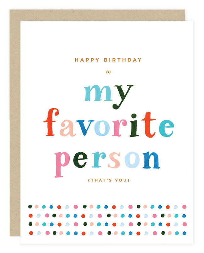
Current Bestseller? My Favorite Person birthday card. This card quickly outpaced our other best sellers to take the crown! P.S.: We gave out 500 at NY NOW, and one very evolved gal said, “I’m giving this to myself!”
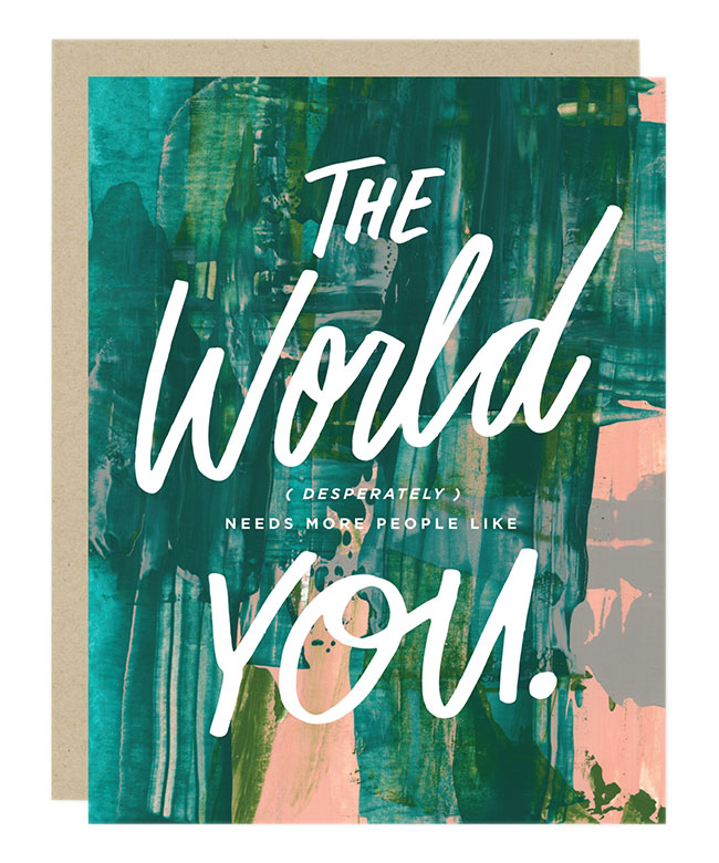
Personal Favorite? People Like You. It can be a thank-you or a note of encouragement to keep moving forward. Using a scraped paint background and laying in knocked- out lettering feels both raw and beautiful, a visual
representation of the universally human message.
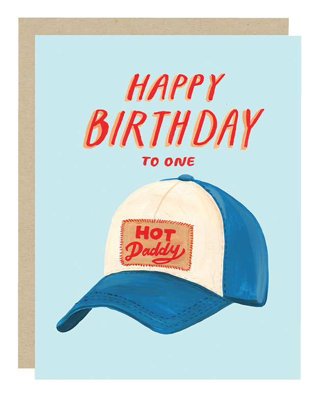
Surprise Hit? Hot Daddy. This card was created as a nod to my husband. We weren’t sure how it would be received, but boy do people like to celebrate the hot daddies in their own life!
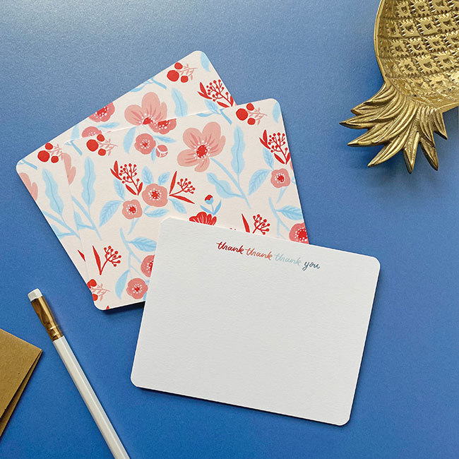
 Iconic Selection? Thank thank thank you flat notecard set. There is nothing more iconic than a classic stationery set, and our flat note cards are on a gorgeous eggshell stock with beautiful patterns on the back. These inspire
us to send more notes!
Favorite Color? I believe this is like picking your favorite child — it’s impossible! I’m going with a deep navy, although a dark foresty green is starting to edge it out.
Current Design Obsession? My forever obsession: lettering. Most recently, I’ve been inspired by large murals. Kind of makes me want to do something large format!
Favorite Flower? It’s oversaid, but peonies are my favorite. They are such show-offs and give us the most amazing aroma.
Favorite Indulgence? With three kids, my favorite indulgence is an amazing dinner out at a nice restaurant. It makes me remember who I was pre- mom, and the combination of food, atmosphere, family and friends always renews me!
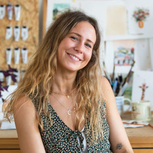
LIBBY LLANSO, Seedlings
Aesthetic of the Line? A whole lot of sweet with a little sass. We’re all about color — the brighter the better! Mix in some foil details and our iconic seed paper envelope, and you’ve got Seedlings! We’re your fashionista friend who is also a touch earthy crunchy — the one who likes to buy thrifted designer bags, shops at your local organic marketplace and paints every room in her rented apartment to fit her bright aesthetic! So yeah, Seedlings is about color, we’re about being eco-friendly, we’re about sweetness—but you’ve always gotta have that touch of sass!
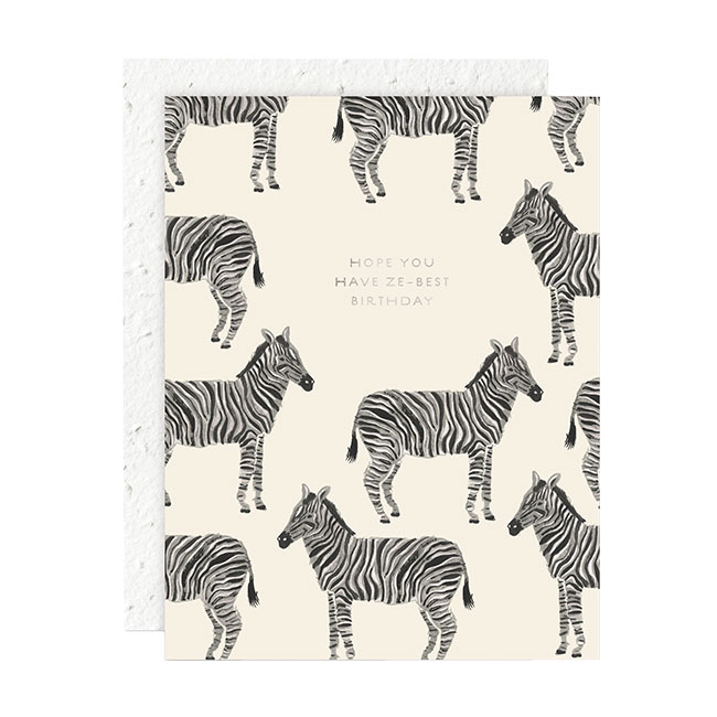
Current Bestseller? “Ze-best Birthday” — it’s punny, it’s oh so chic, and oh so Seedlings!
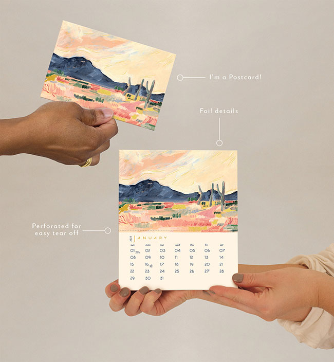
Personal Favorite? I’m not a mother, but this is what I imagine picking your favorite child is like. Let’s be honest, all mothers have a favorite (right?!), so our Postcard Calendar is mine. I just love postcards and calendars, and the sustainability of this zero-waste product!
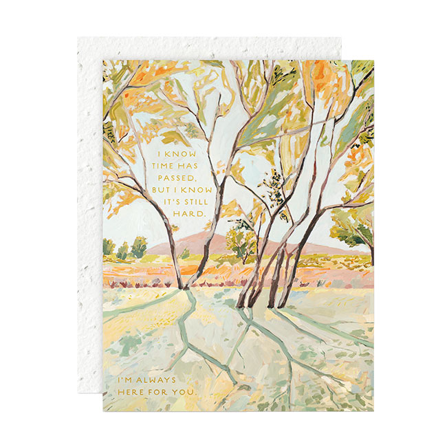
Surprise Hit? I knew this artwork by Margaret Jeane was going to be loved because the art is beautiful! But this sentiment I wrote was honestly so personal, and I was so surprised by how many people it touched. It’s so important to remember that we’re all going through something, even if that something happened years ago. I was so surprised by how many hearts this one touched.
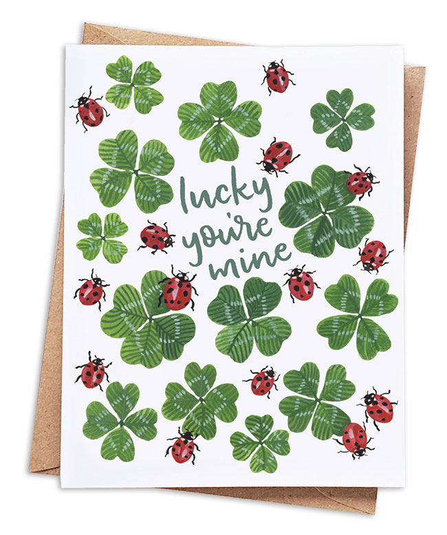
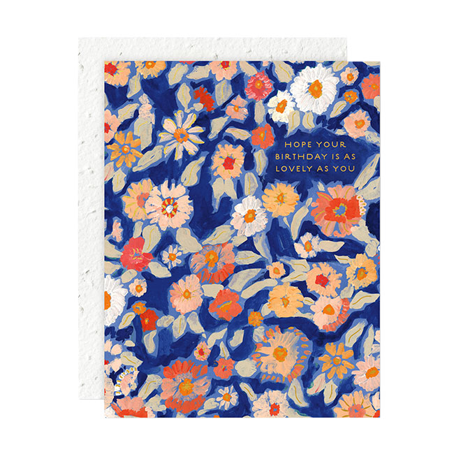
![]() Iconic Selection? Wildflower florals. Florals have become such staples for us in every category. There just isn’t anything quite like a Seedlings Floral!
Iconic Selection? Wildflower florals. Florals have become such staples for us in every category. There just isn’t anything quite like a Seedlings Floral!
Favorite Color? This is so hard because I am OBSESSED with color, if you couldn’t tell by my outfits and the artwork I choose. My favorite has always been purple, but recently I’ve been really into greens of
any kind!
Current Design Obsession? Finding this balance between minimalism and maximalism, if that makes any sense! I’ve been looking at both of these ideas and trying to find a way to create products that still have the feel of “more is more” while also being sneaky minimalist!
Favorite Flower? Snapdragons. They remind me so much of my childhood and going to my Great Aunt Marie’s garden with my mom.
Favorite Indulgence? Buying vintage designer shoes, traveling and cookies — all the cookies!
LOUISE MULGREW, Louise Mulgrew
Aesthetic of the Line? Whimsical, playful and a little bit cute. Although my illustration style is always evolving, I want them all to evoke a sort of warm and fuzzy feeling that makes you smile. I like to think of my cards as tiny, thoughtful pieces of art to be kept and treasured.
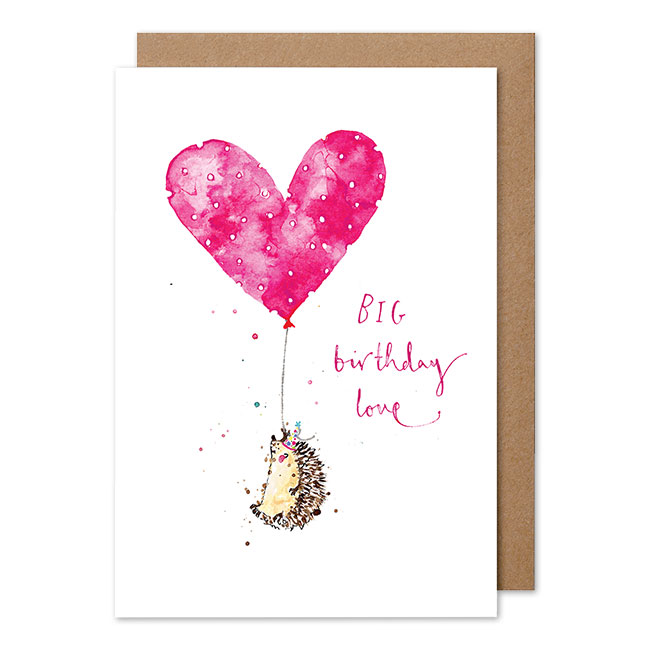
Current Bestseller? Big Love Hedgehog, a small hedgehog with a big heart.
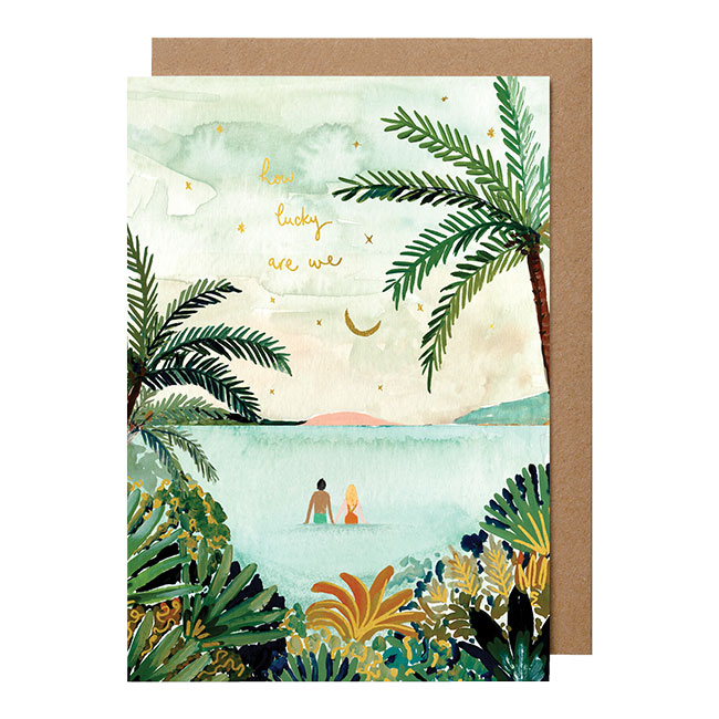
Personal Favorite? How Lucky Are We. Perhaps I’m just trying to manifest a beautiful island getaway, but I’ve been loving painting full color landscapes and scenes like this one recently. It feels quite nostalgic, with a slightly ethereal vibe, too.
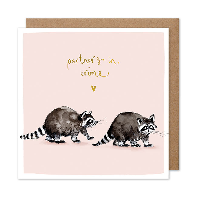
Surprise Hit? Partners in Crime Raccoons card. I think lots of people relate to this cheeky and mischievous duo.
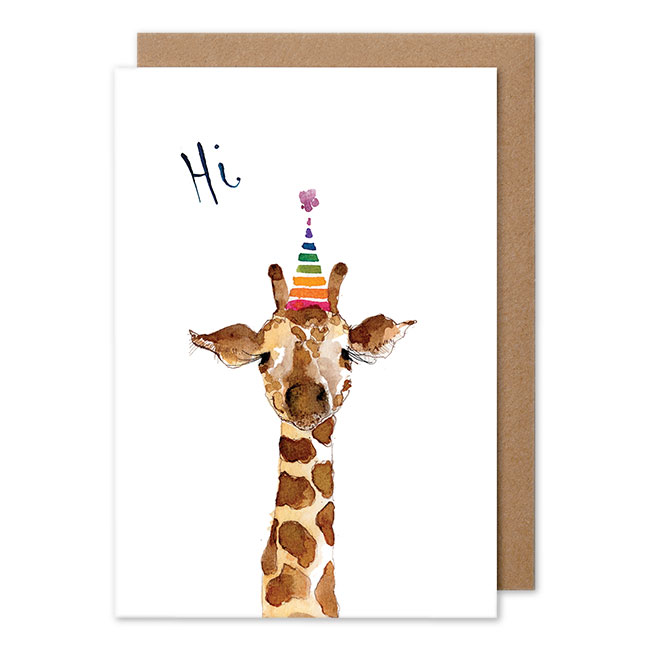
![]() Iconic Selection? Hi Giraffe. He was my very first design seven years ago, and he’s become somewhat of a business mascot over the years. He sits with me on my desk.
Iconic Selection? Hi Giraffe. He was my very first design seven years ago, and he’s become somewhat of a business mascot over the years. He sits with me on my desk.
Favorite Color? Green and pink together are a match made in heaven.
Current Design Obsession? Miniature paintings. I just love small and perfectly formed things. My own illustrations keep getting more tiny, and I always have to blow them up for our cards.
Favorite Flower? Always sunflowers. They’re like great big, warm smiling faces.
Favorite indulgence? Chocolate buttons (specifically eaten with two buttons back to back). I’m a child at heart and think I always will be.
KATE MURRAY, Quick Brown Fox Letterpress

Aesthetic of the Line? I am always going for a bright, cheery aesthetic with my line. The goal of each card is to elicit a laugh if not a smile, so keeping the colors and illustrations simple and bright is super important. Keeping the paper and envelope white, I feel like it really draws your attention to the illustrations.
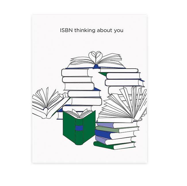
Current Bestseller? For about a year, my ISBN card.
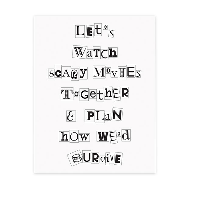
Personal Favorite? I’m a big fan of scary movies. My husband and I started dating by seeing scary movies no one would go with us to, so the Scary Movie Card has to be my favorite. I surprised him with it on our anniversary.
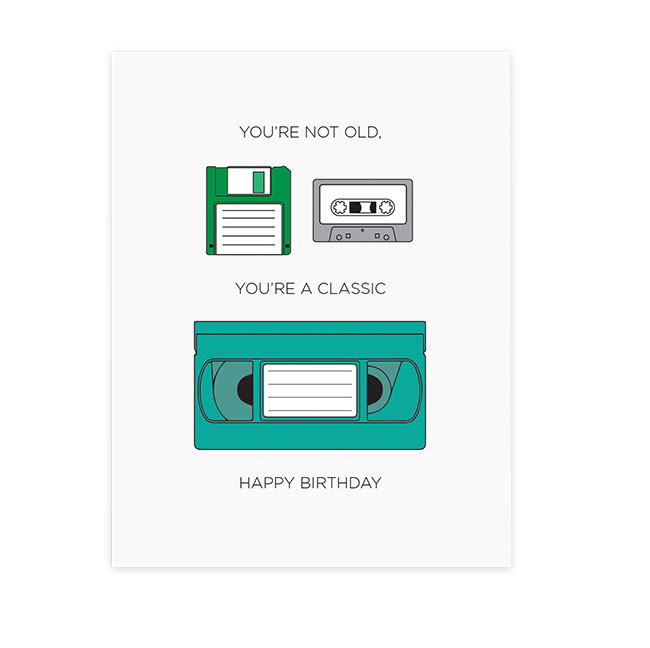
Surprise Hit? My Classic birthday card. Regardless of age, it really connects with people. I think it’s the retro technology?
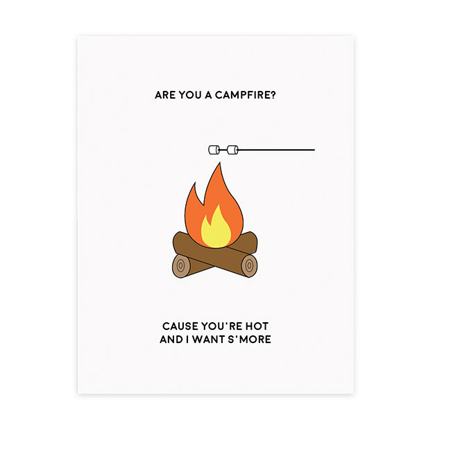
![]() Iconic Selection? My Campfire card, which I’ve had almost since the beginning of my company. It’s bright, it has a cheery (slightly naughty) pun and I haven’t seen a person yet who hasn’t laughed at it.
Iconic Selection? My Campfire card, which I’ve had almost since the beginning of my company. It’s bright, it has a cheery (slightly naughty) pun and I haven’t seen a person yet who hasn’t laughed at it.
Favorite Color? Purple, especially when found in nature.
Current Design Obsession? All things bright colors. I love that people aren’t shying away from adding more colors lately, whether it’s a house design or a beautiful greeting card. The more, the better!
Favorite Flower? It changes all the time, but I really love dahlias and hellebore.
Favorite Indulgence? A really good book, an IPA and a quiet night on my couch.
SADIE TEPER, Twentysome Design
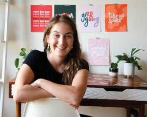
Aesthetic of the Line? My feminist stationery and gift brand features cheeky hand-lettered designs, giving voice to our often unspoken thoughts. Positive and inclusive art empowers people to use their voice and share their values with others.
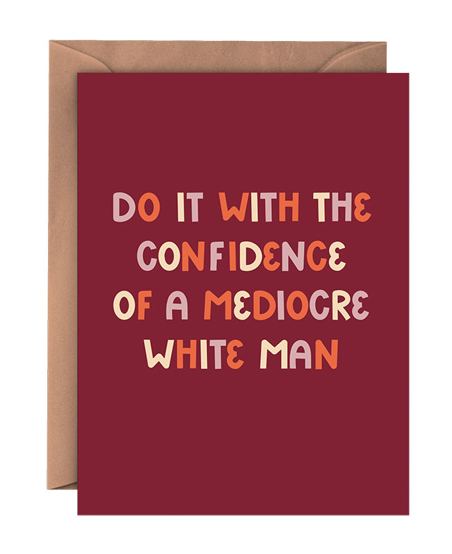
Current Bestseller? Do It With the Confidence of a Mediocre White Man. This card always turns heads and gets lots of laughs. It’s a crowd pleaser through and through.
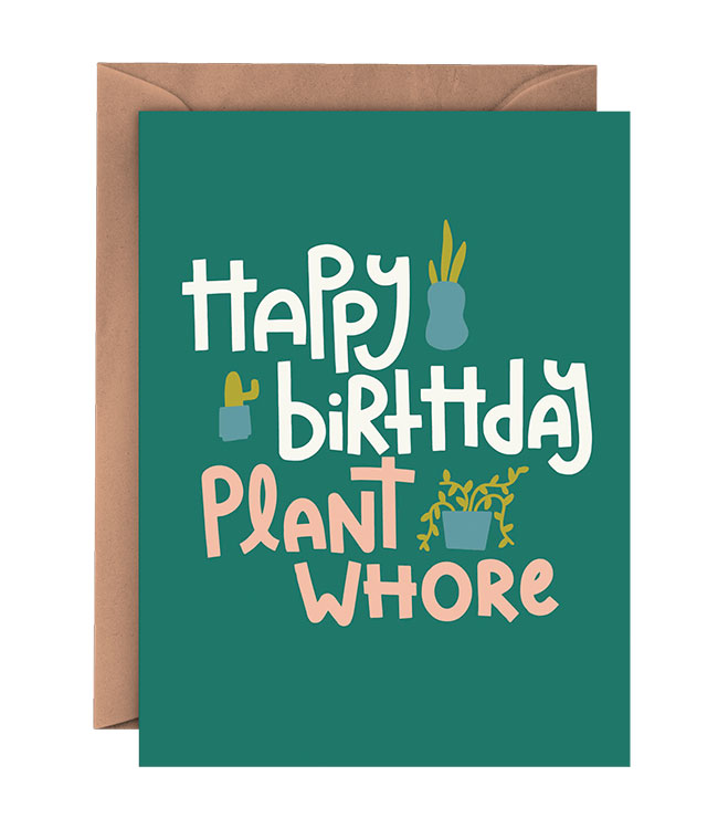
Personal Favorite? Happy Birthday Plant Whore. I designed this card for myself. I am the plant whore, and proud of it.
Surprise Hit? Birthday BFF. I designed this card with a bestie in mind, I never expected it to resonate with so many others and become a top seller!
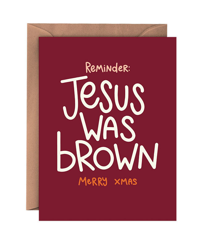
![]() Iconic Selection? Jesus Was Brown. If a card makes people mad, you know you have a winner.
Iconic Selection? Jesus Was Brown. If a card makes people mad, you know you have a winner.
Favorite Color? Light purple, e.g., the purplish-gray in my logo!
Current Design Obsession? Bright colors, squiggles, color-blocked things and my wall of women. The entire wall above my desk features illustrations of women, by women!
Favorite Flower? Sunflowers. I just love how happy they are!
Favorite Indulgence? Mac and cheese, white wine and Gilmore Girls marathons.

VICTORIA VENTURI, Paper Epiphanies
Aesthetic of the Line? Paper Epiphanies, also known as PiPH, is a global card, art and gift brand committed to celebrating the wild rebellion of women and their powerful presence in the world. Bold, authentic conversations paired with bright colors and original typography is what we do best. Known for collaborating with the best women artists of today and provocative in the very best way, PiPH refuses to settle for boring messaging or stuffy designs.
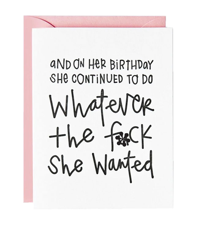
Current Bestseller? Whatever the Fuck She Wanted from the Chelsea Leifken X PiPH Collab.
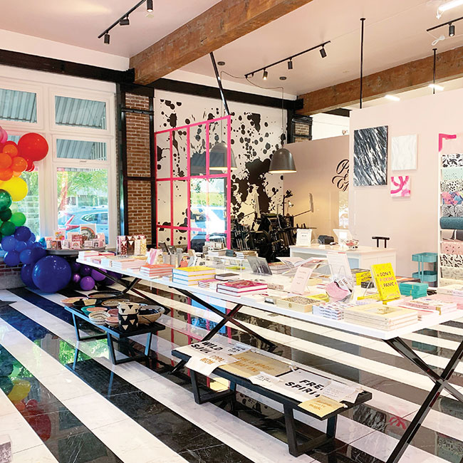
Personal Favorite? Our iconic flagship concept shop in Portland, Oregon, a Mandy Riggar Interiors X PiPH Collaboration.
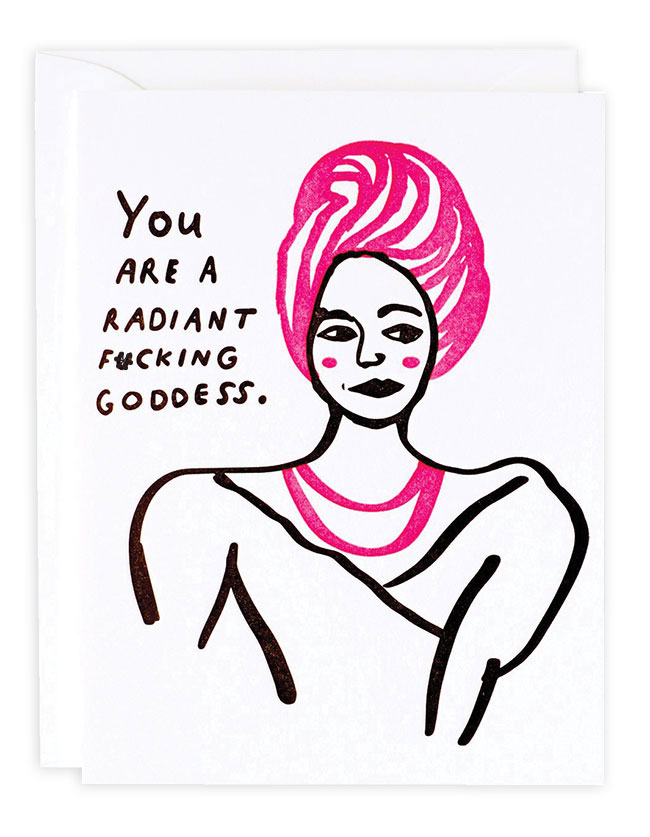
Surprise Hit? Radiant Goddess from the Colleen Harrington X PiPH Collab.
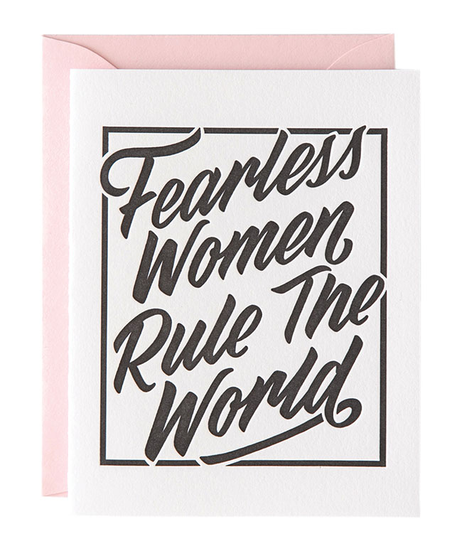
![]() Iconic Selection? Fearless Women Rule the World from the Chie Tamada X PiPH Collab.
Iconic Selection? Fearless Women Rule the World from the Chie Tamada X PiPH Collab.
Favorite Color? Paper Epiphanies PINK baby!
Current Design Obsession? Currently obsessed with NFTs, including our Sad Girls Bar X PiPH! Collection. This design medium is allowing artists to earn residual payments through their creations in perpetuity and is leveling the
barrier to entry for many young artists.
Favorite Flower? Pastelegance peony.
Favorite Indulgence? French fries with a glass of really great red.