

Features Industry Profiles
June 23, 2016 •
Designer Profile: The Everyday, Amplified
Mimi Kim, owner of Clap Clap Design, was one of many first-time exhibitors last year at the National Stationery Show (NSS). However, her upbeat, fanciful style quickly differentiated herself from the pack. The Korean-born illustrator and graphic designer has a fresh perspective that infuses her designs with a vibe that is by turns nostalgic, child-like and whimsical — but always completely her own.
Stationery Trends interviewed Kim, one of our 10 Designers to Watch in 2016, to learn more about how she creates her distinctive range, and where she would like to take it.
ST: How did you first start creating stationery, and what prompted your leap from graphic designer to stationery brand proprietress?
MK: Before starting Clap Clap, I worked at an advertising company in Seoul, South Korea. I often felt frustrated working for clients because I couldn’t design what I truly wanted.
I started thinking about graduate school; for my portfolio, I made a calendar with 12 recipe cards. To my surprise, people really loved it — I ended up making 200 additional calendars and they all sold-out!
The whole thing was unexpected but so exciting. I was able to hear directly from people who bought my work that they liked it, which never (happened) working at a large company. It was so great to control every part of the process, from design to production. The experience made me think about running my own business, and my husband Bert was completely supportive.
ST: What tend to be your biggest inspirations?
MK: Often, I just observe color wherever I go. I stumble upon amazing color inspirations in random places like a restaurant’s table and chairs, or even certain aisles of bookstores that happen to have a row of book spines with odd or peculiar colors! Other times, I look through lookbooks, magazines and Sumally (similar to Pinterest). Sometimes as I work, mistakes will lead to interesting choices.
ST: When creating new work, what role do color palettes play in the process?
MK: I decide (the) color scheme and then what to draw. For example, I will choose khaki, pink and brown, and then draw a cake in brown with letters in pink on the khaki background. In this way, the subjects in the design are informed by the color.
ST: Do you personally collect anything?
MK: I collect small notebooks, especially while traveling. Not only for using them, but I also pay attention to what type of paper or binding method they are made out of, and what makes them stand out.
Business Practices
ST: Does actually running a stationery business differ from how you first envisioned it?
MK: In the beginning, I was able to make decisions on my own, and how I felt best to produce things. However, as Clap Clap grows, certain factors have begun to influence certain decisions. For instance, big clients can affect a direction of future products with notes, or the timing of release. Certainly their feedback will not hinder my core design instincts, but (it) will likely trigger changes in a product one way or another.
Also, before I started going to the NSS, I used to draw only when I wanted and it worked fine. However, NSS now really affects my plans significantly to set the timing of release — and a deadline of designing and pre-production. I feel more obligated to release a certain number of new products every season because of the show. Since I do everything on my own for Clap Clap, sometimes it’s overwhelming, but I like that it keeps me on my toes.
ST: What advice would you give to new or young stationery brands seeking success?
MK: The stationery market is competitive, and it’s getting more and more difficult to stand out. One of the biggest tasks for me is to find and maintain a distinctive style for Clap Clap. I know how difficult this is, so I have so much respect for young designers who refuse to follow trends and stick to their own stuff. Keep up with it!
Secondly, learn as much as possible about the production process. Especially for designers that deal with offset printing, your work is not done until you get your final result. It may seem like your job is done once you hand over your designs to the printer, (but) printing requires your full attention during the entire process. There are so many things that could affect your final products, such as paper grain, registration, ink offsetting, even the temperature and humidity. I can’t emphasize enough how important it is to have knowledge towards these processes.
I’ve went through a lot of printing accidents myself, and it is truly devastating (to) pay a whole lot to only find out that your work got messed up. It is important to research, learn and plan ahead to prevent any regrets and also to have more freedom in a pre-production.
ST: Where would you like Clap Clap to be in five years?
MK: I’d love to see my patterns on fabric. It would be amazing to collaborate with fashion brands one day. So exciting!
ST: What other stationery designers or companies do you admire and why?
MK: D-BROS, driven by Japanese graphic designers puts out a lot of amazing and inspiring work. Designers are often required to think about functionality and practicality first rather than design itself. However, products from D-BROS feel more like art pieces that show that the designers were actually having fun.
All their products are very playful, such as notebook covers that are uncoated and super thin, randomly cut notebook pages, and cards made out of newsprint paper with illustrations drawn with crayons. Their designs are always well thought out with so much control. I also admire how they approach the production process in a really fun and experimental way.
ST: Is there anything else you’d like to share with Stationery Trends readers?
MK: Our retailers’ feedback is valuable. Some retailers share their customers’ feedback or photos with us, and it really helps me to improve. If you have any thoughts or feedback, do not hesitate to drop me a line!
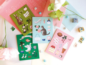
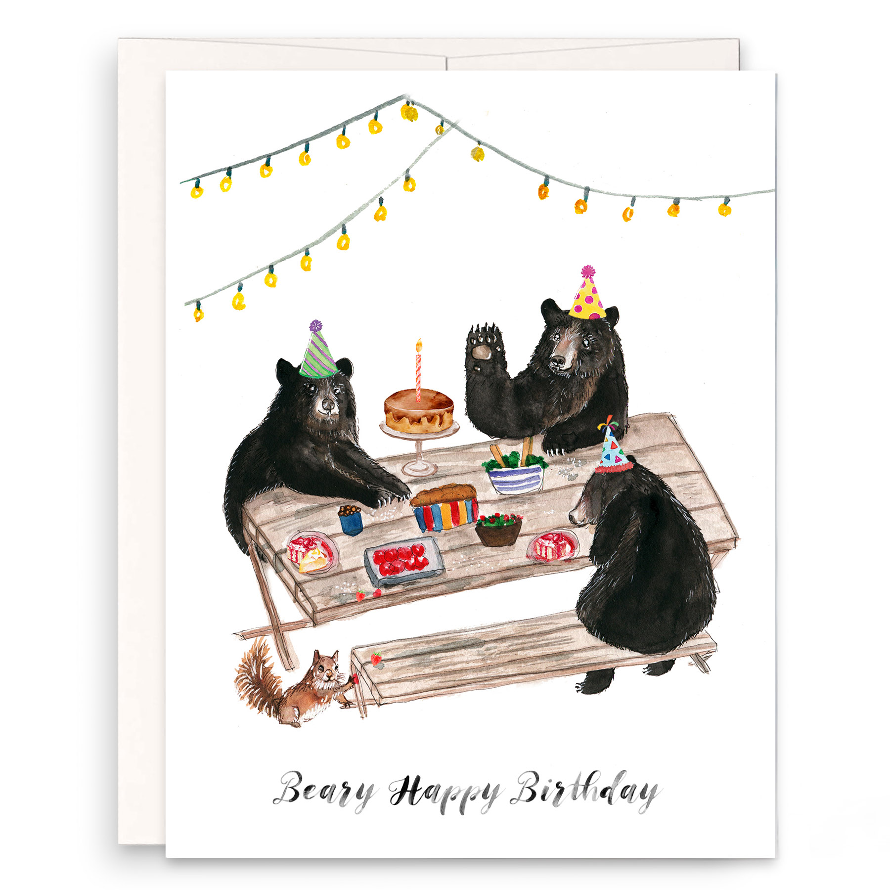
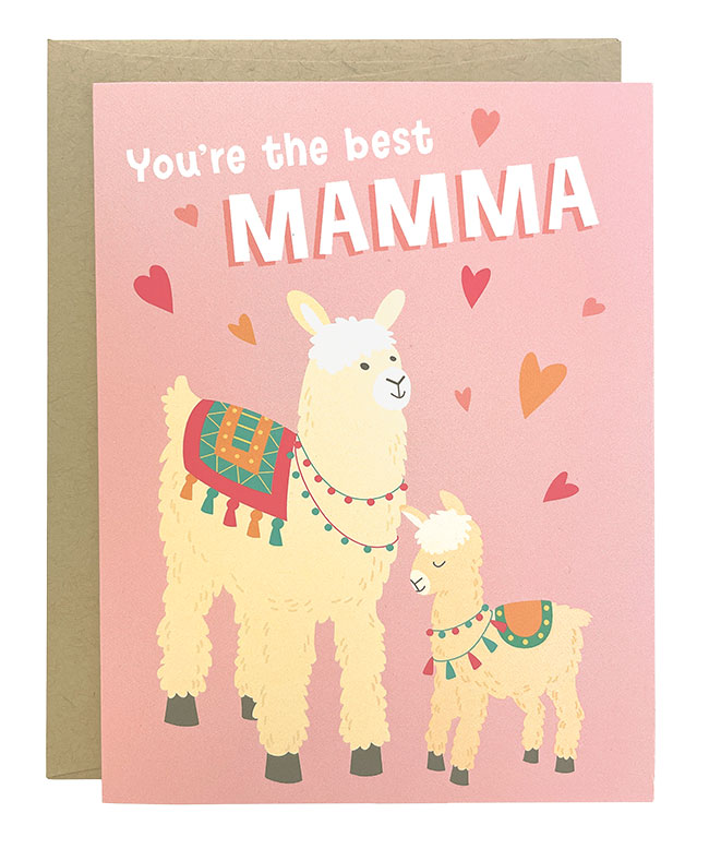
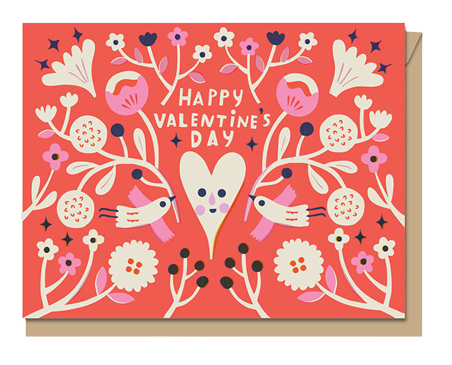
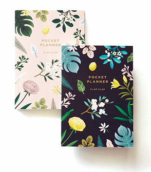
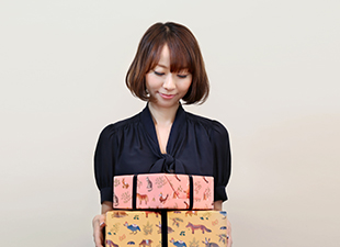
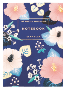
Signature Style: These whimsically illustrated flora & fauna are unmistakably the work of Mimi Kim of Clap Clap.
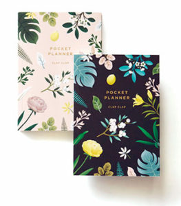
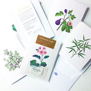
New for 2016: Look for new additions to Clap Clap’s scented card series, as well as its very first planner.
Personal Favorite: The Hibiscus Notebook in blue was difficult to print, but well worth the effort.
inspiration board:
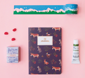
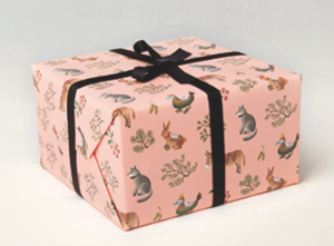
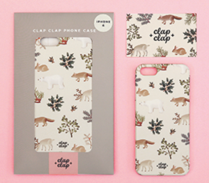
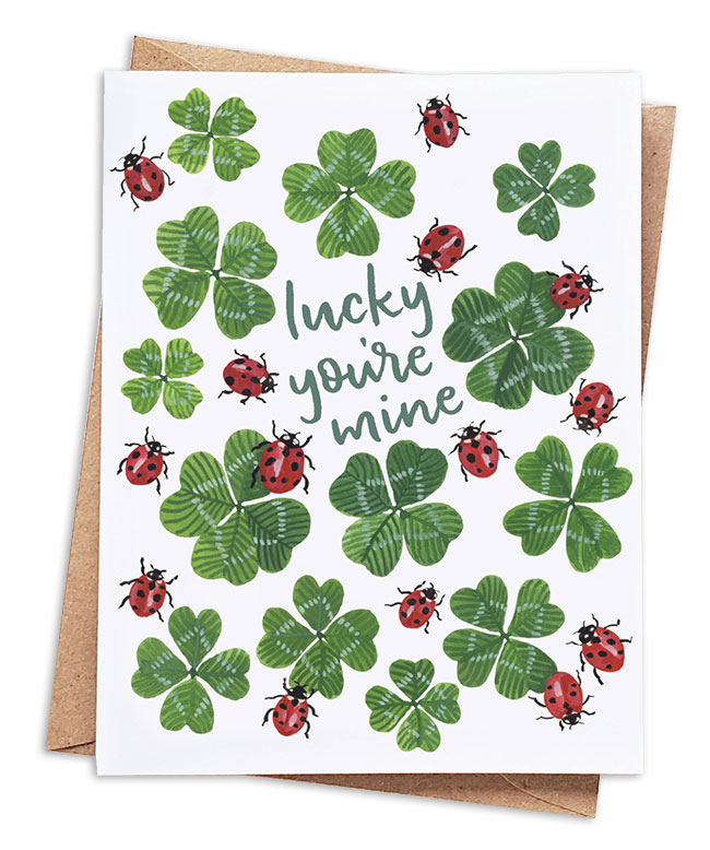
Direction of the Line: Floral and animal patterns tend to be the most popular — and best represent the overall Clap Clap aesthetic.