

Features
February 12, 2019 •
Path to Success
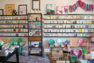
Designing your retail store’s interior is both an art and a science that requires artistry, psychological insights and a little bit of testing. How you organize things can tell your brand’s story, create an immersive shopping experience and set you apart from the competition.
Here are some of the basics when it comes to creating effective retail interiors that attract more customers to your store, get them browsing for more products and encourage them to head toward the checkout.
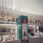
The “Right” Point of Entry
The threshold area, also known as the “decompression zone,” typically consists of the first five to 15 feet worth of space when they enter your store. It’s here that shoppers make critical judgments — like how well coordinated your lighting, fixtures, displays, and colors are — and what kind of products you offer. Since they’re transitioning from the outside to the inside, customers are more likely to miss any product, signage, or carts you place there, so make sure your best-sellers are located further along in the store.
From there, it’s off to the right. Why? In North America, 90 percent of consumers unconsciously turn right when entering a store. The first wall they see — the “power wall” — acts as a high-impact, first-impression vehicle for your merchandise. You’ll want to make sure you capture your customer’s attention with the products you put on display — whether it’s your new or seasonal items or high-profit or high-demand products.
Walking the Path
Knowing that most North American customers will naturally turn right, your next job is to make sure that as they do, they also continue walking throughout your store to gain the maximum exposure to your products.
Many stores use a counterclockwise path to get customers to walk through to the back of the store and come to the front again, exposing them to more products along their path. You can even get creative by covering the path with a different texture or look from the general flooring, as “where the eyes go, the feet will follow.”
Remember that you want to use the path to lead your customers somewhere, so consider putting an eye-catching and attention-grabbing display at the end of your aisles.
Create Speed Bumps
While you want to create a good flow in your store, you don’t want customers to rush by your displays and merchandise, so now it’s your job to stop them by creating “speed bumps.” These are essentially anything that gives customers a visual break, whether that’s done through signage or special display fixtures featuring products near the end of or in between aisles. The goal is to complement products on display in close proximity while encouraging impulse purchases.
It can help to think about grouping products in a way that makes sense from a shopper’s perspective. Higher-demand products should be displayed at eye-level, while lower-grossing products should be placed at the bottom or above eye level. And remember to change up these speed bumps regularly to create a continued sense of novelty for repeat visitors.
Ensure Appropriate Product Quantities
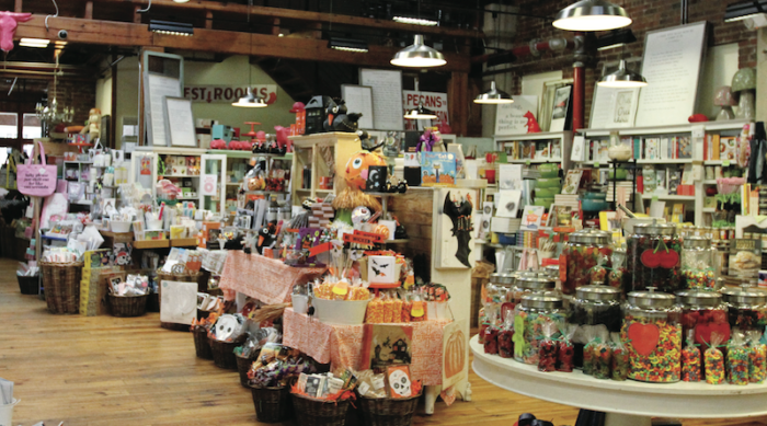
The question of how much merchandise to have on display is an important one, and there’s no easy answer. On the one hand, having more products on the sales floor has proven to increase sales. On the other, having too much merchandise out can make your store feel cluttered and lead to a decline in brand perception, especially if you position yourself as a boutique or high-end retailer.
The bottom line? The amount of product you display will depend on the size of your shop, how you want to be perceived and the type of experience you want to create.
Packing your shop with merchandise could be a good strategy for you if you’re a discount retailer who wants to make the most out of your store space. But if you’re a high-end boutique, it’s best to put a few select items up for display and keep your selection curated.
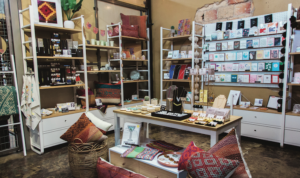
Leave Space Between Products and Fixtures
It’s fine to have shelves that are packed with merchandise — if that’s your goal — but you also still want to give your customers their personal space and avoid the “butt-brush” effect. Simply put, this is where shoppers abandon a display or product they’re looking at when they’re bumped once or twice from behind.
People don’t like being brushed or touched from behind, and will even move away from merchandise they’re interested in to avoid it. This means it’s your job as a retailer to ensure that your aisle, floor, and displays allow customers to have more than adequate personal space when shopping.
Check Them Out
Last but not least is the all-important checkout counter. It should be located at a natural stopping point in the shopping experience that you’ve purposefully designed. If you find customers turn right upon entering and continue counterclockwise, the front left is probably the ideal location for your checkout counter.
It’s important that your counter is big enough for shoppers to place their bags and/or personal belongings, and the wall behind the counter is a great place to create interesting and engaging displays. Encourage impulse purchases by stocking items customers commonly need close by.
Measure Your Efforts
Organizing your store to maximize the shopping experience — and sales — is a process of trial and error. Walk through the store yourself and see where your eye takes you, and get staff, friends and family to do the same.
Don’t forget to observe your customers and see what they’re drawn to, what they avoid, and how they move throughout your store. Take those cues and match them with your intended design. By keeping your eyes and ears open, you’ll be sure to create a retail design that’s a win-win for both you and your customers.