

Designer Profiles Sponsored
August 30, 2021 •
Maker’s Corner: E. Frances Paper
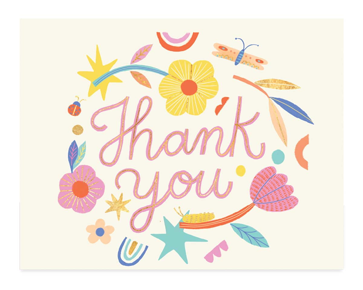
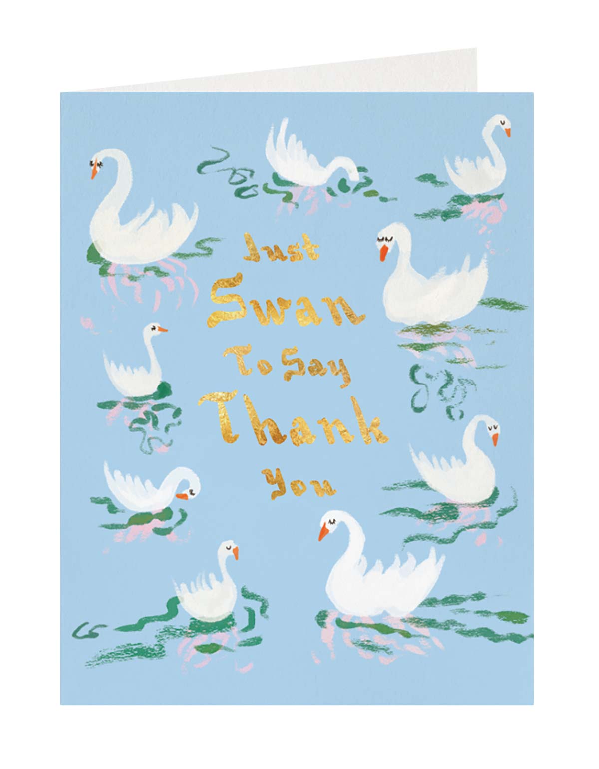
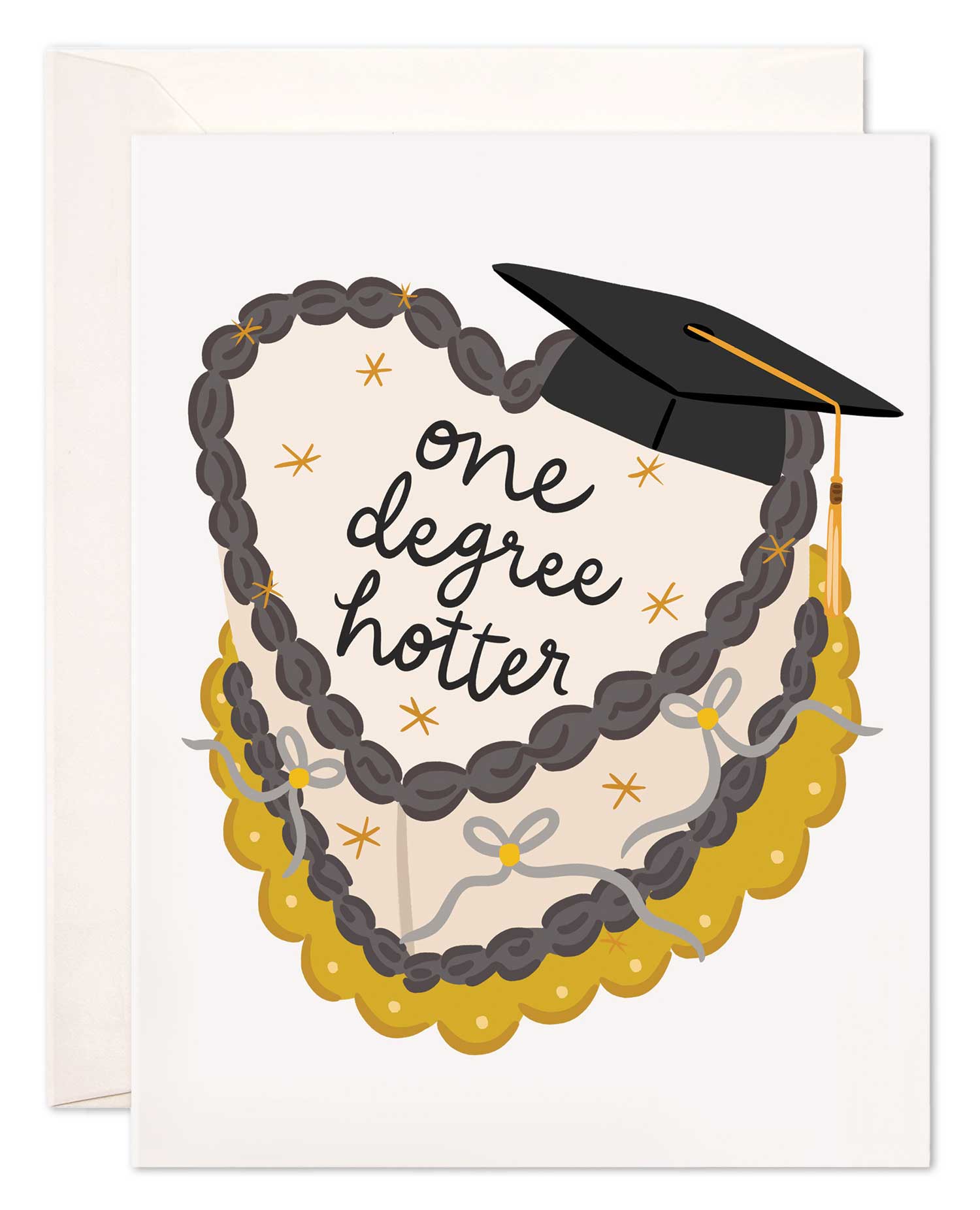
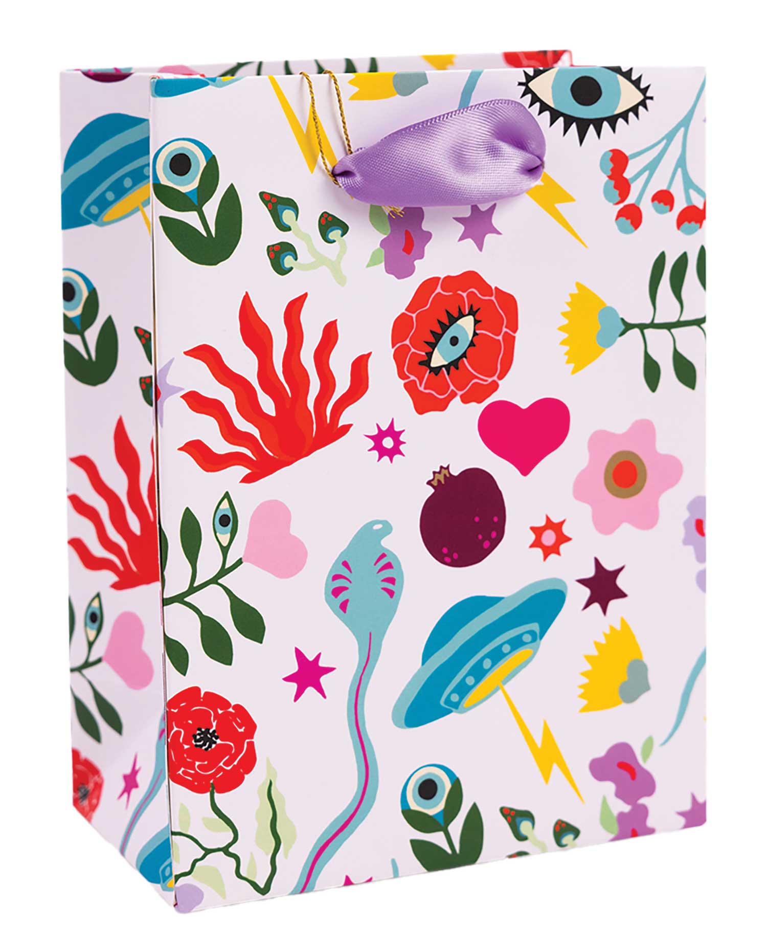
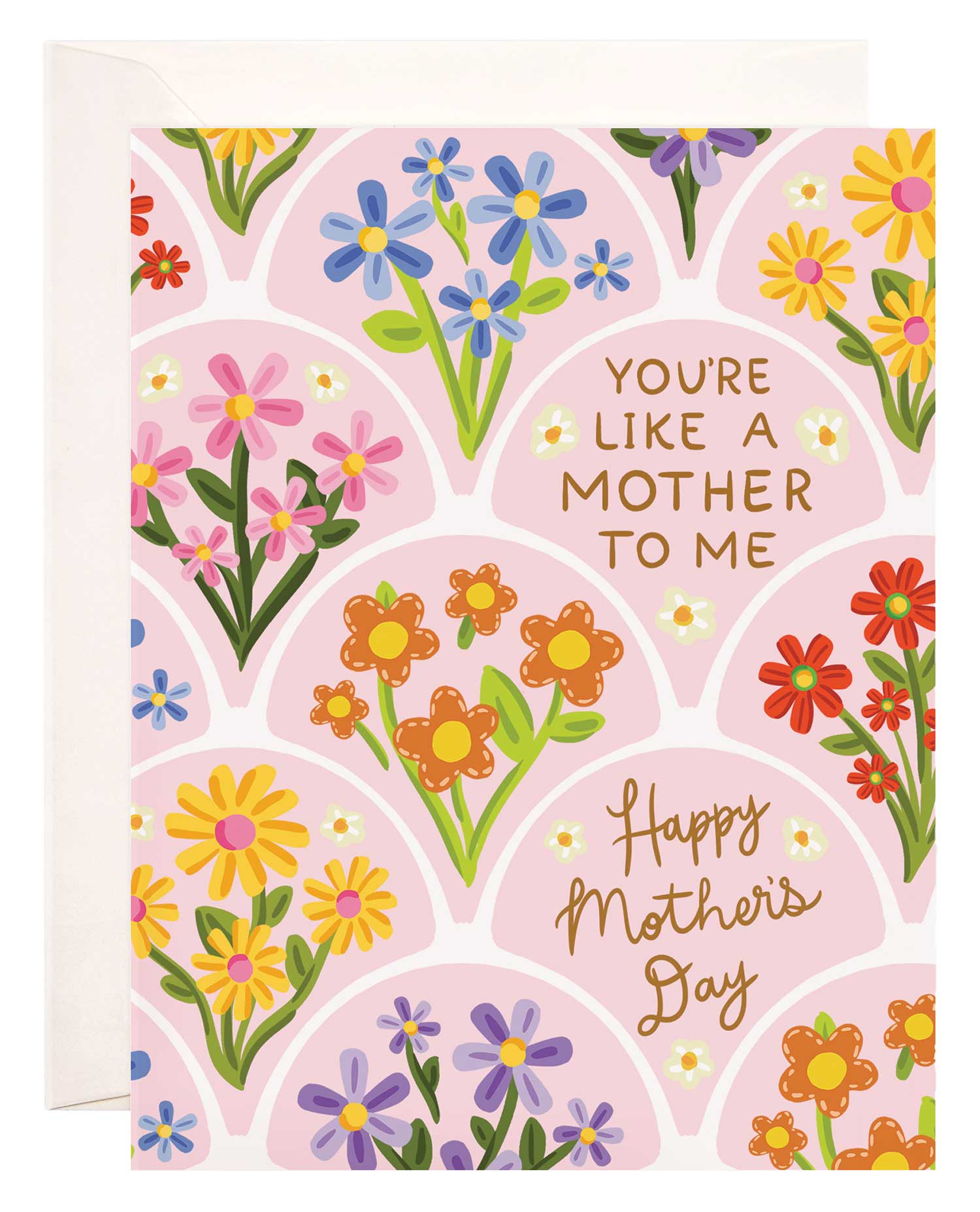
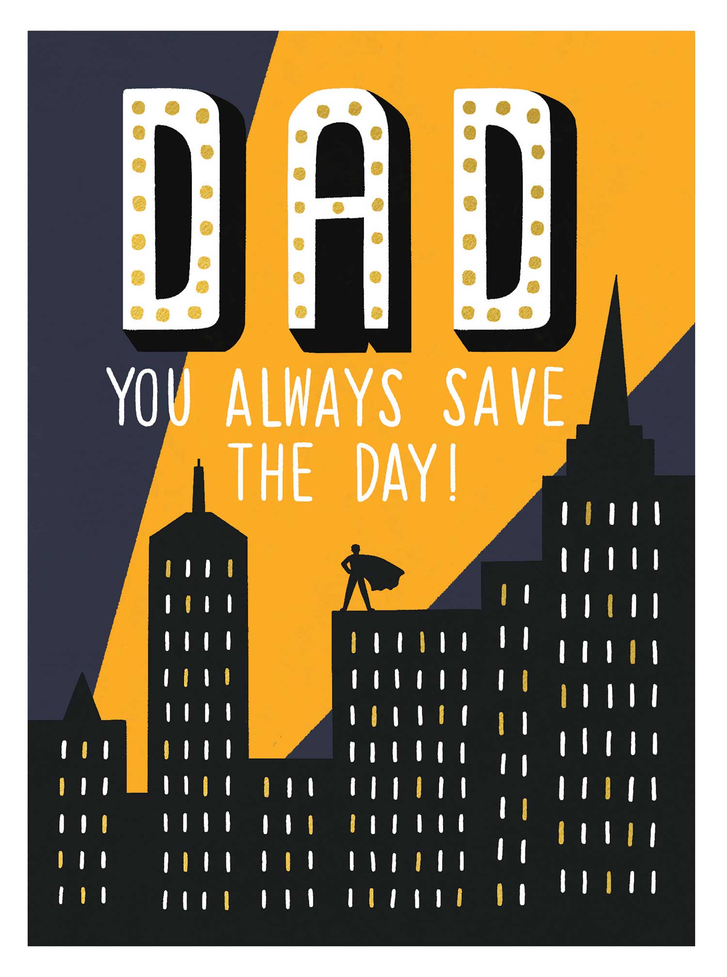
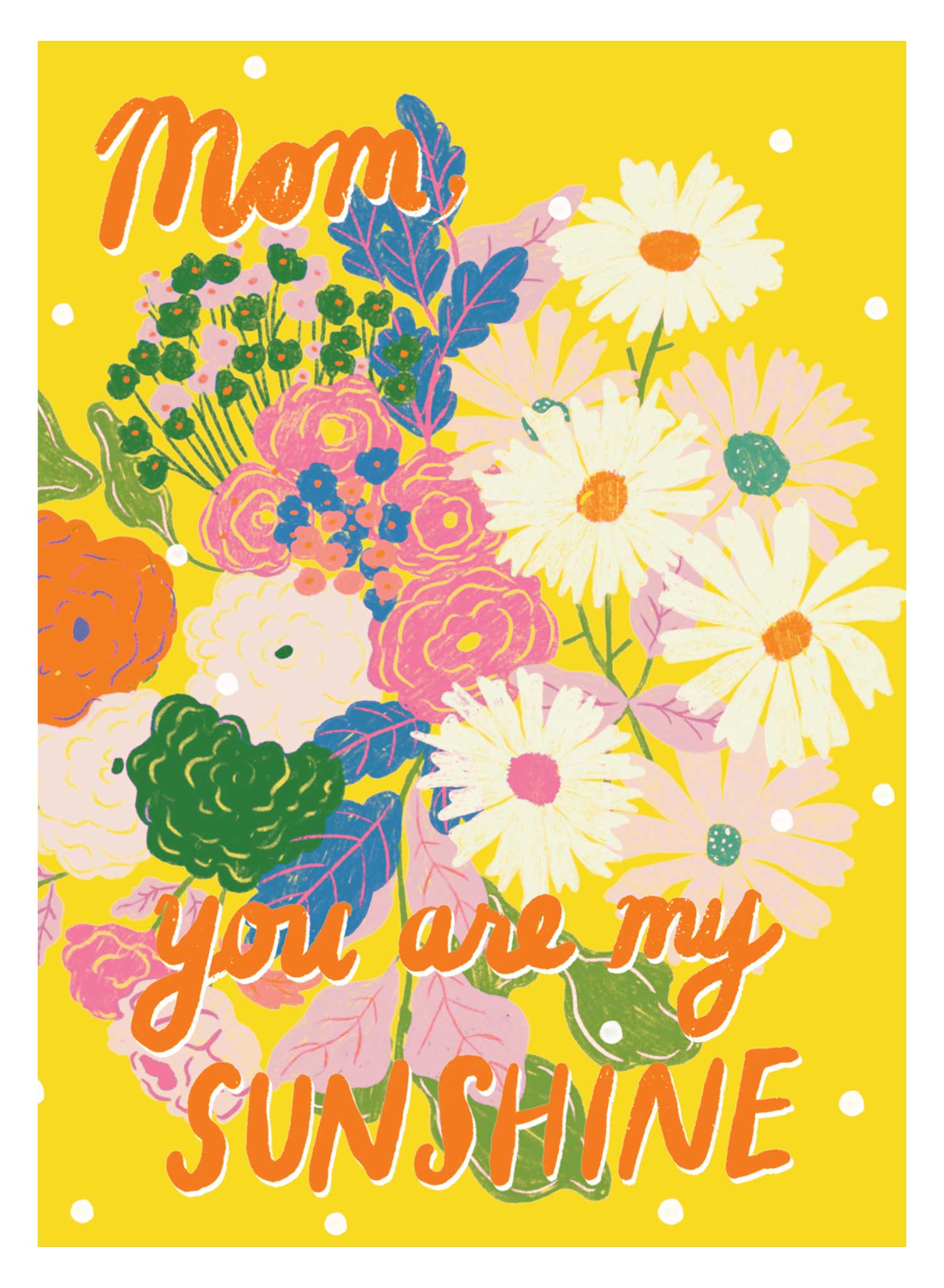
{Sponsored} When we asked Jenni Laundon, co-founder of E. Frances Paper, to describe her sister Ali Flippin’s art, she called it “beautiful, cute, clever and not generic. We call it ‘prute’ — pretty and cute.” Flippin’s art adorns every single card in the E. Frances line, a collection of cards with watercolor designs full of whimsy and imagination. Bears in underwear, a panda bear on a pogo stick, anthropomorphic food (hotdogs hugging) — Flippin’s aesthetic includes creative ideas as well as traditional designs and blocks of bold colors. The captions are even more clever, but who are we to spoil the delight of reading the cards for the first time?
The line is designed to forge connections between people; finding a card that speaks to you and reminds you of a friend is the perfect excuse to send a piece of joy in the mail.
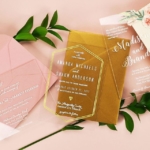
Before the recipient reads the caption, though, they take in the envelope. They scan the return address, hoping for a clue, feel the texture of the paper and its thickness, see the color and it evokes a sense of adventure and excitement; after all, what could be under that opaque paper sheath?
When E. Frances was started by sisters Ali and Jenni in 2013, they didn’t know what would happen. While the envelopes their cards were inside were brightly colored, they were also expensive, too varied, and not ideal for inventory management and cost control.
These days, their team and collection are both much bigger, and their need for the right envelope in a few targeted colors is much clearer. Their cousin Pippi rounds out their “three-legged stool” in leadership as the chief operations officer. They’ve also started a new relationship, working with Leader Paper, to create the perfect envelope style for the whole line. The style has a European flap, deeper than grocery store card envelopes. Outside of a few boxed cards, all of their cards and envelopes are the same size, making it easier to stock them.
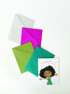
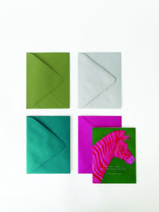
“We use a really nice thick, beautiful watercolor stock (for our cards) and want the envelope to be really high end to match,” Laundon said. They test the stock to ensure it’s nice to write on without any smudging before choosing their new envelope or with any new stocks that come along and aren’t looking back to the old envelopes. Their cards go in one of four envelope colors: cape cod gray, green, bright fuchsia or red, so it isn’t a big deal if they need to switch to a different color if they run out of one.
Laundon works with Sue Charlier, Leader Paper’s greeting card expert. “Sue is my favorite vendor to work with,” Laundon said, “I feel like I can email her and she knows my company, which is a crazy good feeling to have. Leader is a huge company, so to have that personal feeling is awesome. She makes me feel like her only customer,” Laundon continued.
With a reduction in the number of colors of envelopes after switching to working with Leader Paper, E. Frances has an easier time with inventory management and control, reordering and pricing. Ultimately, since the envelope is the first impression that people receiving cards have, it is a detail that has to be right.
© 2021 Leader Paper