


Features Industry Profiles
January 14, 2020 •
An Attitude of Gratitude
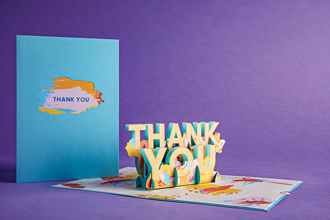
Lovepop’s quartet of cards delivers enormous thanks.
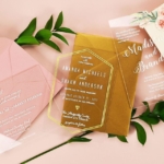
Lovepop is widely known for its intricate laser-cut pop-up cards designed on ship-building software and then handcrafted using the ancient art of kirigami. The act of opening one is nearly magical, as most recipients are not expecting to witness a complex scene or object spring to magnificent 3D life as they open the envelope. But recently the Boston brand took a sharp style turn with the unveiling of its Thank You Collection, in which the words themselves play a starring role.

“Though many of our designs can function as thank-you cards, most are playful or romantic and have no text,” explained Designer Michelle Pechar. “But the difference in text- versus image-focused designs is the emphasis on the recipient’s ability to easily read and understand the sculpture.”
I interviewed Pechar about the challenges this quartet of designs posed as they were being engineered into paper life.
ST: How did the concept for these cards arise?
MP: The design started as an idea from our business partners; we received several requests (for) creative thank-yous with a simple message. (Producing designs that would) fit any professional or personal relationship, while still meeting our standards for excellence, (required) a completely different approach.
ST: Did the engineering process differ since you were using words as opposed to images?
MP: It definitely did. Usually, engineering an image will have more leeway in the design process in terms of finding the right properties. (For these), at first, the engineering process was the same as always. The designer blocked out the initial shape that they wanted the sculpture to be and then carved away at it. When adding the letters to the initial shape, the designer had to make sure that they were not only legible, but also specific widths so that the sculpture would be structurally sound in assembly.
ST: Can you describe the process through which the four themes were created?
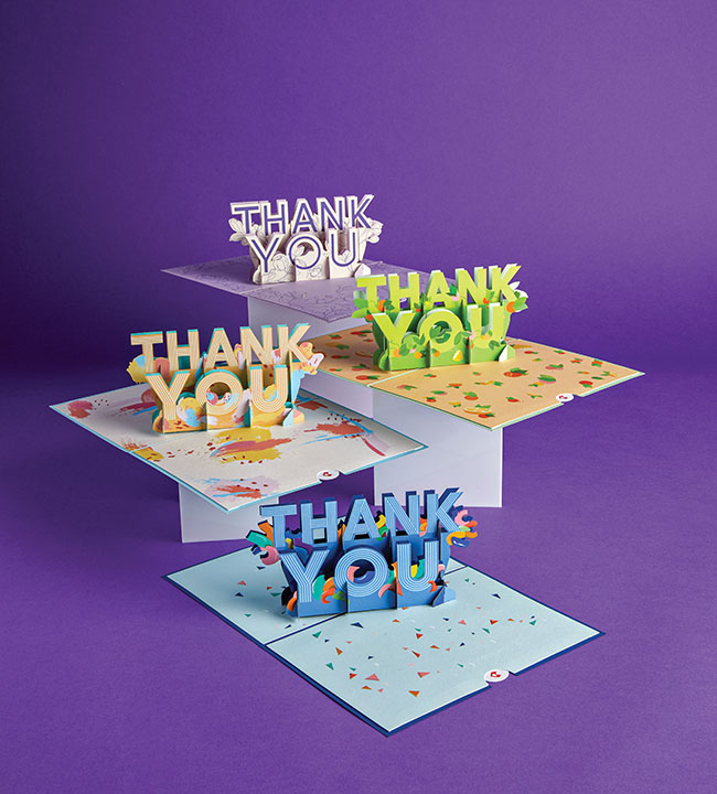
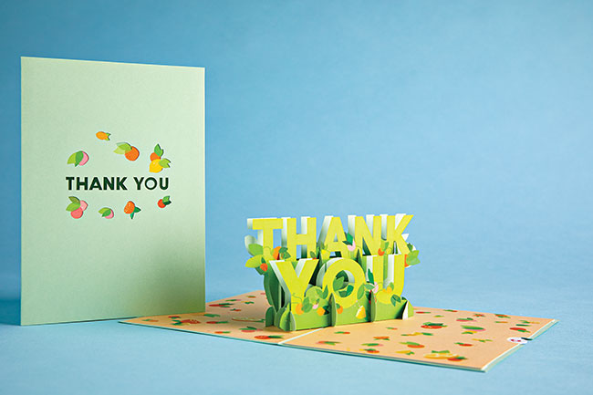
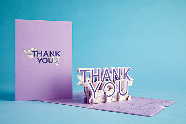
MP: Confetti Thank You was the first of the designs, created with our business partners in mind. There was quite a bit of concepting done before we aligned on Confetti, so we had several other ideas to choose from when we decided to offer additional varieties. Floral, Fruity, and Artistic Thank You reflect the designers’ own gravitation towards bright colors and expressive patterns. And each are a fit for many different relationships and styles, no matter what you’re expressing gratitude for.
ST: What obstacles did you encounter during the engineering process?
MP: These designs had to be approached with the mindset of both a 3D and a graphic designer. One of the biggest obstacles was finding the right way to design the message. There were a few prototypes where the designer experimented with how the text would be read.
ST: How do you recommend retailers merchandise this collection?
MP: As we do with all of our cards, we recommend retailers display these cards open to showcase the beautiful sculpture within. There is a very clear use for these, so the best way to sell them is to ask the customer about the personality of the recipient. Are they an artist? Do they like flashy colors? Are they low key and relaxed? Once (you) have that intel, (you) can suggest the best design.
ST: What kind of feedback have you gotten so far?
MP: The feedback has been overwhelmingly positive. From the construction to the creativity of the colors and patterns, we have created long-time Lovepop customers with these! As a society, we should be sending thank-yous more often than we do, and these allow people to express their gratitude uniquely. Many customers have shared that “they” have been thanked for their thank-you, which rarely ever happens. It’s the little extra touch that people want and need, and we’ve received several requests for additional designs of this kind.
ST: Does that mean you’ll update this range?
MP: We plan to continue to create designs with messages as the sculpture and focal point, both in our standard Lovepop cards and notecards for new occasions. Stay tuned!


0 CommentsComment on Facebook