


News
June 13, 2019
Paperworld trends for back-to-school 2019-2020
Paperworld trends are a highlight at the international stationery, office supplies, and writing materials trade fair, where the latest trendy colors and designs on the basis of selected exhibitor products are on display. The trend worlds inspire manufacturers and dealers alike. Designer Claudia Herke from the style agency bora.herke.palmisano provides tips on how a trend theme be implemented in a store.
At the beginning of summer, many stores for stationery, office supplies, and writing materials are faced with the task of decorating their outlet for the school season. In many cases there are additional satchel promotions and other special events for school starters. This requires a lot of creativity, as the display window should look different every year and attract customers’ attention. Retailers may gain inspiration from Paperworld trends.
Trends in Pattern and Color
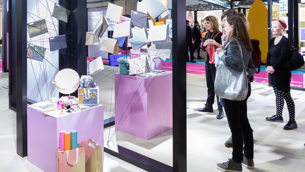
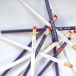
The “graphic + particular” trend world combines a wide variety of patterns with graphic color combinations, giving the theme of gift-giving, packaging, and writing a special touch. Characteristic features here are halftone prints, perforations, grid structures, prints and collages.
Mint blue, mandarin, rose, taupe and intense anemone blue characterize the refined color range, with black and white also providing graphic highlights. The trend also features a modern touch by the metallic sheen of gold, bronze and colored aluminum.

“The trend is defined by patterns and colored areas, which attract attention and can be implemented particularly well in shop window displays,” says Claudia Herke, designer at bora.herke.palmisano style agency.
Eye-catching Shop Window Display
Claudia Herke provides tips for creating attractive showcase designs that suit the back-to-school theme but also appeal to students with the latest color trends: “The shop window design is based on geometrically stacked cubes that reflect the trend colors. School satchels or other stationery products can be attractively arranged on them. The individual cubes are stacked on top of each other in a staggered formation resulting in columns of different heights.”
For stores with a back wall to the window space, Claudia Herke has an additional tip: “This wall should be kept as neutral as possible so the products come into their own. Don’t be afraid of a plain surface, it really emphasizes the colors in the window display. Or you can span black rubber bands over a white surface to accentuate the geometric component of the ‘graphic + particular’ trend. Binders, files and folders can be integrated into the spanning as decoration.”
For a design variation open to the retail area, files and folders can be hung from the ceiling on cords. The color range is varied, with a high proportion of pastel shades, so the decoration should not be too playful. “The trend radiates a simple elegance and the colors are suitable for both girls and boys. These airy light shades are also very popular with teenagers and students. In combination with graphic patterns in black or gold, they are the mega trend of the summer,” says Claudia Herke.
The style agency bora.herke.palmisano was commissioned by Messe Frankfurt to design the trend area at Paperworld 2019.


0 CommentsComment on Facebook