


News
September 12, 2017
Pantone Color Institute releases spring 2018 Fashion Color Trend Report for New York Fashion Week
Pantone LLC, an X-Rite company and the global authority on color and provider of professional color standards for the design industries, today announced the PANTONE® Fashion Color Trend Report Spring 2018 edition for New York Fashion Week. Published for the fashion industry by the Pantone Color Institute, a trend forecasting and color consultancy, the report features the top colors we can expect to see from fashion designers on the runway for the upcoming spring collections.
With the use of color gaining in importance, the PANTONE Fashion Color Trend Report Spring 2018 edition features the top 12 colors for men’s and women’s fashion, highlighting a more multi-faceted color story that expands the opportunity for self-expression. For the first time this year, the report also includes four classic colors, which transcend seasons and provide structure to any wardrobe.
“As consumers continue to embrace color, designers are recognizing the need to show more color in their collections.” says Leatrice Eiseman, Executive Director of the Pantone Color Institute. “In order to reflect the consumers’ ongoing fascination with color, we broadened the direction for Spring 2018 to show where hues are headed by including 12 outstanding call out colors as well as four spring classics.”
Along with this recognized freedom to explore and experiment with more color, experts at the Pantone Color Institute note that fashion, and the people who interact with it, no longer want to limit themselves by following traditional color guidelines. Untypical spring shades that make for complex and original combinations expand the opportunity for self-expression and communicate the consumer desire to experiment with color all year round. The palette for Spring 2018 is a perfect reflection of this new sentiment.
About the Spring 2018 NYFW Color Palette:
“The color palette showcases an appreciation for the complexity and distinctiveness of color and the expression of it, which is something that evolves and can be played with,” said Eiseman. “Consumers need more variety, and this expanded palette embraces the lack of gender and seasonal borders we are seeing within the fashion industry.”
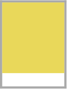 PANTONE 13-0646 Meadowlark The bold and lively Meadowlark, a confident and outgoing bright yellow shade highlights the spring 2018 season, glistening with joy and illuminating the world around us.
 PANTONE 17-1563 Cherry Tomato Impulsive Cherry Tomato is a tempestuous orangey red that exudes heat and energy. Demanding attention, this courageous, never to be ignored shade is viscerally alive.
 PANTONE 16-4132 Little Boy Blue With the expectation of the clear blue sky, Little Boy Blue is no longer for little boys only. Suggestive of expansiveness and continuity, this azure blue shade reassures us with its promise of a new day.
 PANTONE 18-1440 Chili Oil
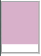 PANTONE 14-3207 Pink Lavender Pink Lavender is a soft and romantic violet rose that charms with its soothing sense of quiescence.
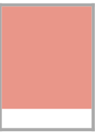 PANTONE 15-1520 Blooming Dahlia With its seemingly suggestive scent, the subtly alluring Blooming Dahlia beckons us with its understated appeal.
 PANTONE 16-5533 Arcadia
 PANTONE 18-3838 Ultra Violet Conveying originality and ingenuity, the magical Ultra Violet is a distinctive and complex purple shade that fascinates and intrigues.
 PANTONE 18-1028 Emperador
 PANTONE 12-2103 Almost Mauve With its gentle petal like touch, delicate and ephemeral Almost Mauve adds a sense of nostalgia to the spring 2018 palette.
 PANTONE 17-3020 Spring Crocus Witty and expressive, Spring Crocus is a flamboyant and tantalizing fuchsia shade that summons you in with its beguiling charm.
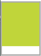 PANTONE 13-0550 Lime Punch Sharp and pungent, Lime Punch hits a chord with its strident and striking citrus like presence in the spring 2018 color palette.
About the Spring 2018 Classic Color Palette:
For many consumers, classic color is the mainstay of the wardrobe and the foundational core upon which they start building their own personal style. “We want to reflect consumers’ increased desire for color, and felt that if we included these core basics into our top color call outs, we would be forced to limit the number of colors we thought deserved special attention,” said Eiseman. “At the same time, the core classic shades play a critical role in any wardrobe, and we also want to highlight the nuance of these classic colors for the spring 2018 season.”
 PANTONE 19-4034 Sailor Blue
 PANTONE 14-4202 Harbor Mist A mid-tone dove gray, Harbor Mist solidifies the spring 2018 palette.
 PANTONE 15-1214 Warm Sand Warm Sand is a comforting neutral shade that effortlessly connects the seasons.
 PANTONE 11-0608 Coconut Milk


0 CommentsComment on Facebook