


Features
January 30, 2025 •
‘My Atlanta Top 20’: Sarah Schwartz unveils standout finds from Winter 2025 Atlanta Market

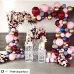
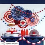
Greetings all from the glorious AmericasMart Atlanta. I am not there currently, but its winter market permanently owns a piece of my heart. No January is complete without an extended visit through its signature sprawling halls to discover the design wonders within, one after another. As an added bonus, all that brilliant merchandising lends itself to clever selfies, like this one from the Ivystone showroom, snapped amongst a sea of fabulous Hazel Mazel offerings.
I found a lot, so I’ll run through giftier finds first, then get to cards. Everything’s alphabetical, and I’m planning on generating similar coverage when I tackle NY NOW and Shoppe Object this February (AKA, later this week!).

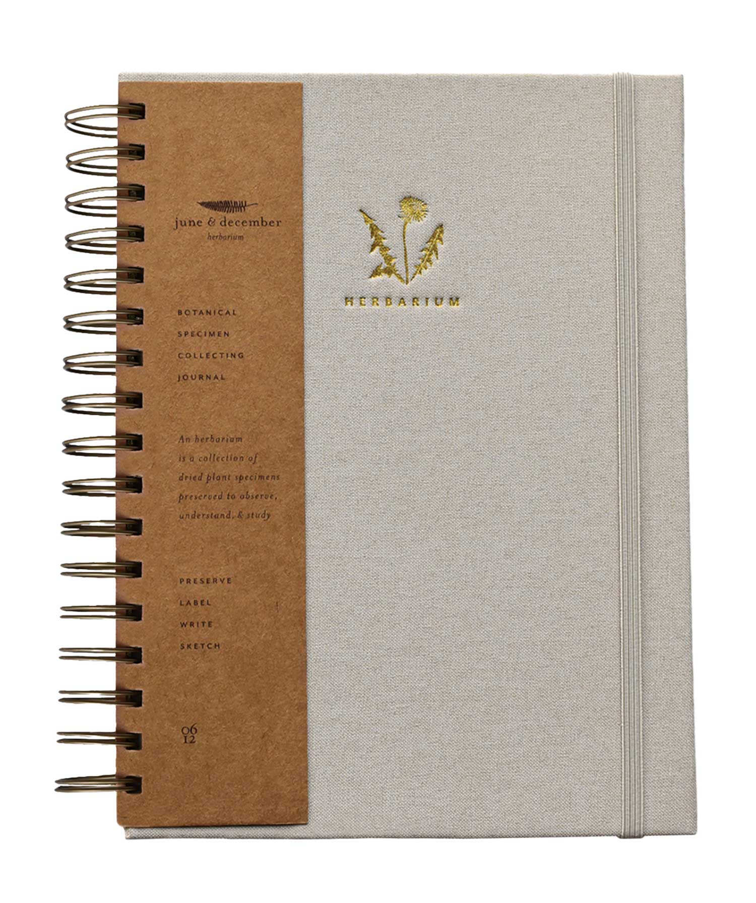
Chez Gagne. If you don’t regularly keep a journal, you will want to after you see these. If you do already journal regularly, all others now literally pale in comparison.

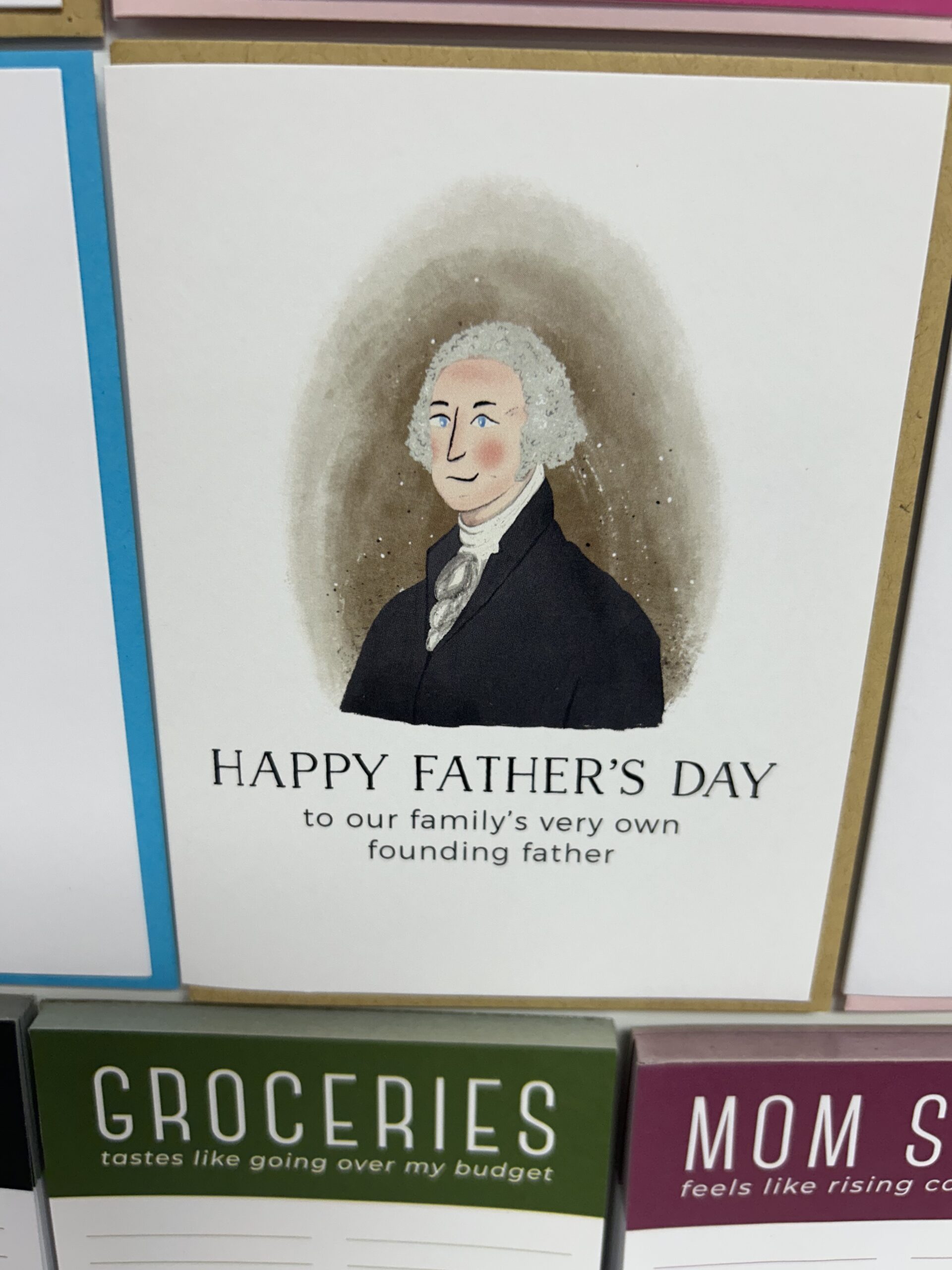
Colorbox Design & Letterpress. This Texas brand’s Charcuterie Cheat Sheets struck a collective hostess nerve — and accordingly come in several themes including Mardi Gras, Boot, Cupcake and Flag as seen above. Based on the above as well as other sights throughout Atlanta, I’m predicting an artisanal July Fourth ‘25, full of original, heartfelt takes on Old Glory and other American icons.

Furbish. This brand’s quirky needlepoints put it on the design map — but everything needs a glow up every now and again. Witness, then, its new hook pillows: They have all the polish, pattern and color of their needlepoint counterparts (which continue to be released as well), but with a recession-friendlier price.
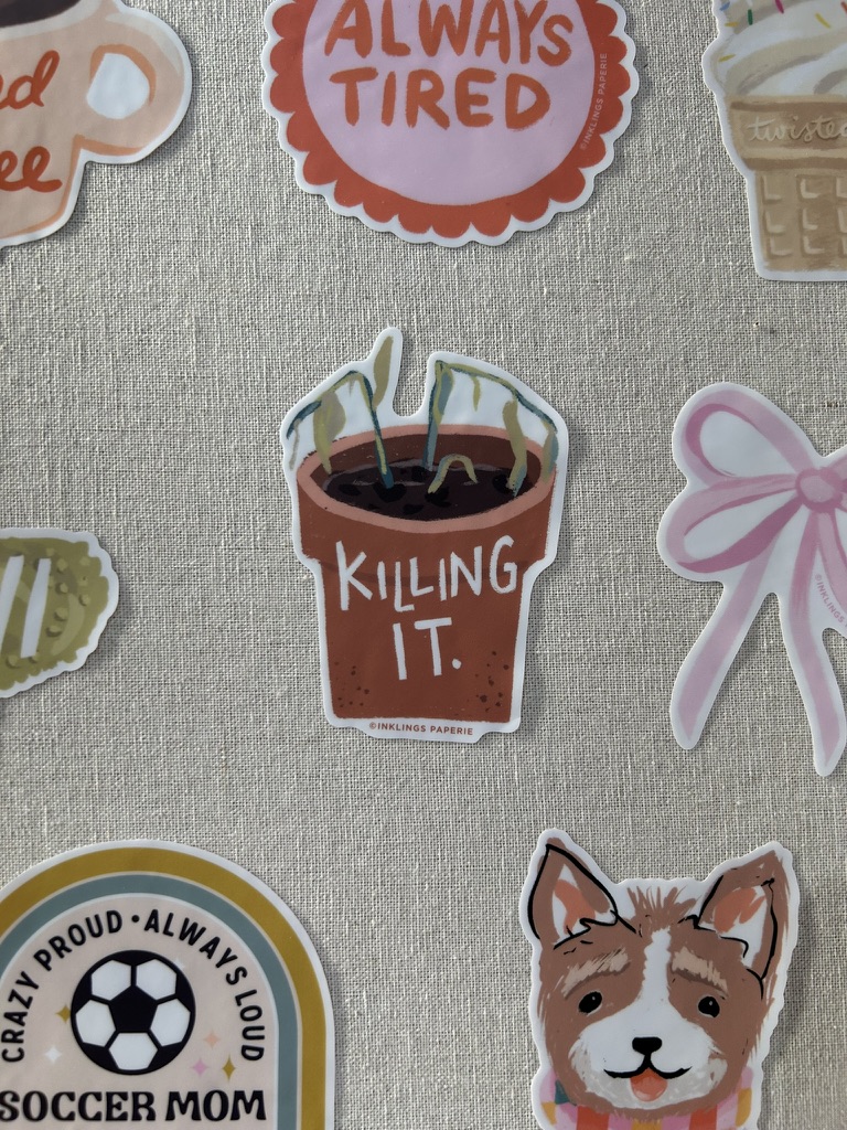
Inklings Paperie. Most of us think of this Michigan brand — as well as Lindsay, the marvelous maker behind it all — as uniformly positive and upbeat, and most of the time, both of them are. However, Lindsay shared at market that the vibe of Stinklings (as she has dubbed Inklings’ snarkier side, but do note, this is *not* an actual brand intro) is showing its face here and there. The mixture of salty and sweet is most intoxicating!

Laura Kelly Designs. Her upbeat bumper stickers became as ubiquitous in the suburbs as the minivans on which they were placed. Now this dynamic designer is back with a cheery range custom tailored to our times via homey icons and upbeat messaging.
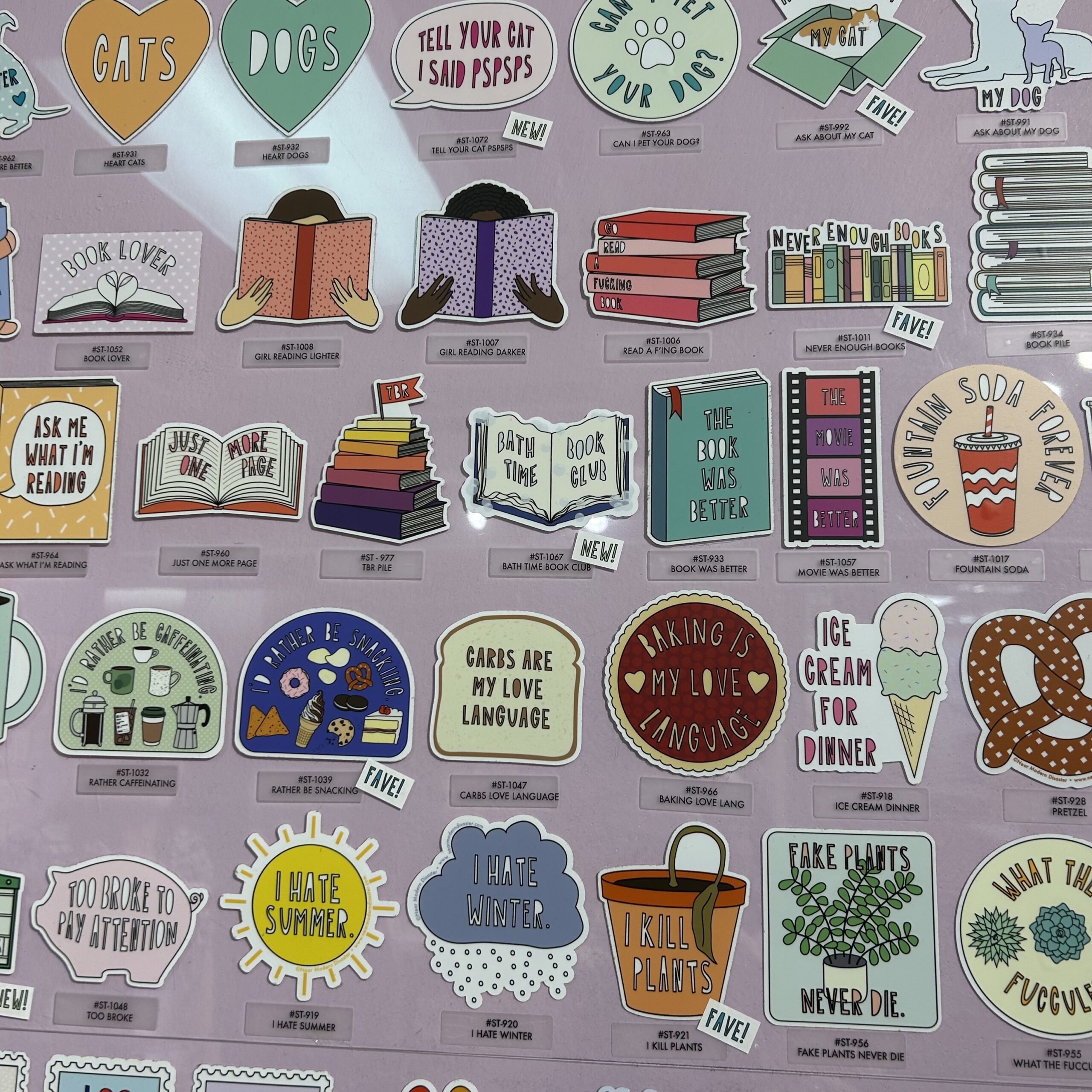
Near Modern Disaster. While this female-founded house of paper also introduced sticker sheets — a bona fide trend in itself — Sam’s single-serve offerings provide an engrossing glimpse into the more edgy, elevated end of this segment.

Saint Austin Company. The extra, hyper-rounded inch on top of these paperweights somehow works magic on the images within, exaggerating and diminishing them depending on angle. Thus each is a sheer joy to hold and marvel at — especially when you are supposed to be doing something else. These are deskscape musts for 2025 (and beyond)!

Snifty. It’s such a joy to not just discover sustainable papers in the wild at Market — these snazzy sheets are made of stone! — but to also see them presented so cleverly, appealing to every age for different reasons.

Seedlings. Check out that cool undulating line on the plantable envelope of the Sprouts gift enclosure from Seedlings. Carlos explained to me that they realized that since gift enclosures aren’t mailed, they don’t require a traditional envelope. The die-cut on the envelope engages with the card image and copy, and can be presented facing front or back for flexibility and fun.

The Gift Wrap Company. Smart messaging meets on-trend illustration meets clever embellishment meets luxe ribbon detail in this extensive gift bag introduction. Just like a great gift, there is so much more going on than initially meets the eye.
The Atlanta Card Deck
Picking a Top 10 from all the divine card designs I saw was no easy task — but these were too good not to share!

Anne Taintor through Boston International. Recently, I found myself wondering what Anne has been up to — turns out, she’s been generating topical and timely (yet still appropriately retro) designs!
Barone & Co. There is just something simply irresistible about the colorful, dynamic compositions that spring from the vivid imagination of longtime licensing artist Vicky Barone. Debuting in the GCA Village, her self-named range seamlessly blended modern messaging and moods in greeting card form.
Drawn Goods. Creating a range that’s enchanting and edgy while tipping its hat to the latest vernacular is not easy, Becca Gore just makes it look that way.

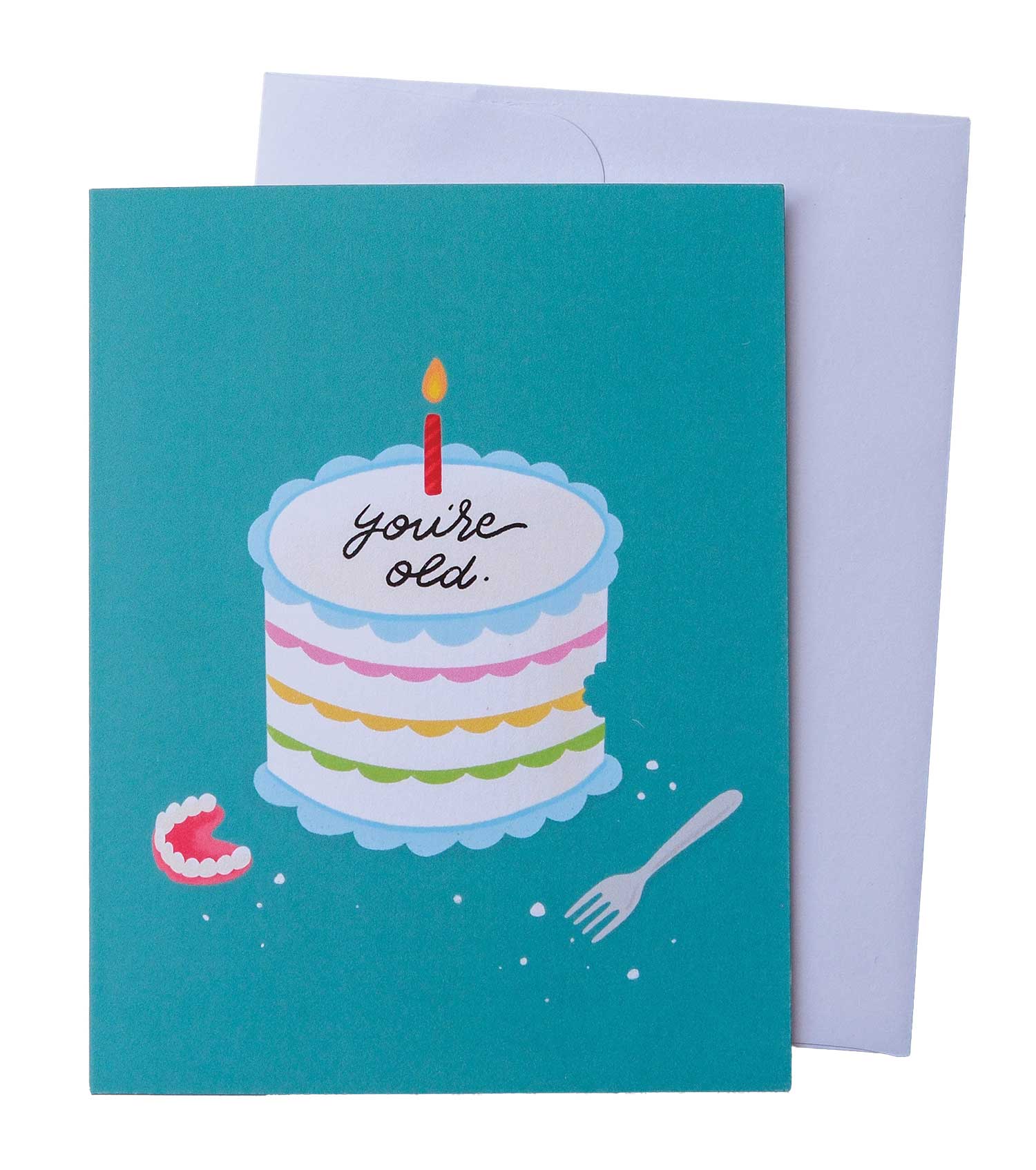
J. Falkner. Only Jason could turn a quote from the not-so-hip Norman Vincent Peale into something so fabulously hip! The unexpected color palette, the delicate gold foil edging on the butterfly wings, that cerulean blue envelope — all unite to make being anti-ageist great again.
Jones Street Press. Also found in the GCA Village, this Atlanta female-founded brand never disappoints! Her fresh, funny perspective always feels new.

Little Lovelies Studio. You would have to be illiterate (as well as blind) to miss the book theme running through market. My favorites put a clever spin on literary messaging and layout, right down to the spine.

Redback Cards. Remember that interesting undulating line on that Seedlings gift enclosure? Here we see a version of it again on this truly dazzling design from Redback Cards, illustrated by Rhi James of Hebe Studios. That sunny yellow envelope is the proverbial icing on the beach cake!
Stannie & Lloyd. This brand new, slightly mysterious range, sourced in Daniel Richards, describes itself as “a publisher of stylish stationery, proprietor of charming confections and chandler of fine perfumed candles.” Fancy description aside, that image beneath the branding — of a white and Black woman toiling over an envelope-book desk, heads touching beneath floral crowns — speaks directly to the modern female stationery consumer.

That’s So Andrew. Billed as being for “the girls, the gays and the theys,” this brand is the stationery equivalent of that brilliantly perceptive (yet frequently inappropriate) person you want to sit next to at the party (not unlike Andrew himself!).
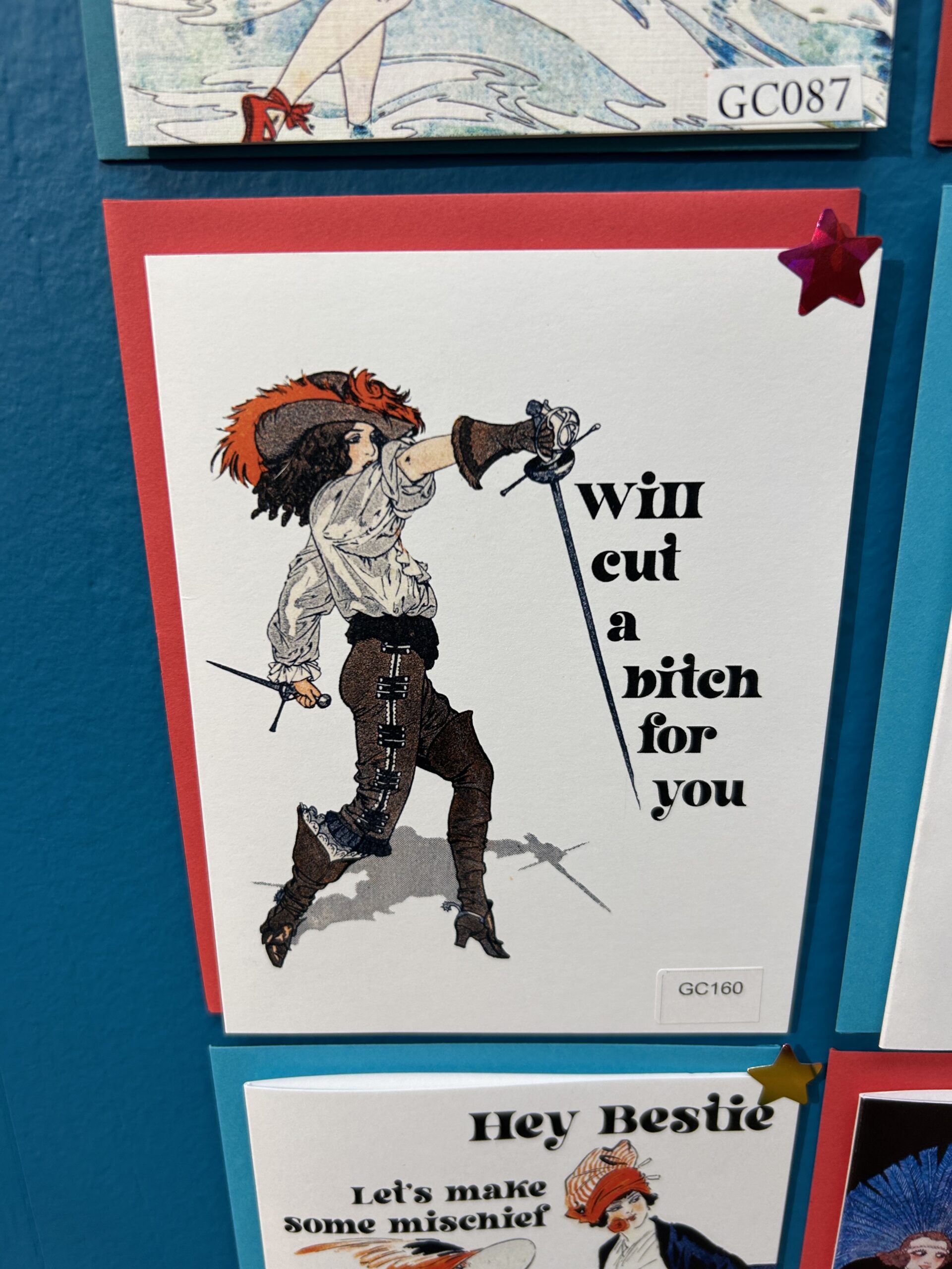
The Twentieth. It’s always refreshing to see what’s selling well at a brilliant range that resembles none other ever in existence! With Emma’s designs also informed by her Chicago retail space, Rare Form, she suspects this source of this card’s bestseller status is the inspiring, powerful female fencer — and the way her promise gracefully runs down and off her sword.


0 CommentsComment on Facebook