

Features
November 6, 2022 •
Coming to Life: Natural Growth
An eclectic brand expands its mission as it enlarges its vision
With time, certain truths reveal themselves. That was certainly the experience of Josh Nusbaum, who in 2011 launched Waterknot with a century-old letterpress and the tagline, “Design a better world.” “From Day One we’ve been committed to creating small works of art that empower people to connect in meaningful ways while printing on 100% recycled paper and donating one percent of our sales to nonprofits,” he recalled.
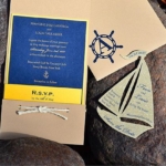
The Waterknot vibe evolved over time, as well. “Originally, the line was established around a handful of themes near and dear to my heart — love, music, food and drink, gardening and outdoor adventure,” Nusbaum described. “We had especially good success with some of our first outdoor designs (so) we pretty quickly narrowed the focus to embrace outdoor adventure, exclusively.”
 However, Nusbaum eventually questioned that direction, he shared. “My idealistic notions about the kind of positive impact a business could make were met pretty quickly with the realities of actually running a small business. To make the kind of positive impact I’d always dreamed of, Waterknot would have to serve a wider audience (and) I knew I’d need more help. This dovetailed perfectly with my desire to help other artists. As an artist myself I am all too familiar with the uphill climb that is finding a way to make a living creativity. So partnering with more artists seemed an obvious choice.”
To Nusbaum, “really becoming a publisher and licensing work from independent artists feels like a winwin. Waterknot provides opportunities for artists and those artists, in turn, help Waterknot diversify our themes and product offerings and expand our catalog.”
Since most transitions entail growing pains, Stationery Trends interviewed Nusbaum to learn more about this most artful evolution.
ST: When did this evolution start and why?
JN: Last year, because while we were achieving our goals in the outdoor sector — for instance, I was getting to create a lot of art for national parks, which personally felt like a great accomplishment — Waterknot’s presence in the larger world still felt really limited.
ST: So, how does one broaden a brand’s vibe?
 JN: A return to our roots was in order. We started exploring multiple themes again, not just outdoor adventure. For example, we knew that food and drink, music, gardening (to name a few), could be great complements to the outdoor niche, especially since our target consumer shares many of these interests. In other words, there’s a lot of overlap. An avid hiker might also be an enthusiastic cook. Hardcore backpackers might garden. Beyond that, gardeners, musicians, foodies, etc. may not have picked up a Waterknot card because they were too outdoorsy. Our hope is that having wider appeal will help us grow. We are only a few months into this transition, but initial results are promising. It’s exciting.
ST: What qualities were you seeking in new artists that hadn’t been present before?
JN: Initially, we cast a pretty wide net. The defining characteristic was simply to have a different aesthetic than Waterknot. I have to admit I became my own worst kind of design client. It’s infuriating when someone says, “I don’t know what I want but I’ll know it when I see it. Just try some stuff.”
But I am also taking a different approach than the standard design brief/spec work model, so I’m not making anyone crazy. This gives us a lot of freedom to experiment. As an art director, curator and publisher it’s been interesting to see how I still gravitate toward what I know best — nature and narrative. That said, it’s also been really fun to explore abstract designs and patterns, and to fill in some holes that have been empty a long time.
ST: How many artists have you taken on, and what product have they contributed?
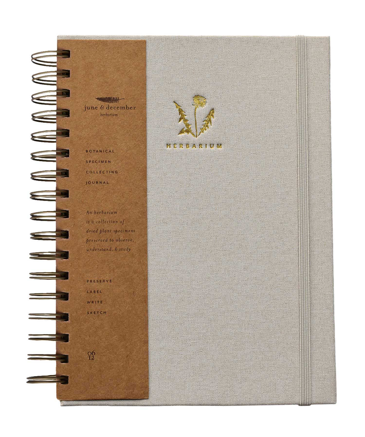
JN: So far, 18 artists. Initially, it was only for greeting cards. But our May 2022 release included notebooks and stickers that highlight their work, as well.
ST: What seems to be performing well? Any new best-sellers? How about surprise hits?
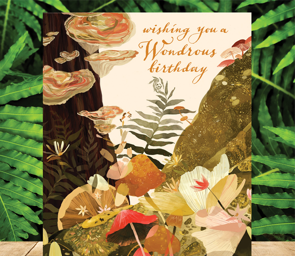
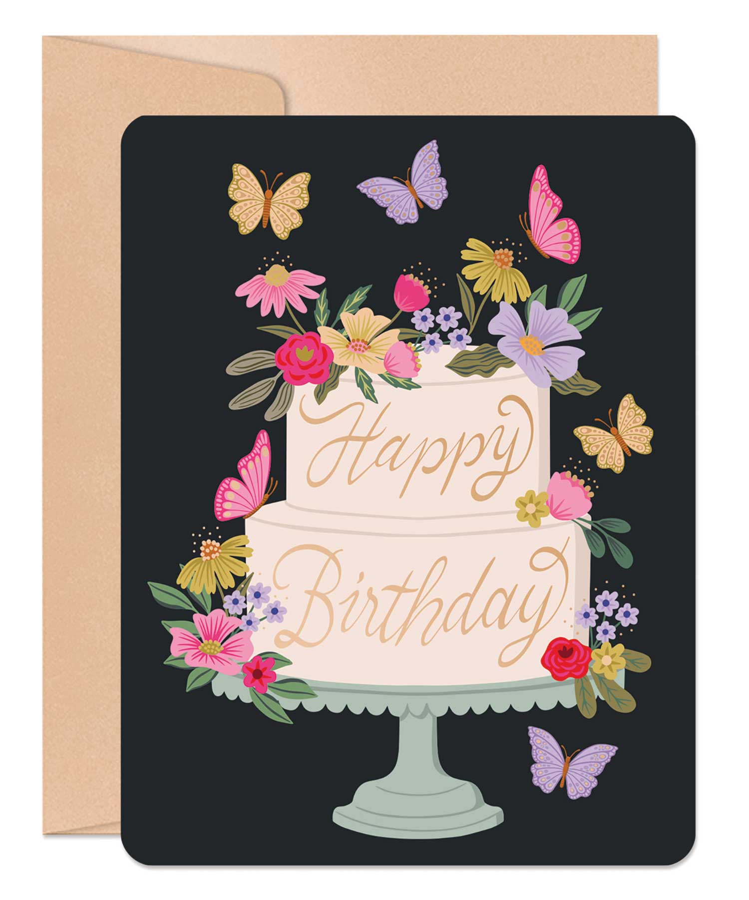
 JN: Nature is dominant. It’s really fun to see people transitioning to our broader line by embracing the beauty of landscape itself and not just the outdoor activities we have traditionally highlighted like hiking and cycling. The best-selling new artist card is Wondrous Fungi Birthday. Cate Andrews’ painting is so evocative and beautiful, it’s really no surprise. We are also licensing this illustration for a thank-you and it’s been doing great, too.
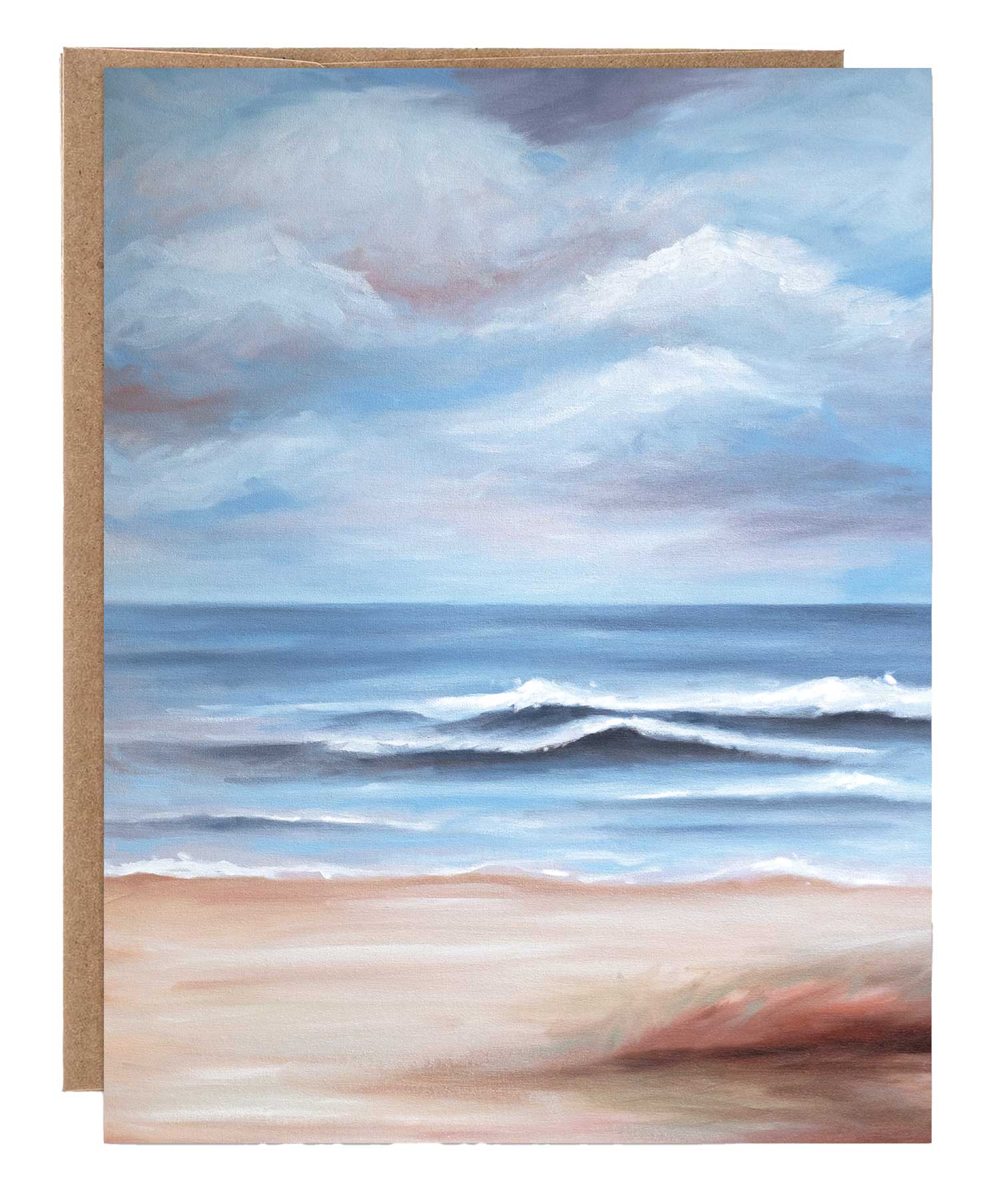
Happy Hour Love has been a real hit and I think it represents our targeted crossover. Wayne Jiang’s beautiful oil painting bridges the thematic elements of cocktails and outdoor/landscape.
The surprise hit has to be Merry and Bright Christmas. It features an illustration by Drew Bardanna so it’s no surprise it’s a great card, but what is surprising is that while our existing customers are slower to adopt the new artists, this card was far and away our best selling Christmas card for 2021.
ST: What has been the biggest challenge so far, and how have you counteracted it?
JN: The biggest challenge is conveying multiple messages during this expansion and transition and letting people know that we are becoming much more than we used to be, but that the most important things haven’t changed. Our mission of connecting people with joy and positivity and our commitment to sustainability are still paramount.
 But, we have something great to offer whether you’re buying for a boutique, a gift shop, a grocery store or an outdoor store. While a company of our size isn’t going to transform overnight into a one-stop shop for everyone, it is our hope that they will come to see Waterknot as a go-to source for a full range of greeting cards and that will help them streamline their buying and make it more efficient. With our bigger selection, we could potentially be the only rack they need.
So, we’re doing what we’ve always done — we just keep trying to find ways to communicate. We didn’t go to trade shows during the pandemic and that’s been tough. But we’ve tried to really stay in touch with people through email. And our hope is that there will be kind of a snowball effect. As people see the line grow and broaden, they will come to expect more and more from us, and we will be there to meet them.
ST: As you continue on this path, what other changes can our community expect to see?
JN: I’ve been using the term “cohesively eclectic” a lot lately. I’ve never been one to chase trends; I’ve had success because it’s authentic and what I know. It’s been interesting to see the line change as I curate more artists. Each artist brings something really distinctive, but when I look at the catalog I see that there’s still a really cohesive collection. Something still holds it all together. It’s not a single aesthetic because everyone has their own style. But something about beauty combined with authenticity, gentle positivity and a bit of humor seems to cement everything. I think that’s where Waterknot is heading. I expect we will continue to add new artists, more occasions and themes so that ultimately, we will grow into a cohesively eclectic brand.


0 CommentsComment on Facebook