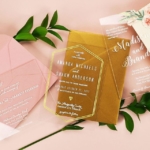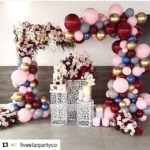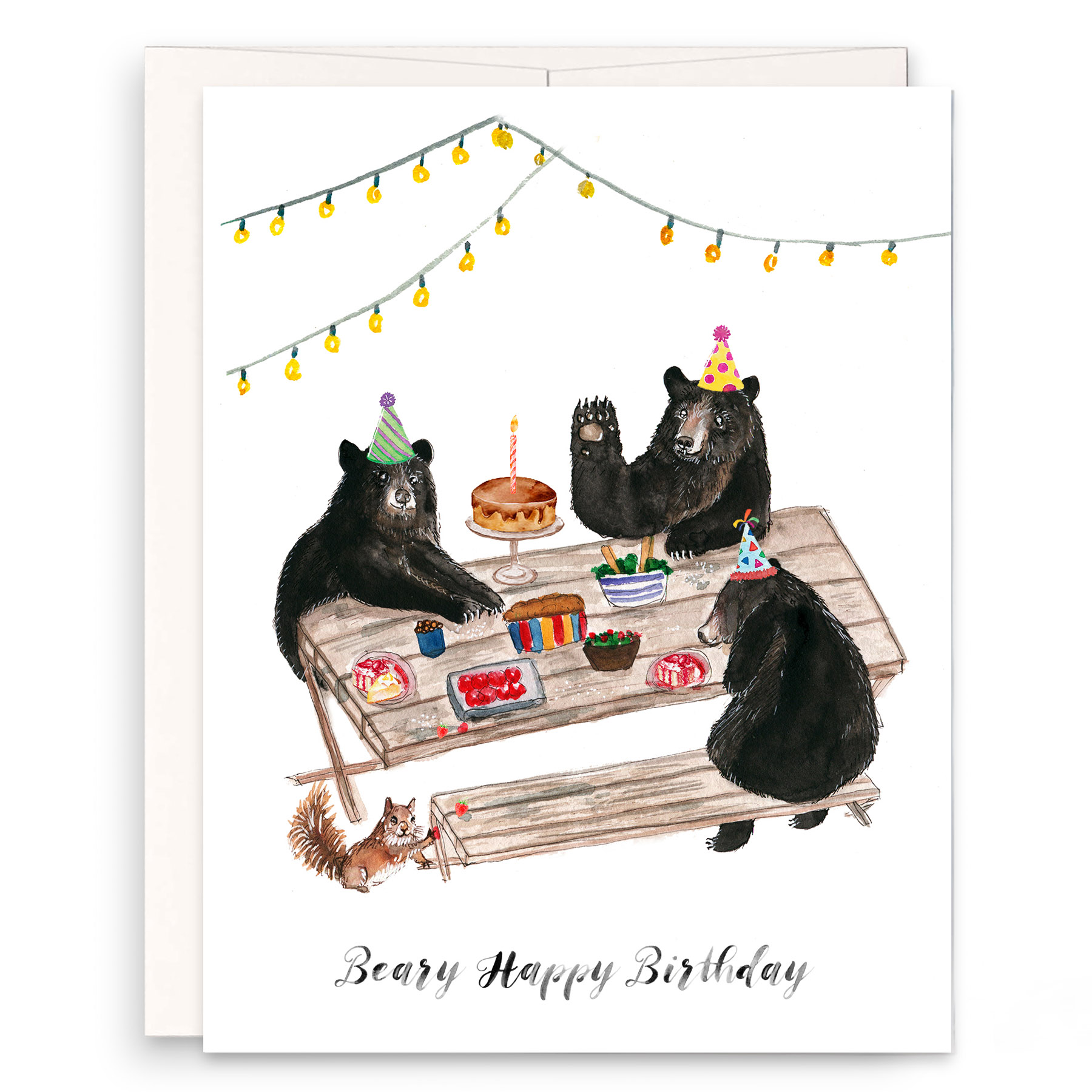


Features Industry Profiles
January 8, 2019 •
Ten Designers to Watch in 2019
Our newest class has something for everyone.
Adam J. Kurtz
AdamJK
www.adamjkurtz.com/shop.adamjk.com
Part-artist, part-author and part-therapist, Kurtz’ work embraces the world with equal parts of optimism, dark humor and fun.
 Aesthetic of the Line? Offbeat and oddly personal gifts and stationery to help people of all ages communicate often difficult or cheesy sentiments with humor and heart.
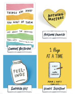
Current Bestseller? Things Are What You Make of Them book.
Personal Favorite? Nothing Matters enamel pin.
Surprise Hit? Bottled Up Feelings enamel pin.
Iconic Selection? 1 Page at a Time journal.
Favorite Color? A bright golden yellow.
Current Design Obsession? Honesty over relatability.
Favorite Flower? I love a pink lily!
Favorite Indulgence? BREAD BREAD OMG BREAD.
Alex Gagné Glover
Chez Gagné
www.chezgagne.com
Clean styling meets clever (and sometimes profane) messaging in these gift, office and paper ranges.
Aesthetic of the Line? If you can’t make it nice, make it funny. Every product in our line is sweet, sassy, a little smart-assy and produced in good humor with
the highest quality.
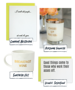 Current Bestseller? I Smell Old People letterpress card. This was in the original Chez Gagné release at NSS in 2015. Totally cracks me up that it’s still a bestseller to date. My mom hates it, my grandma loves it.
Personal Favorite? I was having a really shitty day and my mom told me “Cheer Up Fucker.” And I put it on all our products, and it’s a bestseller in every category. Thanks, Mom! Our Cheer Up Fucker candle totally cracks me up. The scent is red currant, my favorite, and it doubles as a rocks glass when it’s done burning.
Surprise Hit? Apparently, everyone also runs on wine and coffee. Our Breakfast Wine mug jumped to our second bestselling mug ever in six months, and top 20 overall.
Iconic Selection? Good Things Come letterpress card has been around since the beginning. It sums up my thoughts on life.
Favorite Color? Yellow! It is so damn happy. When I buy a house, you better believe that front door will be yellow!
Current Design Obsession? 1. Finding ways to incorporate two-fers into our line, like our candles/rocks glasses. 2. Incorporating new paper clip shapes into our card line. 3. Custom paper clip design collabs with other brands.
Favorite Flower? Peonies. Soooo pretty!
Favorite Indulgence? A killer fully bodied glass of red and fresh baked bread with butter.
Beth Snyder
One Canoe Two
1canoe2.com
This illustration company has a simple mission: Spread joy through cheerful, thoughtful paper goods and gifts.
 Aesthetic of the Line? Handpainted artwork that shows the hand of the artist and highlights our beautiful Midwestern surroundings.
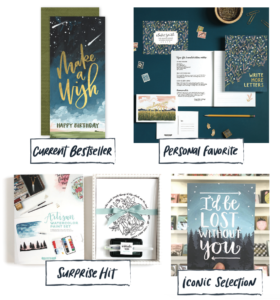
Current Bestseller? Make a Wish card.
Personal Favorite? Field Floral Stationery Set & Envelopes.
Surprise Hit? Watercolor Set.
Iconic Selection? Lost Without You card.
Favorite Color? Any shade of green or turquoise.
Current Design Obsession? I can’t seem to get over rainbows, the shapes or the colors.
Favorite Flower? I always love the humble zinnia, easy to grow and a riot of colors.
Favorite Indulgence? I’m not much of a fancy person, but I do love a spa vacation with good girlfriends. A more everyday indulgence is a long walk.
Bri Bulski
Little Arrow Studio
littlearrowstudio.com
This range, bootstrapped from the ground up with gumption and nostalgia, has organically grown a following around the globe.
Aesthetic of the Line? I’m heavily influenced by toys and memorabilia from my childhood, and vintage clothing and costume jewelry. My goal with the brand was to create a feeling of hope, love and whimsy yet a touch of grit, keeping it “real.” It’s a place where pretty meets tough.
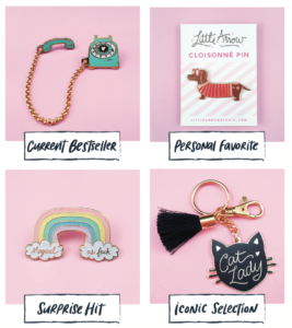 Current Bestseller? The Rotary Phone pin. I’m very proud of this design. The interactive chain, which represents the cord, really adds an element of whimsy. Plus, with landlines becoming pretty much extinct, I think it appeals to people who are drawn to objects from the past.
Personal Favorite? Mr. Wiener Dog pin. I had so much fun drawing him. The design was actually inspired by a vintage Dachshund ashtray I picked up at my local flea market. I use it to hold paper clips on my desk.
Surprise Hit? Magical AF pin. I wasn’t sure if the swear word would turn people off, but it actually did the opposite! People really laugh when they read it; at a glance the design looks so innocent and sweet.
Iconic Selection? Cat Lady keychain. This has become a favorite amongst my stockists — it makes a great gift. I mean, everyone knows a crazy cat lady!
Favorite Color? Pink by far. It makes me happy! I have a pink wall in my studio, and I will often use a pale pink for my product photo backgrounds. The color of pink I’m drawn to is on the verge of being purple. I use it throughout my collection.
Current Design Obsession? I’m in love with anything that has a rainbow on it, or with a rainbow color palette. My new obsession is rings with rainbow jewels!
Favorite Flower? Datura Brugmansia (Angel’s Trumpet). Not only are the blooms beautiful, the scent is so heavenly I wish I could find a comparable essential oil. I’d wear it all the time!
Favorite Indulgence? Ice cream and gelato, with a cup of coffee. Perfection!
Emma Kate
Emma Kate Co.
emmakateco.com
Created in Melbourne, Australia, to inspire adventure and bring joy, this word-driven range is deceptively simple and utterly swoon-worthy.
 Aesthetic of the Line? Our world is everything ethereal, punctuated with coffee. With mess, joy, love and adventure, we color outside the lines — on purpose. With fresh designs and words to stir the soul, it’s like we’ve released a big jar of fireflies into the world, weaving conscious, considered, generous details into every little thing we make.
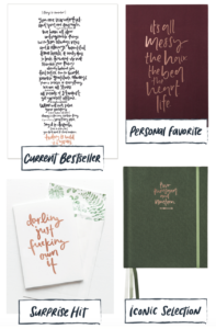
Current Bestseller? Things to Remember Art Print, which has been in our collection since the start. It always makes people cry (and laugh)! They’re words that can be read daily, to uplift, encourage and inspire.
Personal Favorite? It’s All Messy. The Bed. The Hair. The Heart. Life. Notebook. Because … isn’t it?! This sums up my world!
Surprise Hit? Darling Just Fucking Own It greeting card and art print. When I showed my mum the draft of this design, she was mortified and said she’d disown me if I published it in the collection! Needless to say, I did anyway, and it’s outsold every other card four times over. It also sits proudly framed in our family’s living room, and is loved by mum!)
Iconic Selection? Our planners. Each year, we double our production run and still can’t keep up with demand!
Favorite Color? Botanical green (and peachy pastel pink, to complement).
Current Design Obsession? Minimal design, and white on white, or white/cream/neutrals used together.
Favorite Flower? Peonies, Dahlias and Hellebores. Don’t make me decide!
Favorite Indulgence? Champagne! And working from home in pajamas. Maybe even both at once!
Erin McManess
Paper Raven Co.
www.ShopPaperRavenCo.com
From the peach trees of Atlanta come these hand-illustrated offerings that strive for the health and happiness of all peoples, for justice when there is injustice, truth when there is murkiness, and beauty for all.
 Aesthetic of the Line? Floral, feminine, thoughtful and genuine, with a nod to handlettering. With support for the earth, cards are always printed in the USA on 100 percent recycled paper, and every order plants a tree through environmental partner, One Tree Planted.
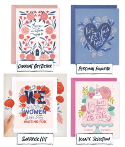
Current Bestseller? Home is Where Mom Is, one of our Mother’s Day cards that was featured in House Beautiful in 2016.
Personal Favorite? I’ve Got Your Back. I love its periwinkles and blue tones.
Surprise Hit? We Are the Women fine art print. I created this for the Women’s March and International Women’s Day in 2017, and the response was overwhelming.
Iconic Selection? Here for the Cake. I love this card, it’s fun and it’s honest! Favorite Color? Millennial Pink (Appropriate or tragic? You decide.).
Current Design Obsession? Folk art symmetrical patterns. I absolutely love the look of Otomi and Scandinavian designs.
Favorite Flower? At the moment, classic, romantic roses. We have bushes growing on the side of our house, and I visit them everyday.
Favorite Indulgence? Always, always a cheese plate.
Kim Burks
Ramona & Ruth
ramonaandruth.com
Named for the founder’s grandmothers who taught her to find beauty in simplicity, the range combines a modern sensibility with timeless sentiments.
 Aesthetic of the Line? I like to say my line has a warmer simplicity. I love keeping my designs clean and simple while adding a bit of delicateness to keep them approachable.
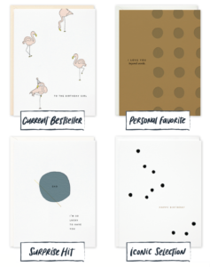
Current Bestseller? Flamingo Birthday Girl.
Personal Favorite? I Love You Beyond Words. Surprise Hit? Dad Lucky.
Iconic Selection? Happy Birthday Big Dots.
Favorite Color? A soft, neutrally pink … and black.
Current Design Obsession? Clean lines and simple patterns, paired with carefully placed type. Favorite Flower? Ranunculus.
Favorite Indulgence? A rich and creamy pistachio flavored ice cream cone.
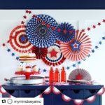
Marcia Cornell
My Mind’s Eye
mymindseye.com
After initially offering paper crafts, this maker hit its stride with partyware that adds style, polish and flair to any gathering.
 Aesthetic of the Line? It runs the gamut from fun to formal to whatever you fancy, and always in the prettiest color combinations.
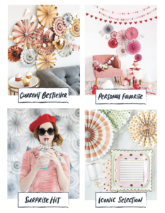
Current Bestseller? Our rose gold party collection.
Personal Favorite? Our Valentine collection turned out to be one of my favorites! We were working on the designs while I was engaged to my husband so this line will always remind me of that exciting time in my life!
Surprise Hit? Our color-changing straws — they’re fun AND reusable! We love that these straws are environmentally friendly.
Iconic Selection? Our Trend collection was our first line and is the foundation of our party décor. We add new items to it every year because it continues to be so popular!
Favorite Color? but I always love a beautiful bright coral.
Current Design Obsession? Fringe. I adore the little extra visual touch it adds. I’m excited to incorporate it into our upcoming products.
Favorite Flower? Peonies.
Favorite Indulgence? My favorite pint of ice cream while soaking in a hot bath!
Pinky Weber
Pinky Weber Studio
www.pinkyweber.com/pinkymart.com
This award-winning doodler, muralist shmuralist, zine queen, donut enthusiast and wiener dog owner not only creates work for a slew of high-profile corporate clients, she also offers her own giftware and stationery.
Aesthetic of the Line? My brand’s website reads “a paradise of pop culture, puns, and positive vibes,” but “Barbie after a couple of drinks,” is just as accurate.
 Current Bestseller? The Trophy Wife greeting card.
Personal Favorite? I love the gold details on the Cheeky Pin.
Surprise Hit? The Cayute Sticker Set & Wrapping Paper is so over-the-top girlie. It’s cool to see that the mix of nostalgic icons and trendy emojis is appealing to both kids and adults.
Iconic Selection? My Lindsay Lohan Mugshot Magnets. I drew these back in college and people have been interested in the design ever since. I’m just waiting for Lindsay’s new reality show!
Favorite Color? Pink, of course! Pink is basically a neutral color to me by now. When I was born, my parents couldn’t decide on a name — and being that I was a very pink baby — my sister nicknamed me Pinky. Since then, everything has always been pink and always will be!
Current Design Obsession? A lot of my new products are inspired by Ingrid Fetell Lee’s research on shapes and patterns that evoke joy universally. We all could use more of that in our lives!
Favorite Flower? If Murakami Takashi’s flowers could come to life, that would be my favorite flower.
Favorite Indulgence? Fun pens! Furry pens, glitter gel pens, paint pens, you name it! I feel so fabulous writing with a giant neon pink fluffy feather-top glitter pen … it makes writing every word that much more fun.
Rebekah Tennis
Wild Ink Press
www.wildinkpress.com
This award-winning operation began as a creative outlet in 2009 — and has bloomed into a thriving retail, wholesale and printing enterprise offering eco-friendly paper goods that are 100 percent made in the U.S.
 Aesthetic of the Line? Clever (but kind) paper goods: loosely illustrated, with fresh colors and zingy prose! Letterpress printed one color at a time using multi-layered and detailed techniques. We are not afraid to slap four or five inks or foil on a single card if it will make it sing.
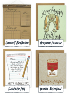
Current Bestseller? Our Big Kitchen Calendar has been killin’ it since its release last spring!
Personal Favorite? Somebunny Loves You. I think I’m going through a sweet mushy phase in my life (having a newborn will do that for you).
Surprise Hit? Our Just Like Mom card resonates with so many people, far, far more than I ever thought it would.
Iconic Selection? Your Souper. because Andy Warhol.
Favorite Color? Black, forever and ever. Do you need a swatch for that? 🙂
Current Design Obsession? The Storybook Style of the early 1900s. It affected American design in so many different ways.
Favorite Flower? Camelia blooming in the dead of winter, leggy ranunculus in spring, big sunflowers in summer and moody dahlias in the fall.
Favorite Indulgence? Lazy Sunday brunch out with my family — great food, great weather, no dishes. It’s a win!