

Uncategorized
May 1, 2012 •
Skirting the Issue
You need never look far for bad economic news, especially during an election year. But the news is not necessarily all bad. One economic indicator concerns skirt hems. The Hemline Indicator, reportedly introduced by University of Pennsylvania Wharton School professor George Taylor, hypothesizes that women’s hemlines can indicate macroeconomic performance. The more revealing, the better the economy.
Business Insider analyzed skirt and dress hemlines at New York’s Fall/Winter fashion week, measuring 2,092 images from 25 designers and comparing year-on-year changes. The BI Hemline index measures hem length as a percentage of length from floor to waistline; the shorter the hemline, the higher the index. It found average hemlines registering 44.38, up from 35.04 for the Fall/Winter 2011 collections.
So, if the economy isn’t looking up, at least women’s fashions are. And when it comes to brides, they’re probably more design savvy than ever, even as they’re simultaneously focused on invoice amount. “Brides want their one special day to be everything they dreamt of, but are budget conscious in getting there,” observed Rebecca Ashby, creative director, The Pink Orange. “They need to know they don’t have to sacrifice fabulous design to get what they want!”
There lies the potential for the stationer to shine for its entire clientele, to combine market savoir-faire with affordable shortcuts. Sometimes a splurge is a good investment, sometimes cutting corners can be done cleverly and unobtrusively. To help you deliver this priceless service, Stationery Trends examined currents on the cutting edge of the bridal, baby, greeting card, green and office categories.
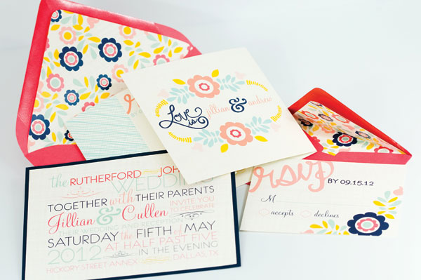
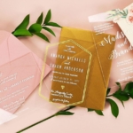
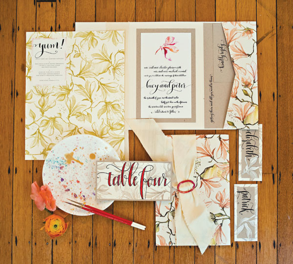
First image: Jenn Sprinkle Paper; Second image: Spotted Ink
Bridal
Pinterest enables brides to hone their own visions, noted Abbey Malcolm, owner/creative director, Abbey Malcolm Letterpress + Design. “Couples create ‘concept boards,’ which include everything they’d like their suite to contain. When they can’t find a pre-made suite that incorporates all their concept board holds, they set out to find a stationer who can create (it)!
Patterns; crazy scripts; unexpected fonts; the mix of vintage and modern; lace accents; shimmery, metallic paper combined with Kraft paper; coordinating, custom stamps; fun liners; and envelope icing are just a handful of the components brides incorporate to set their suite apart from the rest.”
Rachel V. Ivey, vice president creative and product development, Crane & Co., looks to bridal fashion for inspiration. “I always have an eye on the runways and then determine how I would like them to influence our products. Choosing a wedding dress is actually similar to picking invitations, as brides must choose colors, textures and dimensions to represent their special day.”
What’s hot: Think mixed mediums, Ashby emphasized. “Adding a touch of foil with letterpress printing gives the extra punch brides look for. Laser cutting also gives depth and dimension. Custom envelopes made from heavy textured stock in eccentric sizes set a suite apart.”
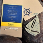
Also look for: QR codes, not necessarily on the invitation, but on elements like direction cards; gilded edges; type-driven designs in happy but muted colors; save-the-dates with creative photography and personal messages; themes such as vineyard, boardwalk, outdoor-barnyard, circus, chalkboard, preppy, nautical and beach-inspired.
Tried & True: Traditional damasks and florals get updated with patterned liners, metallic cardstocks, pockets/pocket folds, bellybands, custom silhouettes of the couple and even the occasional crystal.
Designer Quote: “The clean type you see in ad campaigns for high-end clothing lines is what the modern bride is responding to. There is a market for the traditional bride; however, a new generation of brides is looking for modern offerings.” – Julie Schaffroth, Modern Posh by Vanilla Print
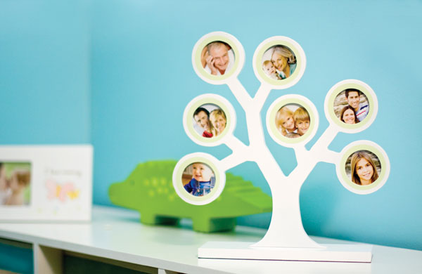
First image: Pearhead; Second image, Tree by Kerri Lee
Baby
To stay on the cutting edge, avoid pastels, cautioned Meredithe Stuart-Smith, president/creative director, Meri Meri. “The baby market is supporting stronger colors, a more sophisticated color palette than 10 years ago when everything was still very pastel and sweet.”
Baby announcements almost always feature a photo prominently, commented Lisa Chin Potash, co-founder, PiPo Press. “When we started the company almost six years ago, photos were a small part of our business, but (now) most orders are for photo announcements.”
What’s Hot: Woodland creatures proliferate, with owls for girls and squirrels and raccoons for boys. Quatrefoils and more mature patterns come here off everyday offerings; photocards feature full-bleed photos and heavier paper stock; fun fonts emphasize a child’s name and identity; graphic prints are paired with ironic sayings; and whether the palette is pastel or primary, there’s an influx of yellow in the mix.
Tried & True: “We are finding our customers enjoy designs that are traditional or with a subtle whimsy with an updated presentation. Damask, linen, gingham, classic stripes and dots continue to be requested,” remarked Kim Kreis, founder/owner Sweet Pea Designs.For infants, buggies, bottles, rattles, lambs, bunnies, trains and sailboats proliferate; flowers draw older girls and sports, bigger boys; and animal prints are softened with lighter tones of taupe, blue and pink. Color pairings such as soft blue and bright orange for a baby boy card add a fresh feel, while monograms remain popular.
Designer Quote: “We are inspired by our family and friends that are having children. We try to think about what we would say to them or what kind of card they would like to receive in the mail. Parents today still want to be considered fun and cool, even after they have had a child. They still want to feel young and hip. We like for our cards to speak to those emotions and make new parents feel special.” – Lisa G. Towns, Farewell Paperie
First image: MIXT Studio; Second image: Figs+Ginger
Green
The green market naturally overlaps with just about every category, especially wedding, explained Jennifer Tatham, co-owner, Night Owl Paper Goods. “The green wedding market has been so inquisitive about our line of wood greeting cards that they’ve demanded more. It makes complete sense that outdoorsy weddings would be looking for green invitations to set the mood.”
Paramount here is product a sense of permanence, described Rhonda Wyman, co-owner, Figs + Ginger. “We try and think less of what’s hot right now and more about making products that we could see ourselves falling in love with and wanting to keep. We source everything as ethically as possible of course – recycled paper, sustainably harvested woods – but really what matters to us is not making disposable junk.”
What’s Hot: Products made in the U.S. “Every item in our line is handmade by a team of family and friends,” underlined Alan Henderson, co-owner, Night Owl Paper Goods. “They provide great ideas, impeccable standards and a commitment to keeping our products green.”
Also look for: Natural or faux woods with bright pops of color; chevron and other bold, graphic patterns; heavyweight papers manufactured with respect to the environment, whether comprised of tree-free fibers or produced with pulp that is Elemental Chlorine Free (ECF) and sourced from sustainable forest management. One example, Colorscope paper, features a range of colors, is available in different weights and responds well to letterpress, hot foil and die-cutting.
Tried & True: Critters, flora, fauna and patterns found in nature, albeit with a brighter, bolder presentation; bold whimsy patterns; content information on products.
Designer Quote: “I think I’m probably inspired by the same things as most people. A head full of fairytales, old school hip hop Pandora playlists and fond memories of a semester in Florence top the list. – Rhonda Wyman, Figs + Ginger
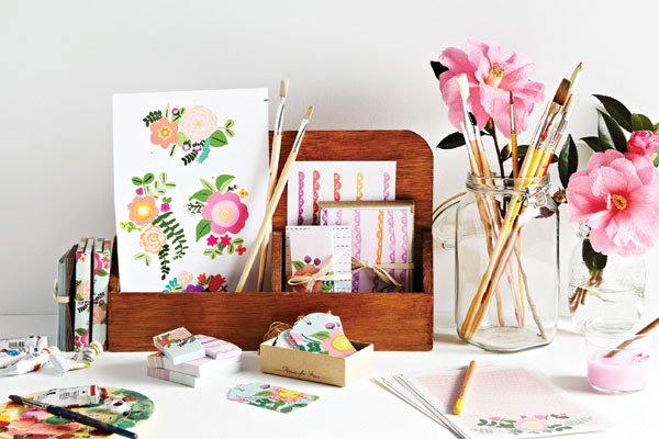
First image: Apartment 2; Second image: Seltzer
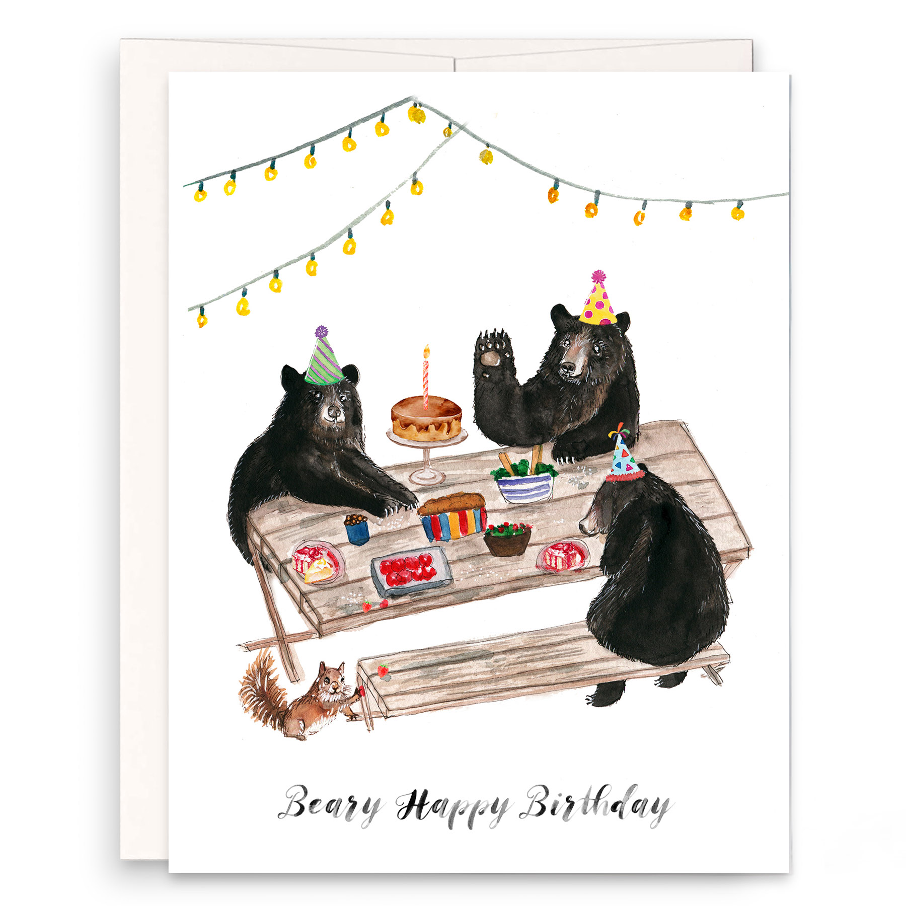
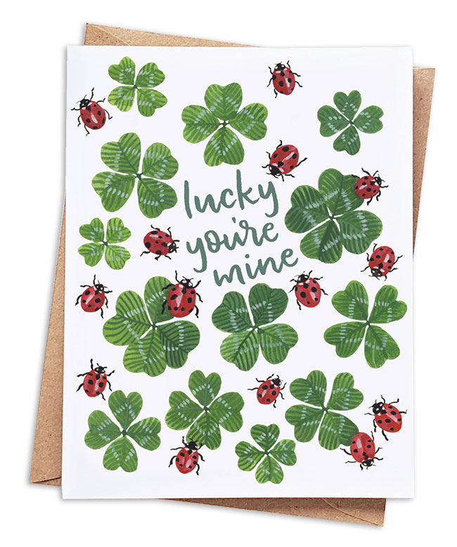
Greeting Cards
This market is defined by popular culture, which has been looking to the past of late, opined Jim York, co-owner, The Found. “Vintage has been all the rage and we think that trend will continue to influence not only the greeting card world but boutiques in Brooklyn, J. Crew, Restoration Hardware and Anthropologie. Lots of throwback-inspired design will continue to emerge. TV shows like “Mad Men,” “Broadway Empire” and “Downton Abbey” influence design trends.”
Unconventional, unexpected messages stand out at retail, reported Stacey Rifkin, co-owner, Hard Cards. “We’ve had great luck with humorous break-up cards and as we call them un-sympathy cards.”
What’s Hot: Poking fun at technology and social media, continued Rifkin. “Since its release, our birthday card that makes fun of people who only post birthday wishes on Facebook has been continually sold out! We just released a birthday card that pokes fun at avid Twitter users, which is already a huge hit.”
Also look for: bold florals with fashion-forward colors, such as rich pastels on bright backgrounds; classic folk art imagery with modern treatments; retro styles and imagery from plaids to people, updated with of-the-moment sentiments and humor; pet themes; and the “cute/clever” trend, think cute animals with witty phrasing and hipster must-haves like moustaches and bicycles.
Tried & True: Birds and butterflies will continue their design reign, as does anything that invites a smile or laugh. “Handmade never goes out of style, if it’s done well,” suggested Matt McNary, designer, Hammerpress.
Designer Quote: “I’m inspired by the lack of great greeting cards that tell it like it is. I’d say 98 percent of all greeting cards out there don’t sound like something I would ever say. So why would I want to give one to a friend or family member? Our cards are for the other 2 percent that wants to give a greeting card that sounds like a real person.” – Ian Kalman, Bald Guy Greetings
First image: Poppies for Grace; Second image: Anne Taintor
Office
This once-bland category has gotten exciting as home offices boom and work spaces have become mobile. “Today’s office can be a corporate workspace, a special desk or table at home, a handbag or even the ever-faithful refrigerator door,” enthused Susan Connor, owner/designer, Susyjack.
With workspaces becoming omniscient, “Consumers look for high design at an affordable price (and) want color, pattern, illustration and special treatments,” stated Christina Amini, editor at Chronicle Books. “First, people realized file folders don’t have to be plain, and that has spread to mousepads, wall coverings, calendars and more.”
“Office products are taking on a dual role as a piece of furniture or decorative accent,” agreed Gwen Weinberg, designer/owner, Three by Three. “For larger items, trends are toward materials and surfaces previously used in furniture and high-end kitchens: wood, bamboo, glass, brushed stainless. The home office category has also yielded a product that merges ‘home’ and ‘office’ – family organizing centers.”
What’s Hot: With a booming market, seek the well made, pointed out Chris Plantan, founder and creative director, Russell + Hazel. “While the wide range of choices available are welcome, it also hints at a lack of quality and attention to detail. Thin flimsy file folders, molded plastics and lack of real ‘sticky’ notes … all beg for quality. We work like we dress, we need hard working basics and we will layer them with accessories of our choice.”
“We pay attention to details; they give that extra je ne sais quoi to a product, whether it’s a touch of glitter, gilded edges on a journal or embossing,” Amini added.
Tried & True: Nearly any visual motif popular in the stationery and gift markets flourishes here, from flowers to arresting patterns. Products with an eco-element add extra allure, said Katie Hunt, owner, Kelp Designs.
Designer Quote: “This is actually a fun market and people should embrace their supplies! Our lifestyles are changing so fast and in so many ways, it is somewhat comforting to gaze upon a stapler and know you don’t need an app for that.” – Chris Plantan, Russell + Hazel
Special thanks to: Abbey Malcolm Letterpress + Design, Anne Taintor, Bald Guy Greetings, Calypso Cards, Chronicle Books, Crane & Co., ecojot, Farewell Paperie, Figs + Ginger, Hammerpress, Hard Cards, Kelp Designs, Legion Paper, Meri Meri, Modern Posh by Vanilla Print, Night Owl Paper Goods, PiPo Press, Russell + Hazel, Susyjack, Sweet Pea Designs, The Found, The Pink Orange, Thomas-Printers, and Three by Three.
Top image: s.e. hagarman DESIGNS