

Trends
April 28, 2015 •
The Personal Perspective
Individuality is key — but is shaped by today’s design trends
When it comes to today’s consumer climate, no one wants to be thought of as part of the faceless masses. They want every product they purchase — regardless of whether it falls in the bridal, baby, greeting card, office or gift segments — to feel as though it was created just for them.
Maybe that is why Kelly Breymeier, creative director of Capri Designs, finds herself most inspired by the idea of the individual. “Every individual has a unique perspective, and in a season of mass market consumerism, it’s our goal to capture a unique appeal through our design offering. No single perspective can dictate the market aesthetic, and we love collaborating with wonderfully talented artists to bring breathtakingly beautiful prints and fresh new designs to our customers.”
So, what are all these individuals collectively craving? Read on to find out!
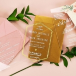
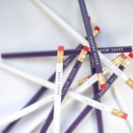
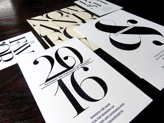
Bridal
“Weddings have become a form of self-expression — a day filled with personal touches that show who they are as a couple,” described Karla Cushman, Kleinfeld Paper.
“Today’s brides know exactly how they want their event to look and they have the pins to prove it,” added Melissa Foster, founder & creative director of Elum. “This market is so flooded with imagery and ideas on their virtual bulletin boards. But this poses some interesting design challenges. Finding a common thread to stitch one comprehensive design is the sweet spot of creative satisfaction.”
What’s Hot: Brides are playing with both shine and texture, observed Foster. “The incorporation of metallics, whether (through) foil stamping or metallic dusting, adds a sleek ornamental touch to the tactile quality of letterpress.”
“I think we’ll continue to see gorgeous foils, double thick paper, letterpress and even more lovely hand lettering and calligraphy,” noted Megan Wright, founder and designer of Megan Wright Design.
Tried & True: Monograms “brand every element of the wedding day,” noted Cushman, while Wright remarked that “a classic stripe or floral can transform a design from modern to whimsical.”
Classic neutrals in soft creamy hues, radiant whites, blush champagnes, warm and cool tones of gray and the ever-popular black “will forever be timeless in their broad appeal,” Foster pointed out.
“Satin ribbon, lace that mimics the wedding dress, simple calligraphic elements or a damask detail can (create) a timeless piece that can be used now or 10 years from now without dating badly,” detailed Gayle Willliams, owner and invitation stylist, I Will Invitations.
Designer Quote: “I’m inspired by my creative brides and their stories. Weaving meaningful details into their custom invitations is why I love what I do! To me, a fabulous invitation is not just a pretty piece of paper … it’s the joy that she walks away with at the end of the day.” Megan Wright, Megan Wright Design Co.
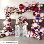
Baby
These days, it’s all about Gender Reveal parties — that is, baby showers where the sex of the baby is announced — explained Melissa Danaher, president/creative director, Bella Ink Designs. “For these we suggest gender-neutral invitations featuring greens, purples and/or yellows in addition to pinks and blues.”
What’s Hot: Glitter and metallics in gold and silver combined with shades of blush pink, mint or pale blue, underscored Heather Swanson, head designer, Event Blossom. “Trendy color schemes (include) pink and gold for a girl baby shower or blue and gold for a boy baby shower.”
Also look for: Brighter pinks and yellows for girls and richer browns, blues and greens for boys, suggested Jodi Sanford, president & creative director, Fancy Pants Designs. “And, with the increase in Instagram users, you’ll see a lot more personal photos and pieces to highlight baby’s first year and beyond!”
Tried & True: Stripes, polka dots and graphic looks, as well as classic icons, reinterpreted. “We use carriages and rattles on many of our baby items, but we’ll apply less traditional shades of pink or blue to the design and add in an unexpected print or font,” stated Danaher.
Designer Quote: “I’m easily inspired by decor and clothing and love to mix things up a bit. Color and pattern mixes can make or break a look.” — Jodi Sanford, Fancy Pants Designs
— Visit http://www.fancypantsdesigns.com/downloads/86 and http://www.fancypantsdesigns.com/downloads/87 to download this free wall art, brought to you courtesy of Fancy Pants Designs.
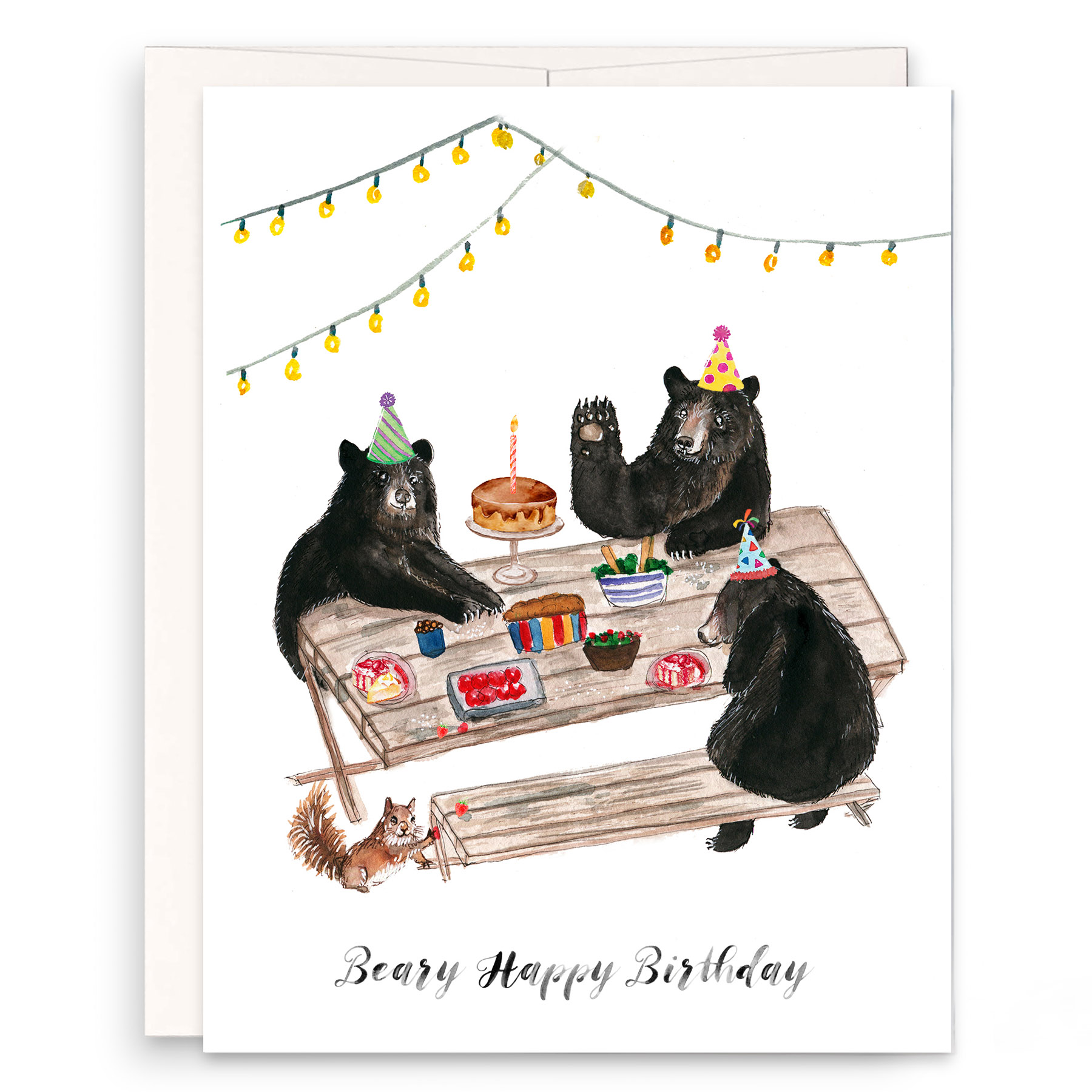
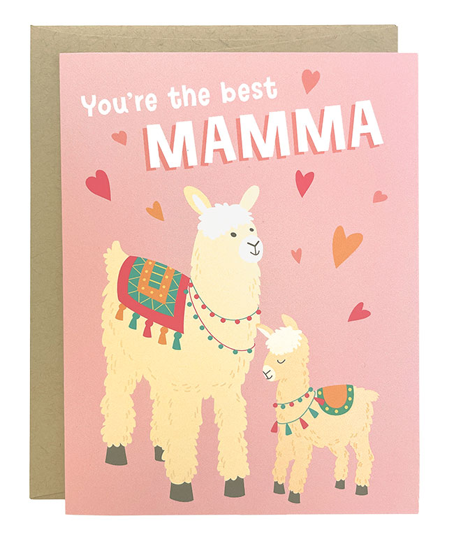
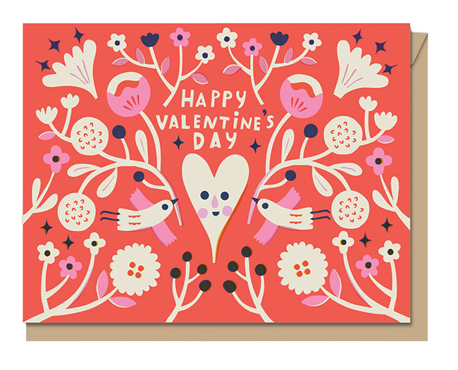
Greeting cards
“What’s hot?” rhetorically inquired Allison Nadeau, owner, INK MEETS PAPER. “Using paper to connect with friends.”
“We’re finding that people are more interested in letter writing in general lately, there’s more value being placed on the handwritten note,” agreed Tess Darrow of Egg Press.
What’s Hot: “Pastels are very hot for 2015,” described Augusta Levy, director of product management, PAPYRUS. “One of our themes this year is Candy Crush, which utilizes palette of pastels in a variety of materials and subject matter. Other finishes that are trendy right now in fashion and home décor are feathers and fur, which we have adapted into spectacular, eye catching greeting cards.”
Tried & True: “Hand-lettered and hand-drawn designs are certainly popular right now, and we think they have staying power as well,” opined Daniel Nadeau, owner, INK MEETS PAPER. “The subtle quirks and inconsistencies in artwork produced by hand (on paper) continues to stand out amidst all the straight lines in screens we look at throughout the day.”
The birthday cake has evolved into cupcakes, macaroons and ice cream sandwiches, added Levy. Dogs are a very popular icon right now, and all-over pattern, often graced with foil, is equally enticing.
Designer Quote: “Last year we did a letter writing campaign for National Letter Writing Month, April, with our friends Hello!Lucky. We called it WRITE_ON. We challenged ourselves and anyone else who wanted to join to write 30 letters in 30 days. We realized how much sitting down and taking the time to write positively impacted our day. And the love that came back to us in cards, phone calls, anecdotes and support for the campaign went beyond our expectations. By month’s end we had given away 8,000 letterpress cards. You bet we’ll be doing it again. — Kara Yanagawa, Egg Press
Office
“Whenever I delve into a new design project, my first consideration is personal style – what fits my customer and their lifestyle,” observed Breymeier. “I think this speaks very much toward the recent trend we’ve seen in the office market of traditionally functional essentials restyled for the fashion conscious. We all want morsels of inspiration throughout our day.”
What’s Hot: For many, that inspiration translates into playing with transparency infused with pops of color and organic shapes, noted Angeline Tetrault, former senior product designer at imm Living. “Also using brush stroke applications mixed in with inspirational or quirky quotes.”
“I love how bright color is still in full force, but is grounded with darker, sophisticated hues and materials that make the color combinations more timeless,” commented Dyna Kau, creative director, Girl of All Work. “Without the dark, the colors wouldn’t be half as dramatic or interesting. I’m still seeing a lot of hand drawn elements and watercolor patterns that really blur the distinction between home office and office.”
Tried & True: Be they abstract, watercolor or geometric, florals are always in bloom. Modular and stackable desk accessories maximize minimal space. “We enjoy maintaining a simple elegance through clean silhouettes and matte finishes on our paper designs,” remarked Breymeier.
Designer Quote: “Like it or not, we tend to work more than we play, and I think more and more people are trying to find ways to personalize their work experience. It’s gone beyond just changing out the screensaver on our computers, and I think the market for designed office accessories can only grow.” — Dyna Kau, Girl of All Work
Gifts
“I think there are a couple aesthetics that are big right now,” said Sarah Lin, publicity assistant and stationery publicist, Chronicle Books. “One is bold and graphic, showcasing bright colors and clean strong lines. Another is more artisanal and hand-crafted, embracing the Etsy and home artist movement.”
What’s Hot: Large-scale, boldly colored custom monograms. “We are doing these on everything from pads to shatterproof cups to engraved stationery,” pointed out Kate Pickett, owner, Pickett’s Press.
Tried & True: Vintage design elements draw admiring glances from many, while the cornerstone of Boatman Geller’s success has been colorful patterns, detailed Jane Geller, owner and creative director, The Boatman Group | Boatman Geller. “Trending color combinations shift in and out of style, but the one tried and true (and a personal favorite) is pink and green — clearly a classic!”
Designer Quote: Pickett’s Press: “I’m inspired by my children. They love the classics. They watch Grace Kelly movies over and over. It makes me realize that sticking to tradition is always fresh.”
Special Thanks: Bella Ink Designs; Capri Designs; Chronicle Books; Egg Press; Elum; Event Blossom; Fancy Pants Designs; Gayle Williams Invitations; Girl of all Work; Kleinfeld Paper; Imm Living; INK MEETS PAPER; Kleinfeld Paper; Megan Wright Design; PAPYRUS; Pickett’s Press; and The Boatman Group | Boatman Geller.