

Trends
April 23, 2014 •
Market Style Update: Detail Driven
What design elements drive the bridal, baby, greeting card, office and winter holiday markets? While trends like the glint of gorgeous gold shape many of the season’s most beguiling offerings, every shiny surface should actually reflect the personalities and proclivities of end consumers. So whether it is vintage motifs, painterly artwork, hand-lettering, florals or monograms driving a given design, sophistication and individuality are at its core. “What we have come to appreciate is that every order is different and provides inspiration in its own way,” emphasized Molly Ryan of Kramer Drive.
Remember that today’s design climate is informed by simple, clean lines as well as by that which is created by the hand — and is even sourced from elements we see each day and fail to appreciate. These can shape even the most ornate releases.
“With Mr. Boddington’s adventures always on my brain, I am often inspired by the extraordinary and the over-the-top, by excess and the grand,” explained Jessie Pickren of Mr. Boddington’s Studio. “However lately, ordinary things have been catching my eye … the architecture of a certain building on my walk to work, the tiled floor where I met an old friend for a glass of wine, the simple Italian label on the wine bottle for that matter. The small things, simple shapes and patterns can be extraordinary if you keep your eyes peeled.”
Read on to learn about other trends driving these markets, from the companies that interpret and present them.

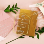
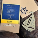
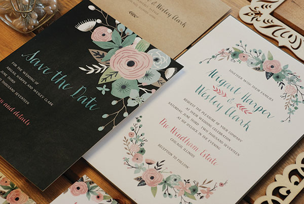
Bridal
“It’s all about expressing your style as a couple through unexpected combinations of patterns, prints, textures and color,” noted Jenny Kunz, product development — wedding, Gartner Studios. “Clean, sophisticated designs continue to be popular, keeping the invitation itself simple, yet using typography through the use of unique fonts to convey the tone or theme of the wedding.”
What’s Hot: A return to romance, observed Delphine’s Erika Firm. “Bringing the wedding back to focus on the two people getting married, rather than on all the superfluous details, is such a refreshing trend! Couples are choosing invitations that reflect something meaningful to them, whether it’s the venue, the region or the overall feeling of the event. Understated, elegant, romantic and organic are the key words we focused on when designing this year’s collection.”
Tasteful hints of metallic gold “have been a constant request,” described Pickren. Other can’t miss trends: rustic chalkboard and Kraft elements; font mixing; Art Deco looks implying a can’t-miss Gatsby-esque event; the black, white and gold palette; classic cabana stripes and bold polka dots; delicate florals.
Tried & True: “We’re seeing a lot of interest in personalized monograms and motifs, lace patterns, and the use of color, whether applied in subtle ways or splashed boldly throughout an entire invitation suite,” enthused Vita Mechachonis, art director – Kleinfeld Paper.
Also look for: hand-written fonts; pinstripes; pockets, gatefolds and bellybands; vintage elements.
Designer Quote: “ I always look forward to seeing Vera Wang, Carolina Herrera, and Monique Lhullier’s bridal gown collections. During bridal week I love stalking Darcy Miller, Vané Broussard and Anne Chertoff’s Instagram feeds for behind the scenes details of the shows — it’s an insider peek at upcoming bridal fashion trends, which nearly always translate into wedding design trends. But what inspires me most is our customers. I love listening to their engagement stories & wedding plans, and am constantly inspired by them. — Erika Firm, Delphine

Baby
“Popular design trends carry across markets,” underlined Margaret Nelson, creative director, Carlson Craft. “Today’s sophisticated customer wants baby market items that reflect what’s popular in home décor, fashion and event décor. Geometric designs, chevrons, color blocking, stylized typography, and whimsical owls are all featured in our newest products.”
What’s Hot: Unique keepsakes, particularly items that can be personalized. “Décor items that are giftable as well as needed in the nursery, like clocks and nightlights, are hot,” said Kerri Lee-Sensiba, Tree by Kerri Lee.
Also look for: richly textured and shimmer stocks; foil treatments; typography lettering; off shades of pink and blue, for example aqua; neutral palettes and natural materials like linen and burlap.
Tried & True: polka dots and strong geometrics die-cuts; traditional themes like building blocks or woodland animals. “Animals can be designed to appeal to various styles ranging from cute and traditional, to sweet and quirky, to modern and abstract,” emphasized Lee-Sensiba.
Designer Quote: “We always look to the European market, (where) baby accessories have always been so much more trendy and cute than in the U.S. There is more of a whimsy and artiness to European design rather then the ‘cutesy’ found in America. I think the young hipster moms and dads of today are gravitating towards being ‘cool’ rather than cute.” — Nancy Dickson, The Gift Wrap Company

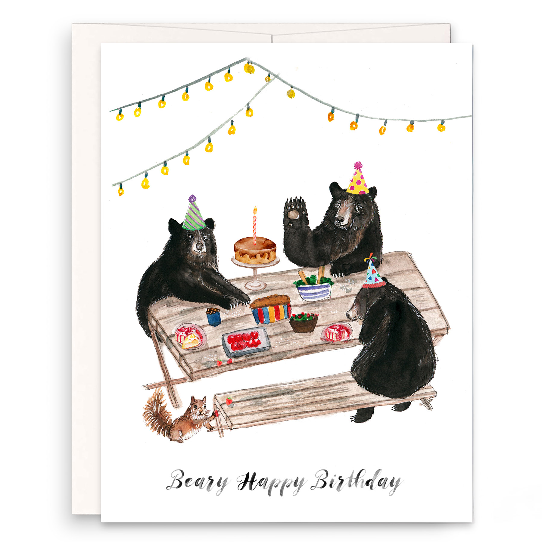
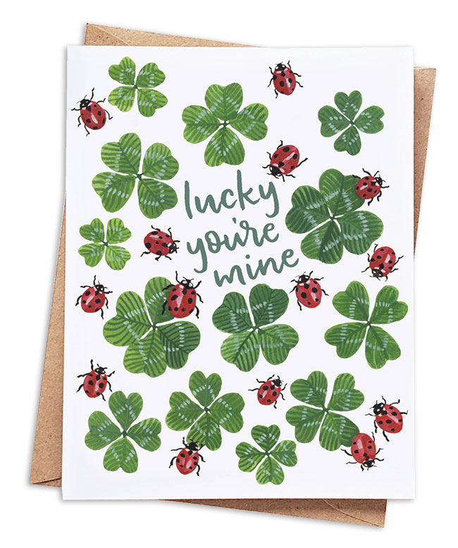
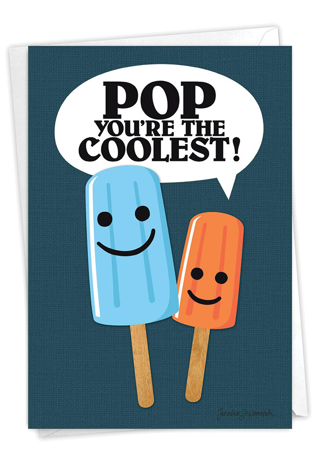
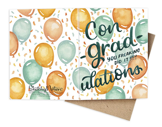
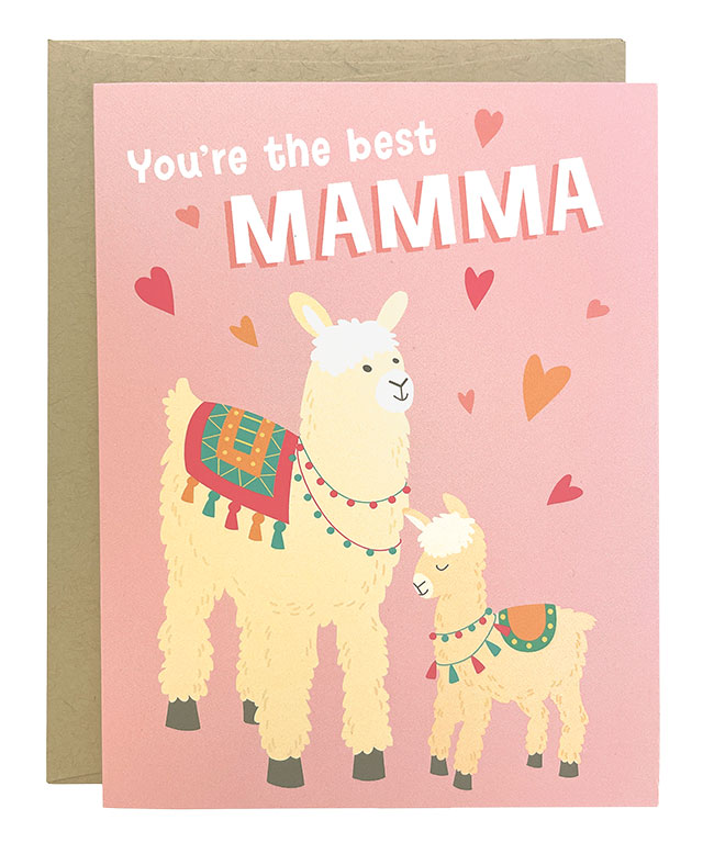
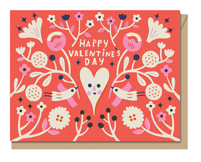
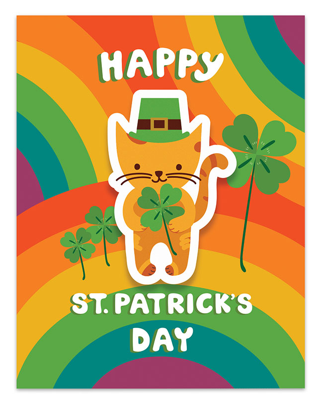
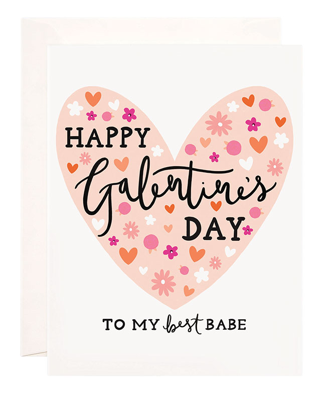
Greeting Cards
“I think it is actually lack of heat — the fact that we are a retro product rather than the hottest new thing — that keeps greeting cards hot in the smartphone age,” remarked Alan Friedman, president, Great Arrow Graphics. “They are touchable and holdable (unlike a Facebook post), savable (unlike a snapchat message) genuine and dependable (unlike that email that never seems to arrive in your aunt’s AOL inbox). The realness of paper and the sexiness of seeing someone’s actual handwriting inside is our hottest attribute. Letterpress has outlived the life expectancy many had thought because it celebrates paper as more than a flat screen.”
What’s Hot: “We continue to see the ‘edge’ moved,” pointed out Ron Kanfi, chief cardologist, Nobleworks. “What would have been too edgy in the past isn’t anymore.”
Certain occasions lend themselves to physical communications, added Friedman. “A look at Facebook shows how awkward social media is at handling personal loss. When someone dies, ‘Like’ just doesn’t seem to cut it. Sympathy (including pet sympathy) is among our most important categories. Same-sex wedding (we call the category marriage equality) is big and getting bigger.”
Also look for: faux prints and texture; painterly artwork; hand lettering; smart humor; bold colors, pattern play and chalkboard looks; foil and glitter finishes; a series of cards within a theme adds a narrative element as they deepen sales; interactive techniques like multiple choice greetings “add more personality and involvement to the card-sending experience,” underscored Patrick Wallace, director of marketing, Leanin’ Tree.
Tried & True: Body functions, sex, chocolate and complaining reign supreme; florals; updated retro designs with elements like cameras and typewriters; wordplay; and sweets and other decadent food and drink.
Designer Quote: “Anthromorphism is as hot as it is difficult to pronounce. Human emotion acted out by animals, robots, bacon and eggs … these are the strongest sellers in our line. Fourteen of the top 20 cards in our line share an anthropomorphic twist.” — Alan Friedman, Great Arrow Graphics

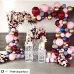
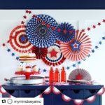
Winter Holiday
“A quality photo is always a holiday market ‘hottie,’” stated Ryan. “Add sparkle, foil stamping or hand lettering and (your) product will stand out. That card is a sure hit on the Holiday Wall of Fame!”
What’s Hot: The recipe for a great photocard typically includes a great pattern like chevron, stripes, dots or damasks combined with cool fonts and a great photo, suggested Abbey Malcolm, owner/creative director, Abbey Malcolm. Letterpress+Design. “This year, the inclusion of fun, multiple color letterpress printed patterns has become more popular, along with edge painting.”
“Our color palette is very diverse for a holiday collection in that we’re bringing in fashion shades of blues and pinks as secondary colors within compositions,” agreed Lisa Blinn, vice president, Crane Stationery.
Also look for: luxe touches like letterpress, patterned envelope liners, die-cutting, photo-tipped images; gold in both yellow and rose hues; hand-lettering and messy, brush scripts; Kraft papers; and double-thick and shimmer stocks.
Tried & True: Seek out traditional colors as well as familiar motifs like pinecones, birds, reindeer, holly, Santa Claus; and vintage botanicals paired with opulent textures of flocking and foil stamping. “Just when we think we should retire our wreath, hanging ornament, red bow mistletoe or snowflake, we are suddenly bombarded with orders for (them),” laughed Ryan. “We simply add a touch of gold, silver or neon glitter and traditional becomes traditional with a twist!”
“We love updating classic patterns, like taking a classic chevron and adding an Ikat element,” explained Haute Papier’s Erin Miller.
Designer Quote: “Designing for the Holiday market is extremely challenging: How many unique ways can Santa Claus be depicted? In the end it’s the combination of imagery, composition and color that will connect with your customer — and you better know who that customer is!” — Lisa Blinn, Crane Stationery

Office
As home offices and workspaces become household staples, the office category assumes new importance, emphasized Gwen Weinberg, owner/designer, Three by Three Seattle. “I’m always inspired by the four principles of design from Dieter Rams: Is it useful? Is it innovative? Is it beautiful? Is it efficient? I strive to create planning and organizational solutions (that) fit with materials found in modern home environments.”
What’s Hot: glass, bamboo, stainless and chalkboard surfaces and strong graphic patterns. “Hot colors include brights with golds or metallic accents,” noted Jan Dornseif, VP of product development & design, Russell+Hazel. “Navy, orange and purple are more dominant. Acrylic material continues to be strong with the straight clean lines and sleek look.”
Tried & True: Pops of color against neutral backgrounds is nothing new, observed Julia Drechsler of SARUT. “Cubist painters made strong use of bold color and pattern in the 1920s, while Expressionists reinterpreted color in the 1940s and Pop Art artists applied their own twist in the 1960s. Art trends have always influenced product development.”
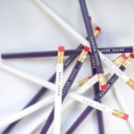
Also look for: Classics like pencils and paper clips redefined via shape, color and humor. “Inspirational words and sayings continue to sell,” remarked Ralph Shamah, vice president, Eccolo. “We’re finding that the trend of mixing fonts has its roots in the 60s and 70s, and that playing with typography never really goes out of style.”
Designer Quote: “We are especially noticing an elevated trend for design and quality. For spring, we are releasing a line of office accessories for kate spade new york featuring Lucite and gold in a stapler, tape dispenser, in-and-out box and pencil holder. And, of course, our gold paper clips in bows and expletives continue to be bestsellers!” — Todd Ferrier, Lifeguard Press
Special Thanks To: Abbey Malcolm Letterpress+Design; Anna Griffin Inc.; Calypso Cards; Carlson Craft; Crane Stationery; Delphine; Design Design; Eccolo; Gartner Studios; The Gift Wrap Company; Great Arrow Graphics; HBH Company; Haute Papier; Kleinfeld Paper; Kramer Drive; Leanin’ Tree; Lifeguard Press; The Madison Park Group; Mr. Boddington’s Studio; 9th Letter Press; Nobleworks; Russell+Hazel; Sarut; Three by Three Seattle; Tree by Kerri Lee.
—