

Uncategorized
May 1, 2012 •
Ink onto Paper
Envelopments carved a distinctive niche and continuously stays relevant as the originator of the mix-and-match system and trademark owner of Pocket Folds and Envelofolds. With more than 250 stocks, they offer the widest selection of card stocks, papers and envelopes, explained Ramon Gomez, design manager.
“Our goal has always been to enable the design of custom communiqués,” he described. “We strive to be as diverse as possible to stay relevant to the different types of brides. Trends are cyclical – what’s old is new again – so we design for the spectrum of modern to traditional; over-the-top to subtly sophisticated.”
To delve into licensed designs, then, can be viewed as something of a risk since it ties the brand to that of an artist. The company first started working with Anna Griffin in the 1990s and offers three of her patterns, but was more recently intrigued by the work of artist Kristy Rice of Momental Designs (www.momentaldesigns.com). A watercolorist whose custom invitations have garnered her extensive praise everywhere from the bridal must-read print magazine The Knot to the fashionista must-view webzine Matchbook Magazine, she opened an Envelopments account several years back, recalled Gomez.
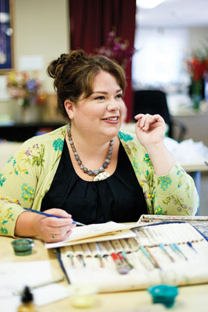
Kristy Rice
“We loved her innovation, sense of artistry, connection to nature and eye for color. She would post samples on her website and we were blown away not only by the hand-painted designs, but also by how she sees colors,” he observed. “There were so many instances where we never would have guessed that certain stocks would complement each other, but she made it work! We knew we wanted to collaborate with her, so while we were in New York last year for the National Stationery Show, we got the ball rolling.”
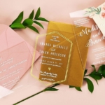
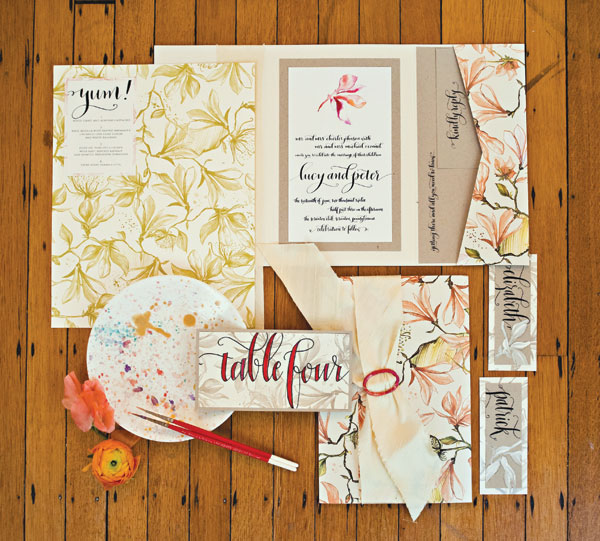
As a result, this January, Envelopments unveiled 10 Kristy Rice prints in the Trellis design. “For the first time, we are using a four-color process to create two pink floral options and two orange floral options. In keeping with our existing model, we are also releasing six one-color options, one of which is on a duplex stock, another first!” Gomez explained. “We have selected our favorite elements of the Trellis Pattern and are offering 30 pieces of Envelopments Original Artwork in a variety of color ways. The artwork can be placed anywhere from the invitation panel to the outer envelope. We’ve also created 42 designs for custom postage stamps that coordinate with the Trellis prints, which will be available through Zazzle.com/Envelopments.”
Stationery Trends interviewed Kristy to learn more about her vision and the process of creating this line and bringing her custom artistry to brides everywhere.
ST: How would you define your aesthetic?
KR: My aesthetic could be described in three words: modern, fussy, romantic. While I don’t trend towards the minimal and stark side of a modern aesthetic, I do interpret classics in a new, more artful way. Romance is never too far from my mind, which is why I love the fluffiest of blooms and flourishes. Watercolor, my favorite medium allows me to take traditional elements and flood them with a sheer, ethereal quality.
ST: What made you explore licensing?
KR: Licensing was a distinct way to grow as an artist outside my role as stationery designer. The core of my business is art; painting and the act of creating art, so licensing allows me to share my art with a wider audience.
ST: During the development process with Envelopments, did you learn anything about invitations that you might not have known beforehand?
KR: The magic moment for me was to see the evolution as Ramon wove my watercolor elements into a pattern. Not being a technical pattern designer I learned a lot about what makes a good pattern great while bending the rules just a bit.
ST: Were you working under any design constraints, parameters or limitations?
KR: Timing was a constraint considering the January 2012 launch date. Specific styles were the goal and words like sophisticated, classic and elegant were used to describe the early stages of artwork development. Contrast was a huge factor when creating each watercolor element, as I had to be sure to capture enough detail and variance from light to dark to be best reproduced in the Envelopments printing process. Color palette, while not monochromatic during development, was limited. As a watercolorist I am accustomed to playing with shades of many colors to create the right shadow or highlight. When painting for this pattern I had to stick to shades of one color to accomplish the look.
ST: Do you have a favorite piece or pattern in the Envelopments line?
KR: Well of course my new favorite is Trellis, but in a life before this pattern, Repousse was always my go-to for its curious shapes and woodblock print texture. Of course I can’t have just one favorite; Magnolia is by far my most loved stock. The distinctive canvas texture is wonderful to paint on.
ST: Did you encounter any unanticipated obstacles during the creation of this line?
KR: I think the biggest obstacle was finding a common ground in talking about style, as language can be so subjective. For example, the word “sophisticated” may conjure a very different image from artist to artist. Discovering more detailed, exacting words and anticipating the others creative tendencies became integral in the process.
ST: You’ve worked as a visual merchandiser so we are especially curious, how would you display and promote this line?
KR: In my mind, a standard stationery display just wouldn’t do. The Trellis pattern has the unique ability to transcend paper and inspire well beyond correspondence. To show Trellis’ true design impact and versatility, I envision it in a lifestyle space where walls are covered, chairs are upholstered and pillows are stuffed.
ST: Is there anything else about the new release you’d like to share with Stationery Trends?
KR: Trellis for me has become a new go-to. Although floral-based, it is filled with quirky details and sophisticated moments that can satisfy many tastes from the most romantic girly-girl to more stark, masculine aesthetics. I am genuinely excited to see how other designers interpret this new classic!
All photographs courtesy of Swoon Over It Photography