

Trends
October 2, 2013 •
Girls Against Boys
While both Bar and Bat Mitzvahs celebrate a Jewish child’s ascension to adulthood in the eyes of the religion, stationery related to the occasion is a different matter entirely. Each gender tends to gravitate in different design directions, noted Heather van Breda, owner and creative director, Real Card Studio: “For the most part, the Bar Mitzvahs tend to be more conservative. They want something special but they want it classic. Our Bat Mitzvah clients are usually looking for something over-the-top, and go for energetic designs and eye-popping color.”
That doesn’t mean there isn’t a lot of overlap. Both “share the desire to create something uniquely their own,” observed Kerry Amidon, product manager, Checkerboard — it is just that the paths to that goal often differ so. Stationery Trends interviewed several top designers for a better understanding of the gender-driven climate.
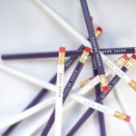
For the Boys
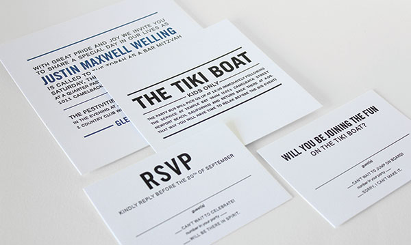
Young men gravitate to neutral bases, Amidon commented: “Bar Mitzvah celebrants trend toward a strong charcoal grey base and then add pops of neon colors, specifically lime green or mango orange. Layers are key and strong typefaces that highlight the name are featured.”
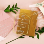
“Bar Mitzvah invitations are typically more conservative in style,” agreed van Breda, citing other popular neutrals as browns, navy blues and even black and whites. “Frequently the layout is clean and classic, with the exception of a great type treatment for the name. The neutral tones lend themselves best to letterpress printing, but for the more dramatic neutrals — black and white or navy and white — we do foil printing as well. Since the colors are more understated, they tend to seek out papers with more texture and interest give the piece more depth.”
Valerie Carlson, creative director and owner, Spark Letterpress, also cited the importance of theme. “We have several themed suites as standard designs, and then our clients are build on those suites or take certain elements away to make it their own. We have very popular basketball and hockey themed suites that can be customized to preferred colors or sports teams,” she said.
For the Girls
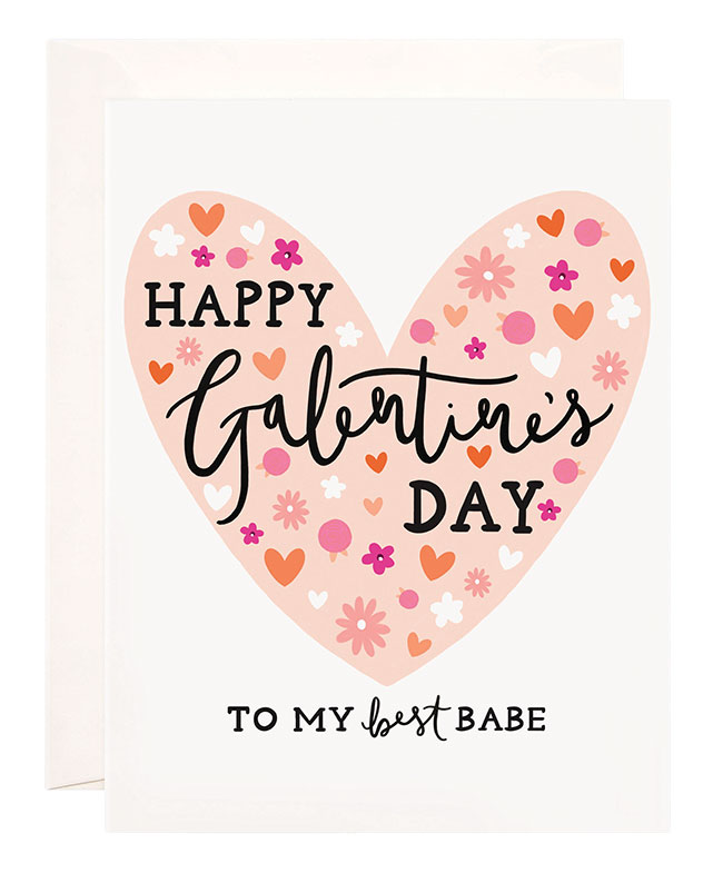
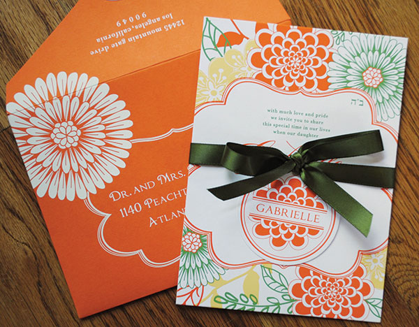
This segment runs the gamut from sweet and pretty to bright and kind of crazy, “in a good way!” laughed van Breda, adding that popular color choices include pinks, purples and teals and frequent choices for embellishments include glitter and rhinestones. “Last year we had fun with a candy theme, and printed a pearlescent foil on glossy white to look like a piece of candy. We do lots of pretty hand lettered names for these girls, too. We do letterpress for softer designs, but we definitely use a lot more metallic foil printing. We’ve even used a rainbow foil a few times.”
“We often add whimsical elements such as crystals, fun liners, ribbon to the Bat Mitzvah suites,” Carlson added, noting that girls often select the same sports-themed invitations as the boys — just with different color palettes.
Design risks are more the standard than the exception here, said Megan Jenny, marketing director, Luscious Verde. “We have also created a lot of fun custom die-cut frames with simple letterpress for the text. Rainbow inks and multicolored patterns (are) popular because of the youthfulness of the look.”
Here choices in color, pattern and overall design are often more fashion-trend driven, described Annabelle Stefanski, founder and president, Annabelle’s Creations. “(Lately) we have gotten many requests for neon patterns, paper and embellishments.”
Market Overlap
All this doesn’t mean there aren’t elements that attract both genders. For example, pointed out van Breda: “Everyone is hot for custom duplexed and triplexed paper combinations right now. The heavier the card, the better, usually with contrasting paper colors on front and back. Custom illustration is (also) gaining ground. We offer custom portrait illustrations; they are a great alternative to a photo and such a keepsake.”
Other overlapping trends include details such as foil, edge painting and modern typefaces, Carlson explained. Another commonality is the involvement of two key players — and financiers — who are often referred to “mom” and “dad.” While both boys and girls now voice their opinions about pieces, many designers also mentioned both parents as involved in the process.
“It’s really a fun collaboration of both parent and child,” Jenny detailed. “We’ve found that parents try really hard to include everything their child would like in the invitation. We always start off with custom estimates so the parents can see where they stand within their budget and try and narrow down the selection. Usually, the parents will let their son or daughter choose the paper color combination.”
Regardless of gender, approach each sale with an open mind and have fun with the process. Stay attuned to what elements will to help build a design to uniquely suit this most special milestone. “Overall, mitzvahs are some of my favorite projects,” van Breda finished. “Customers always want what’s new and exciting, and they keep the genre fresh.”
— By Sarah Schwartz, editor