

Features Industry Profiles
January 10, 2011 •
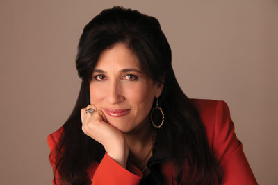
Andrea Liss
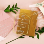
Whatever you do, don’t underestimate Andrea Liss, designer and owner of Hannah Handmade. Hers has been more than just another gorgeous line since its 1991 inception. Her first greeting cards featured beads and letterpress images sewn onto recycled paper, while early invitations were fabric-covered gatefolds with jeweled brooches – all common now, but were then firsts of their kind.
Since then, Andrea has not only seen her company carve a niche for itself, she plays a prominent role in the Greeting Card Association (GCA), even helping to develop the Butterfly Stamp.
Stationery Trends interviewed Andrea about her background and artistry, as well as where she’d like her line and the industry to go.
Past & Present
ST: You have a bachelor’s degree in journalism from the University of Illinois, and a master’s degree in advertising from the Medill School of Journalism at Northwestern University. With such a verbal bent, how did you end up in such a visually driven field?
AL: I grew up surrounded by textiles from around the world. My family is now in its third generation as Oriental rug dealers, and over the years the collection branched out into tapestries and other jacquard-loomed fabrics from France, Italy and Belgium. The textures and colors were influential in developing my eye for color and appreciation for fine craftsmanship and detail. This visual and tactile treasury was the backdrop for my love of reading; I could often be found curled up with a book amongst piles of rugs and rolls of fabrics.
My love of books and reading led me to study journalism, and as luck would have it, one of the requirements was a design and photojournalism class. There I discovered I had talent for all things visual, and that the most moving way to tell a story is with a combination of words and pictures.
ST: When you opened your design business in 1991, it meandered into stationery almost accidentally, when the greeting card you designed to announce its creation garnered an enthusiastic response. Looking back, are you surprised you ended up where you have?
AL: As I look back, I am able to see the pattern of my winding road, and I am very pleased with where it led me. Each choice along the way made a difference, editing and guiding my journey. One of my favorite poems is Robert Frost’s “The Road Not Taken.” I wonder where other roads may have led me, but those will have to wait for another day ….
ST: Can you give an idea of the breadth of your collection of paper ephemera? Do you have any favorites?
AL: I have hundreds of antique postcards and greeting cards in my collection as well as a respectable collection of Esther Howland and other Victorian valentines. Favorites include my silk-fringed collection of Louis Prang Christmas cards, antique menus and place cards and an extensive series of Victorian memorial cards and envelopes, with varying widths of black borders to connote the depth of the loss. I also treasure my Penny Black stamp, the world’s first adhesive postage stamp used in a public postal system, issued in the UK in 1840, but the most special pieces are a series of love letters written in 1850 on valentines by a woman in love with (one) William Goodall, Esq. who worked at Barnum’s Museum in Philadelphia. The embossed envelopes bear the mark of Blood’s Despatch, one of the longest surviving private mail enterprises of its time.
Divine Design
ST: You model your approach on that of Parisian and Milanese ateliers. How do you replicate it?
AL: The original haute couture ateliers, beginning with the House of Worth, originated in Paris in the late 19th century. Translated as “high sewing,” true haute couture garments are one-of-a-kind creations that are made-to-order for private clients using only the highest quality fabrics and finishing techniques.
Similarly, our invitations are designed for each client in a personal, collaborative fashion. Once a design (is) approved, our invitations are meticulously handmade in my atelier’s adjoining workrooms by a dedicated team of master artisans. In keeping with our tradition of excellence, we use only the finest materials, many of which are exclusives made just for us.
ST: How do you incorporate weightier elements like textiles, beading, embroidery or needlework without giving your designs a heavy feel?
AL: Restraint is key. While we have many tools in our tool chest, the discipline to hold some back is central to good design. What you leave out is as important as what you put in.
ST: You are one of a handful of designers using engraving. Why do you select it over letterpress, and what do you love about the printing method?
AL: There are so many beautiful, and well-designed letterpress lines. My thought in creating our engraved Made to Measure collection was to create something that would complement the offerings already out there.
Engraving has long signified refinement and prestige, and is known for its ability to capture the finest details. It’s particularly well suited for printing on colored papers as its opaque inks remain true to color. I also love its tactile, raised surface and how well we are able to reproduce intricate fonts, monograms and hand calligraphy.
ST: Your Made to Measure collection presents your vision in a more affordable format. Did you encounter any stumbling blocks in creating it?
AL: I wanted to create a custom album that (was) organized so that our couture experience could be enjoyed (at) fine stationers across the country. The biggest hurdle was editing thousands of papers and fabrics into a manageable collection. We ended up with a wide array of over 100 different paper and fabric options and 10 different custom shapes as a starting point.
ST: Do you have a favorite project you’ve created for corporate and nonprofit clients?
AL: My most memorable projects are those that have given me the opportunity to create invitations and holiday cards for some of the nation’s top institutions and non-profits. Highlights include designing the holiday card for the US Department of State’s Chief of Protocol and designing stationery ensemble color palettes for the White House Social Office. (Recently) three galas on the same night began with our invitations: The National Symphony Orchestra Ball in Washington, D.C.; the Opening Gala for the new Weston Wing and Japanese Art Galleries at the Art Institute of Chicago; and the Three Cups of Tea Gala with Greg Mortenson and the Central Asia Institute in the San Francisco Bay area.
The Bigger Picture
ST: You sit on the GCA’s board of directors and Postal Affairs Committee, so you played a big role in the development of the Butterfly Stamp. Can you describe its creation?
AL: The Butterfly Stamp is a great example of what can happen when people come together for a common goal. The idea developed during discussions between the Postal Affairs Committee and our counterparts at the U.S. Postal Service (USPS). Our objective was to simplify the mailing of square and irregularly shaped envelopes. We came up with a special postage stamp and a corresponding image printed on envelopes. The icon on the envelope (indicates) that the butterfly stamp is all that’s required — no need to wait in line (or) measure envelopes. The process moved from concept to market in a little over a year.
ST: How was a butterfly decided upon?
AL: Our early idea was to use a shape-based graphic such as a circle, diamond or triangle, and the USPS considered developing stamps in one of those shapes. Ultimately, the USPS came back to us with the idea of the butterfly, which we immediately recognized as a brilliant solution. The monarch butterfly stamp was designed by Tom Engeman, and I designed the corresponding butterfly icon that companies print on square envelopes.
ST: You worked with the GCA to create the Esther Howland Award, honoring visionaries in the greeting card industry. Can you share a bit about it?
AL: Esther Howland (1828-1904) is known as the Mother of the American Valentine. In the Victorian era, it was neither fashionable or common for women to have any connection to the business world, yet Esther Howland, after graduating from college in 1847 at the age of 19, managed to design a line of handmade valentines, assemble a labor pool and sales force and build a sales volume of $100,000 a year, which today would translate into millions.
The idea behind the award was to honor the achievements of visionaries in the industry who, in the spirit of Esther Howland, exhibit such qualities as creativity, leadership, business acumen, perseverance, entrepreneurship and excellence and who have grown their companies to be an inspiration to us all.
ST: Please tell us a bit about the Scraps to Art program.
AL: Our Scraps to Art program regularly donates excess paper, fabric and other materials through partnerships with art programs at schools, not-for-profit literacy workshops and writing programs in our community. Our mission is to encourage creativity and artistic expression while acting on our commitment to recycle and reuse. It is very exciting to see a box of excess paper and fabric transform into beautiful works of art. I would encourage others to seek out schools and local art programs in their communities and ask how they can donate. It is easy to do and very gratifying to see your materials take shape in such new and original ways.
ST: Is there anything else you’d like to share?
AL: This is such an important time. The Internet, e-mail, Facebook and Twitter have changed how we communicate. I think it’s more important than ever to be creative in our designs, and to build strong relationships with our customers. We need to keep the art of personal correspondence relevant – nothing can ever replace the feeling (of) receiving a personal note or invitation in the mail.