

Trends
June 14, 2016 •
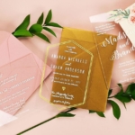
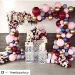
The Color Wheel: Serenity & Rose Quartz
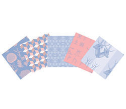
2016 brings with it a U.S. presidential election, the Summer Olympics in Rio de Janiero and not just one Pantone Color of the Year, but two. Meet Serenity and Rose Quartz, a symbolic duo representing a color snapshot of our culture right now, described Leatrice Eiseman, executive director of the Pantone Color Institute.
Each is a soothing salve for this moment, Eiseman continued. “Weightless and airy, like the expanse of the blue sky above us, Serenity comforts with a calming effect, bringing a feeling of respite even in turbulent times. Rose Quartz is a persuasive yet gentle tone that conveys compassion and a sense of composure.”

But why both of them, especially when each is popular in its own right? “For 2016, we saw a harmonious pairing of the two shades Serenity and Rose Quartz as the most emblematic of our cultural zeitgeist,” she explained. “The color trend experts at Pantone saw this pairing around the world and across many design verticals — from fashion, home décor and beauty to packaging and industrial design.”
Together they “embody a mindset of tranquility and inner peace,” she observed. “The harmonious union of the two shades imparts a calming mood much sought after in our hectic society. We’re seeing them together across all areas of design — in prints, color blocking, ombré, mixed separates and more.”

Depending on what they’re mixed with, the tones can impart a broad variety of moods and themes, from earthy to ethereal. “This gives a great deal of choice,” Eiseman underlined.
While there is no formula for predicting how long this duo will remain popular, don’t expect them to fade anytime soon, she finished. “We anticipate that the next few years will see a prevalence of this combination.”